
Power BI Blog: Waffle Chart
27 June 2019
Welcome back to this week’s Power BI blog series! This week, we’re going to look at another Power BI’s awesome custom visual: Waffle Chart.
More often than not, Pie Chart is used when we try to show data proportions. But wait, have you ever found it difficult to grasp the difference between 30% and 35% when figures are not displayed? (I know comparing 45% to 60% or even 90% is obviously easy, I am trying to make it hard).
Introducing the Waffle Chart.

This looks nice, but what I mean is…
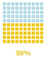
Waffle Chart presents proportional data in beautiful visualizations. Its organized in a 10x10 dimension which means you can clearly see a 1% difference, this makes the comparison between small percentages easier.
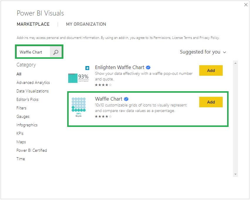
First things first, I need to import the Waffle Chart to my Power BI Desktop as it is a custom visualisation, you can read more about custom visualisations here. In Home Tab's Custom Visual group, choose 'From Marketplace', search "Waffle Chart":
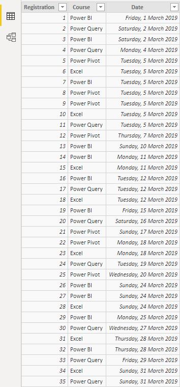
Looking at my simple sample data set, I want to see the registration performance of the 4 short courses in March 2019:
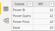
compared to the predetermined KPIs as shown in this table:
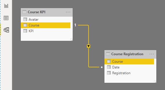
In the Model view, I create a relationship between two tables, by connecting the “Course” fields among them.
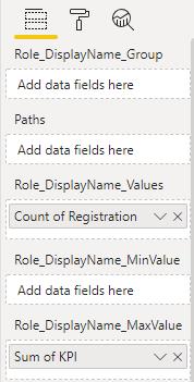
Coming back to the Report view, I choose Waffle Chart which has just been imported, and I drag the “Registration” to Role_Display/Name_Values field, and to reflect the performance based on total KPI, I drag “KPI” to Role_Display/Name_MaxValue and set this as Sum.
This will result in a waffle chart showing the total registration in 4 courses (which is 35) over the total KPI of all 4 courses (12 + 12 + 10 + 15 is 49). I do some touch-ups with the title design and other display settings so I get a visual like this.
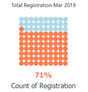
Beautiful! Course registrations in March have nailed 75% of total KPI.
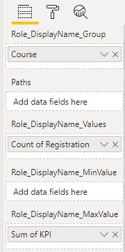
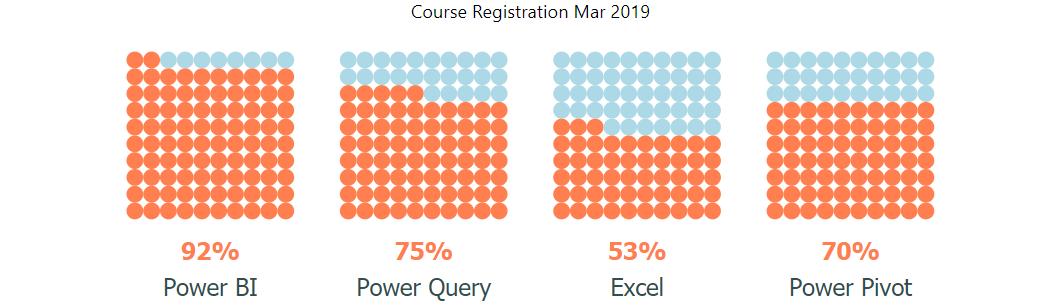
Waffle Chart can do further with multiple categories, so there’s no need to create multiple charts for multiple entities to compare. I just need to drag “Course” to Role_Display/Name_Group field:
The Waffle Chart will separate each of 4 courses and show their registration:
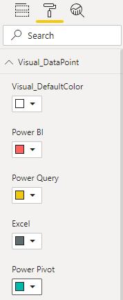
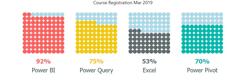
To make it distinct between groups, I can colour code them using Visual_Datapoint:
Each course now has their own colour:
That’s it for this week, check back next week for the next blog in the Power BI series.