
Power BI Blog: Sydney’s Register of Food Penalty - Part 3
14 November 2019
Welcome back to this week’s Power BI blog series. This week, we are going to look at getting our data to properly display on the map visualisation.
Last week, we created a custom function query that allowed us to extract the information from all of the links contained in the data table. Today, we are going to take that new data that we have managed to load and create some visualisations from them.
As a quick recap, last week we just invoked the custom function and was able to retrieve the data contained in each link in the dataset (you can read more about last week’s blog here).
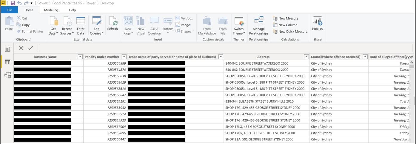
After waiting for the query to load, perhaps grab a cup of tea because this query took us around 20 minutes before it completed loading. However, once completed, our data now looks something like this:
We have the proper address now, let’s try plotting this on the Maps visualisation and hopefully we will get more than two results plotted correctly in NSW.
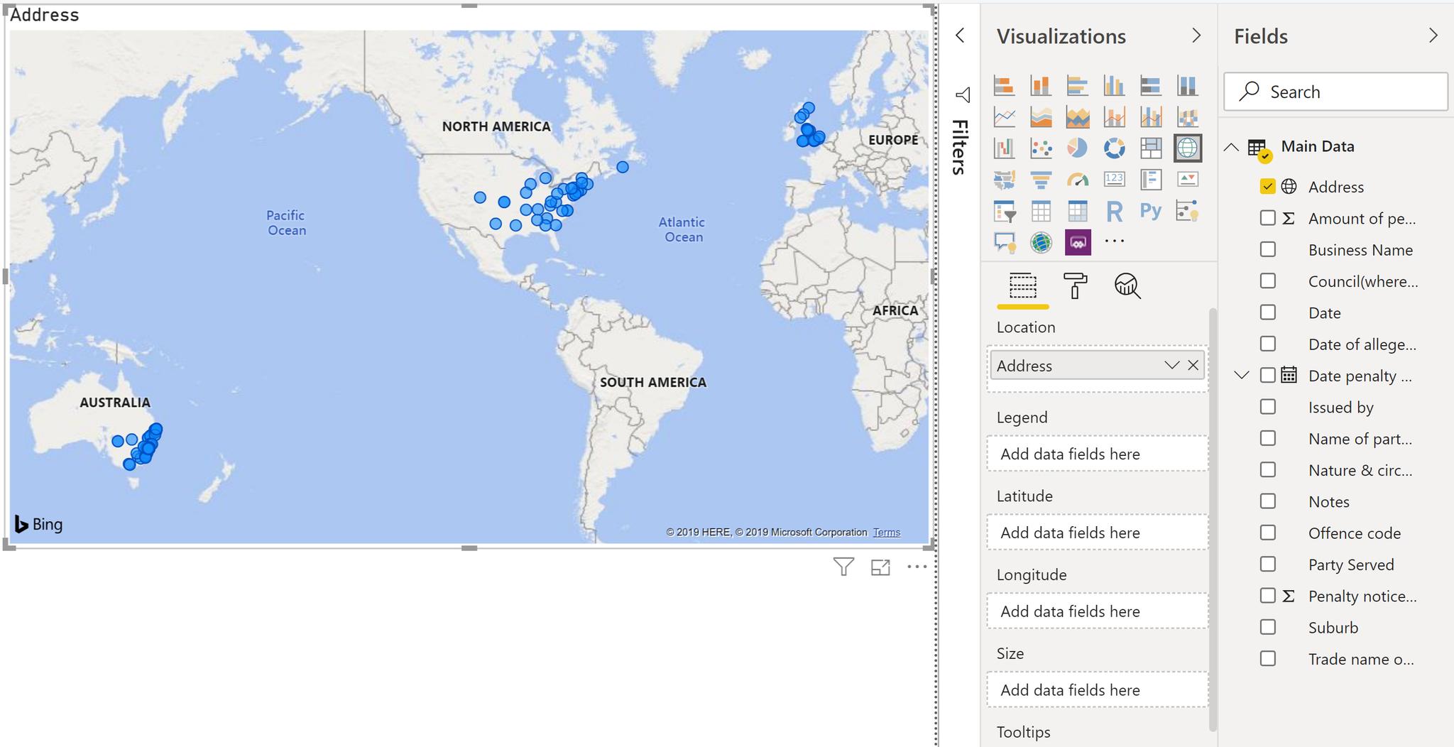
Fantastic, our results seemed to have grown to include offenders in the States and from the UK. Let’s try adding a state and country to our address column to see if that helps Bing maps out. Head over to the Data tab of the report, then click on the Modelling tab on the Ribbon, then create two new columns for the country and state as so:
Country = "Australia"
State = "NSW"
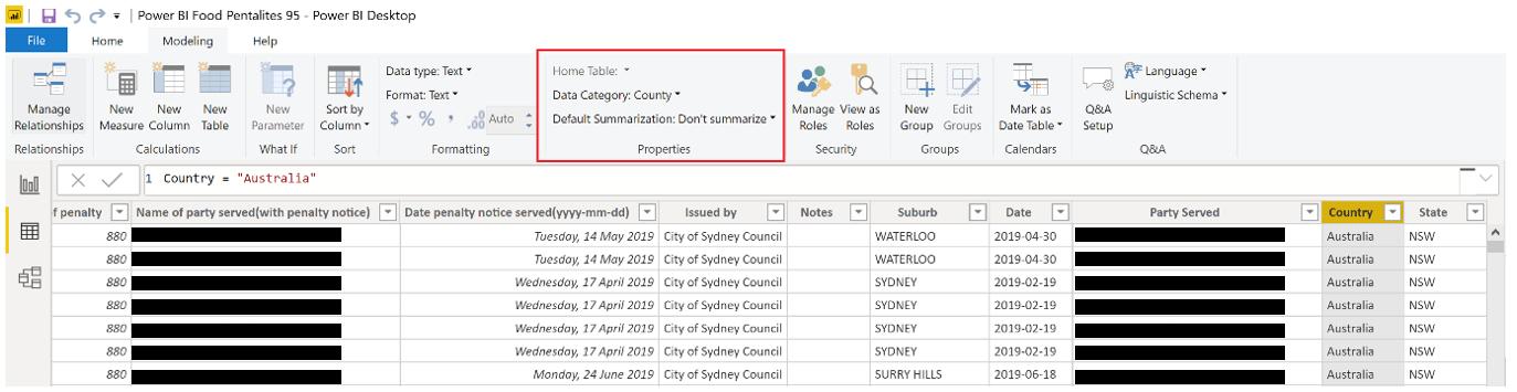
Also, remember to set the proper Data Types for the Country and State columns.
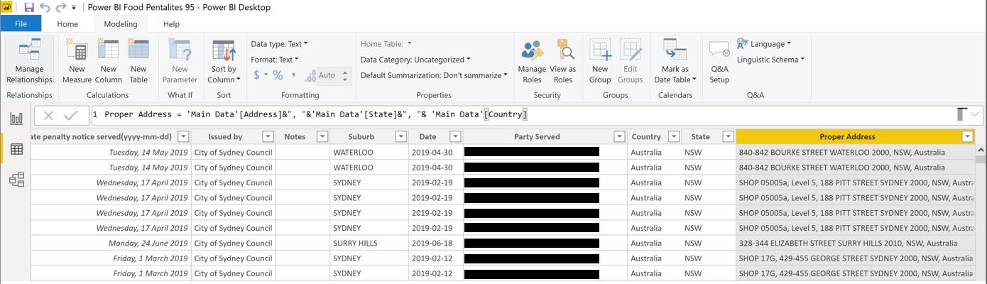
Now, we can add the State and Country to our address via creating a new column again:
Proper Address = 'Main Data'[Address]&", "&'Main Data'[State]&", "& 'Main Data'[Country]
Let’s try plotting this column onto our Maps visualisation:
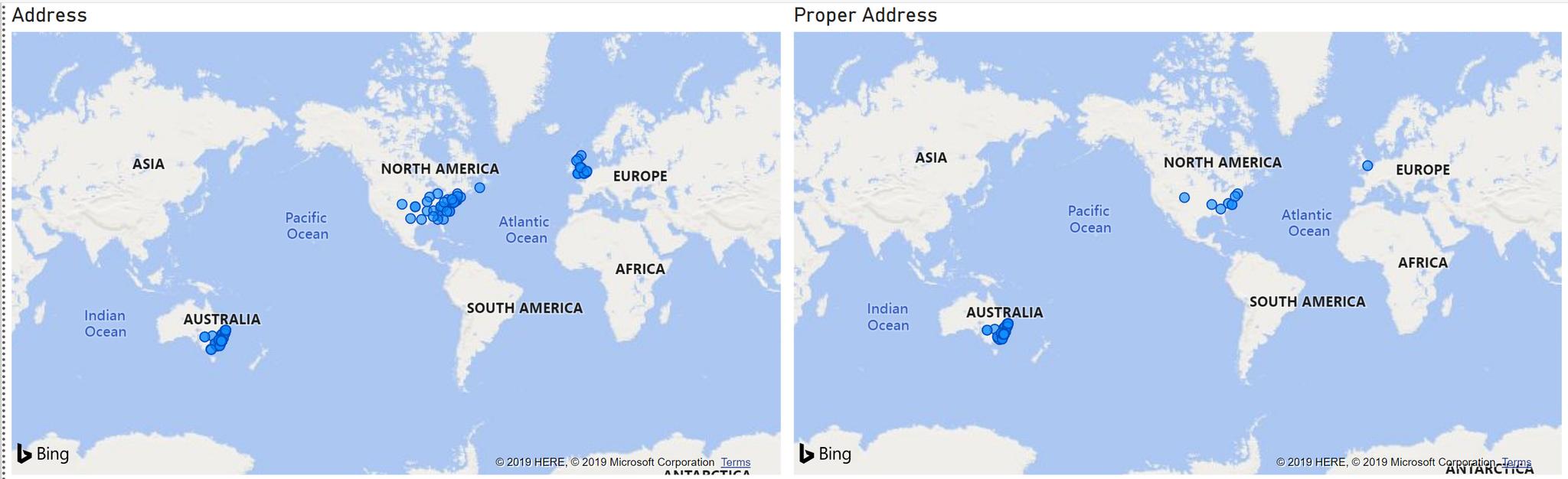
As we can see the original Address field is plotted on the map visualisation on the left and the Proper Address field is plotted on the visualisation on the right. Our efforts weren’t completely in vain this time, the Proper Address column has significantly reduced the number of results displaying in North America and the UK.
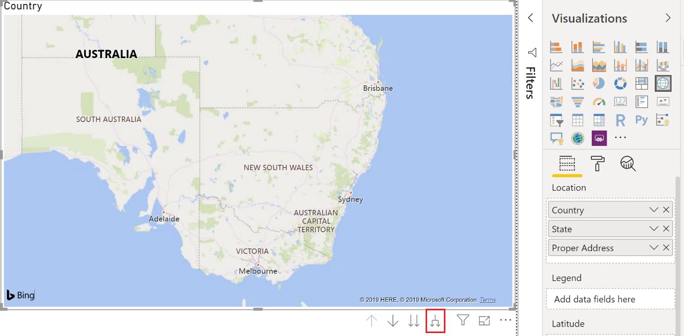
There must be something else we can do. Let’s try adding in the State and Country fields into the Location box of the visualisation. Ensure that they are in order of Country, State, then Proper Address. This will ensure that the fields are in a proper hierarchy (we will cover hierarchies more in a later blog).
Our report now looks very promising, with no points plotted on the map:
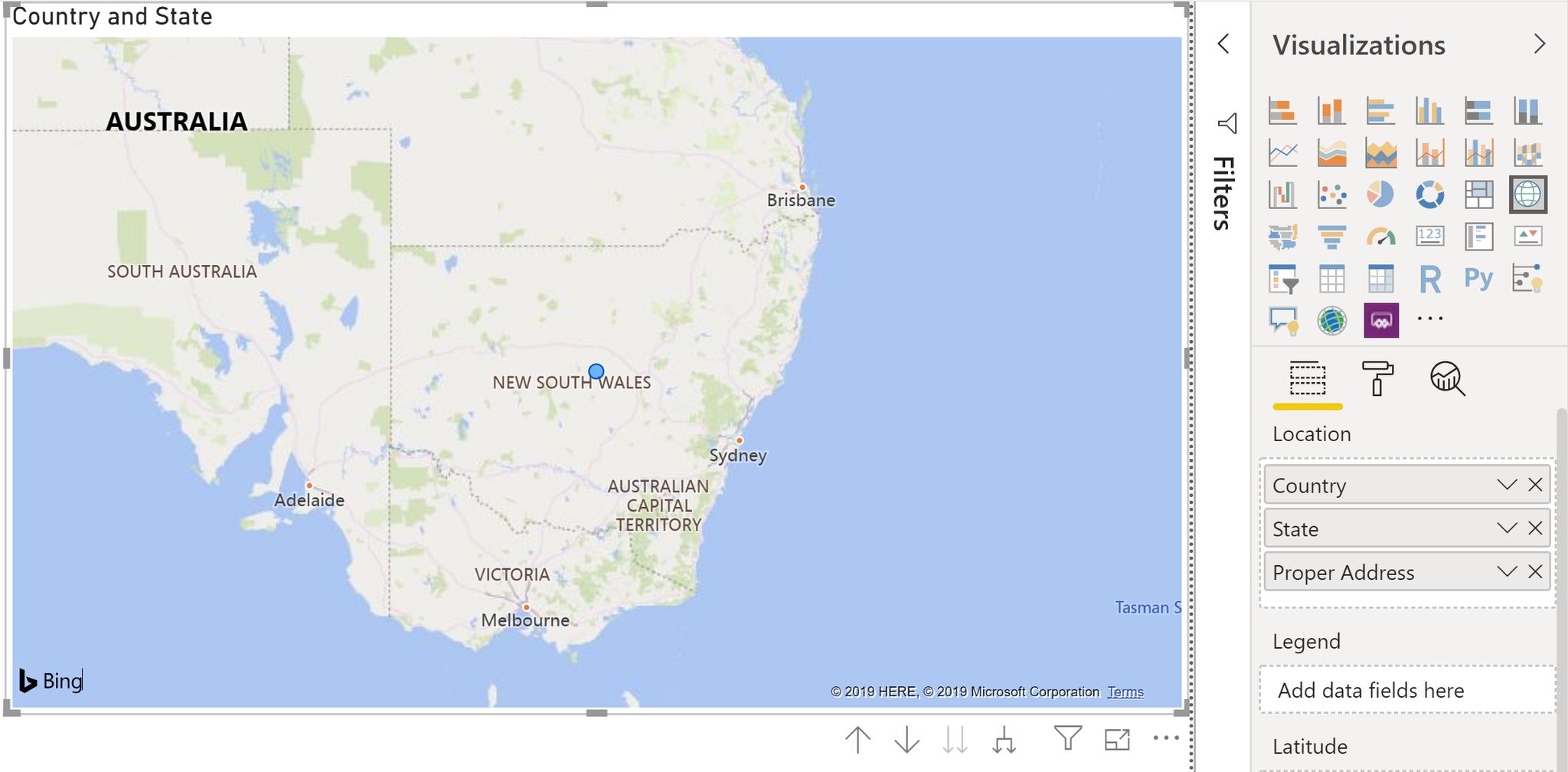
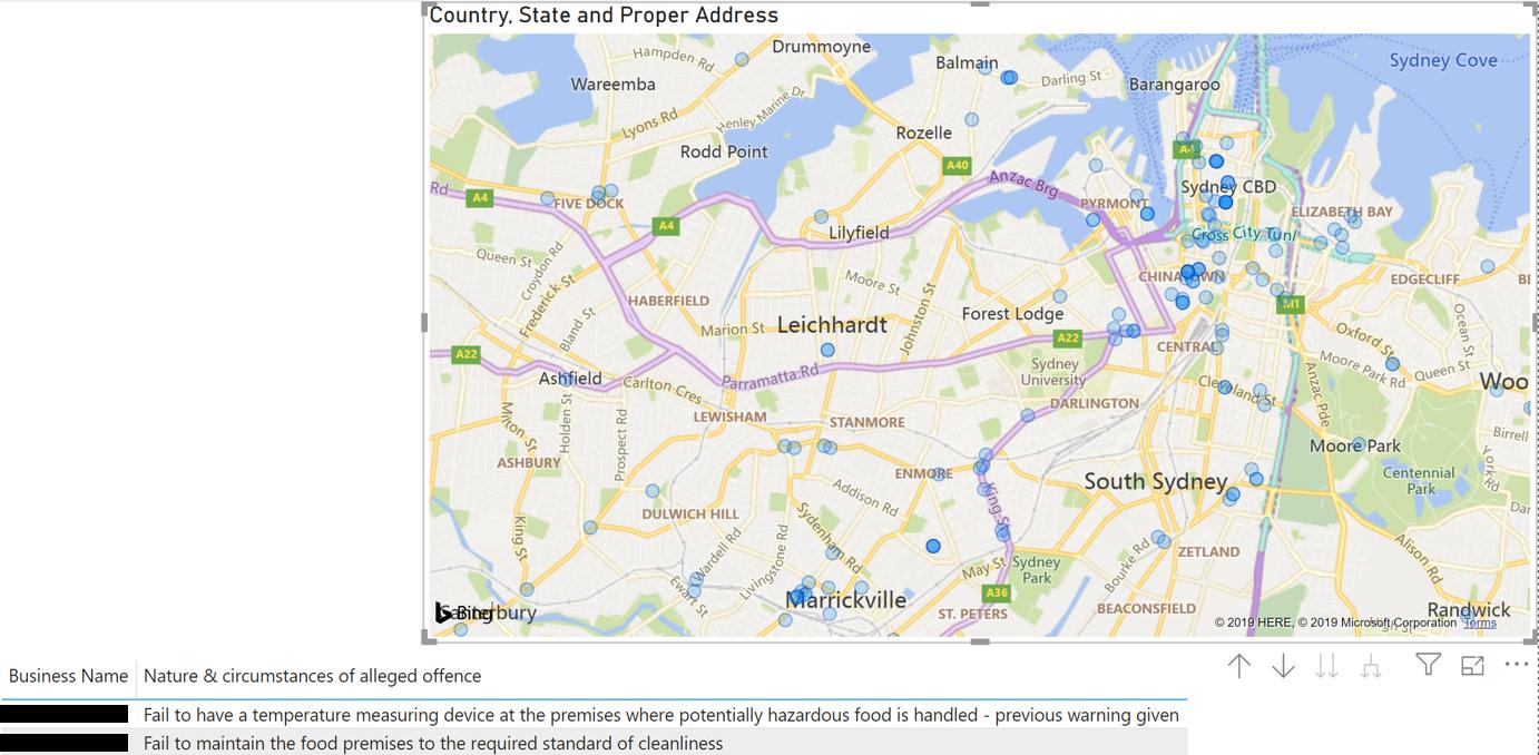
However, notice that we have the option now to drill down into our report? Let’s click on the “Expand all down in one level in the hierarchy” button. This gives us one dot:
Let’s try again:
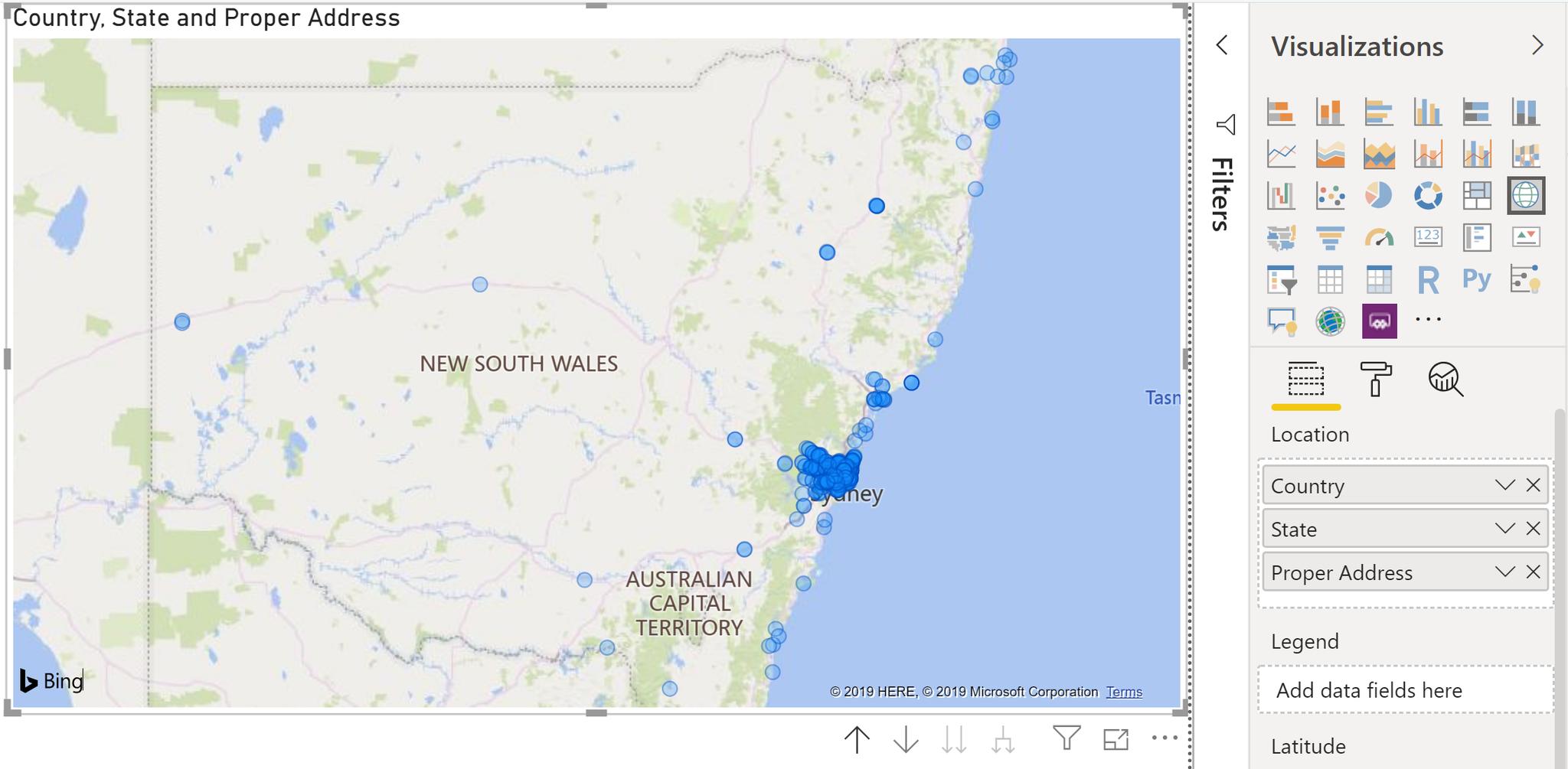
Success. Adding a simple Table visualisation to the report with the Business Name and Nature & circumstances of alleged offence fields will allow for an interesting analytical session:
That’s it for this week! Check back in seven days for more gut-wrenching analysis on this dataset!
In the meantime, please remember we offer training in Power BI which you can find out more about here. If you wish to catch up on past articles, you can find all of our past Power BI blogs here.