
Power BI Blog: Sydney’s Register of Food Penalty Notices – Part 6
12 December 2019
Welcome back to this week’s Power BI blog series. This week, we are going to look at creating our dashboard and applying appropriate formatting.
Last week, we looked at creating a customised category column for all of the food penalties and used that new category system as a filter. This week, we are going to improve on our dashboard to make it more user-friendly.
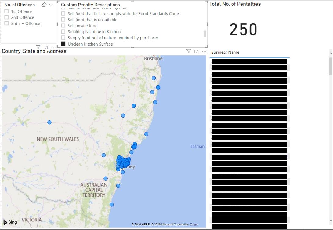
Our current dashboard looks like this:
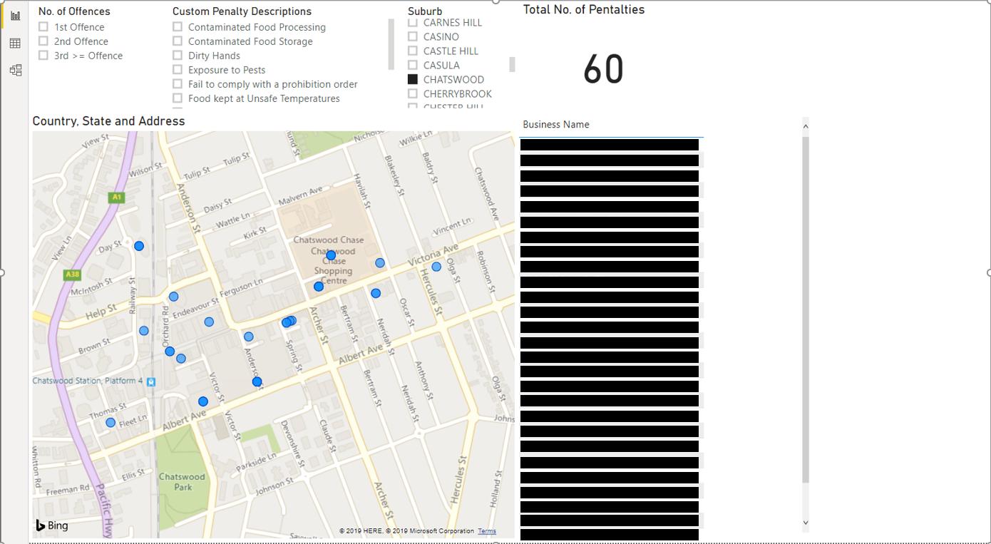
Let’s see what we can do to make this look better. We can include the Suburb field as a filter:
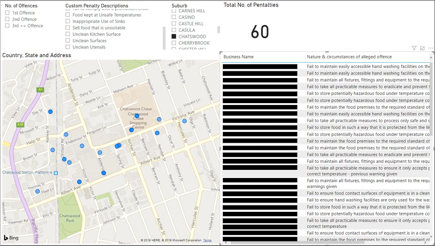
What if we also wanted to see the nature of the penalty? We could include that field into our Table visualisation.
What if we also wanted to see the amount each business was fined for the penalty? It would be rather difficult to fit all of that information in a Table visualisation. What if we used a Matrix visualisation instead?
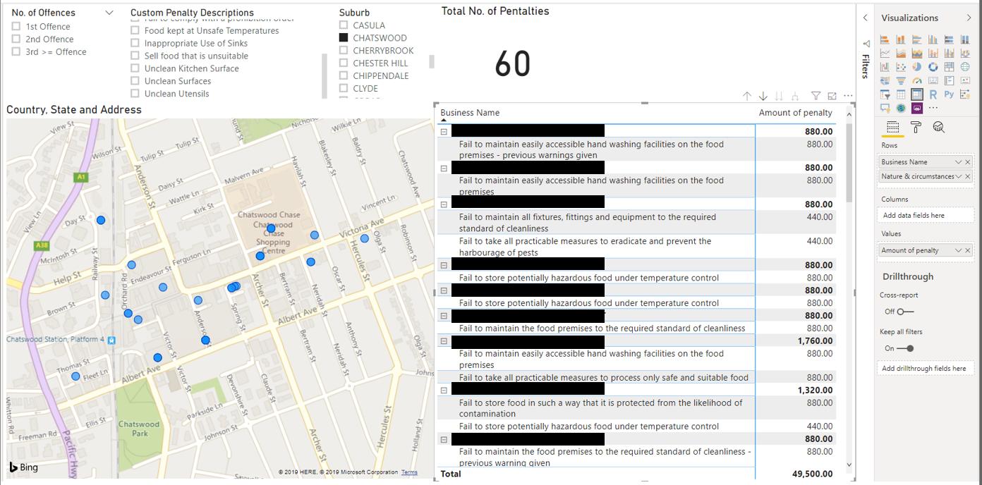
We have placed the Business Name and Nature & circumstances of alleged offence in the Rows area of the matrix, and the Amount of penalty field in the Values area of the matrix. We have then elected to ‘Expand all down in one level of hierarchy’ so that we can see all of the details behind each penalty. The Matrix visualisation displays all of the data that we wish to show very effectively in a small box.
Another formatting change that we may elect to make, is to change the row subtotal position to ‘Bottom’:
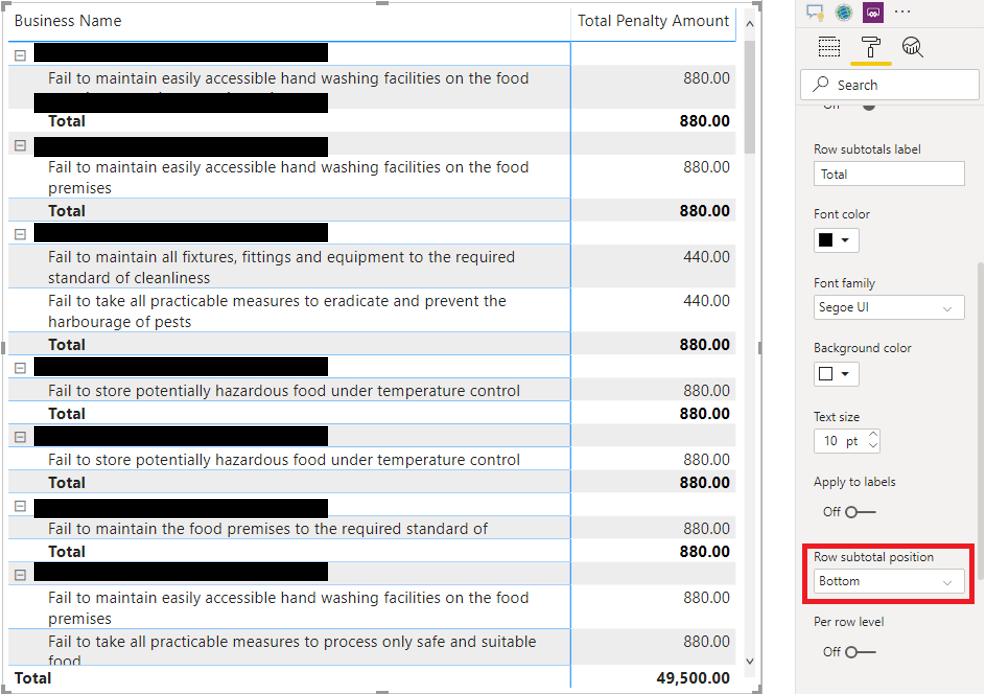
Depending on the end user, they may prefer to have subtotals on the top or bottom of each row. We prefer it to appear on the bottom so that is it clearer that it is a ‘total’ amount.
Another metric that may be useful to know is the % of Total. To create this, we will need to create three simple measures: Total offences, No of offences and finally, the Percentage of Total measure.
Total Offences =
CALCULATE(
COUNT(
'Main Data'[Business Name]),
ALL('Main Data')
)
The Total Offences measure uses the ALL function so that we ignore all filters applied and count the total number of penalties in the dataset (you can read more about the ALL function in our Power Pivot blogs series here).
No of offences = COUNT('Main Data'[Business Name])
The No of offences measure will count the total number of penalties in the current filtered selection.
Finally, we can create the % of Total measure:
Percentage of Total = [Filtered Offences]/[Total Offences]
We can include this measure in our report through a card visualisation:
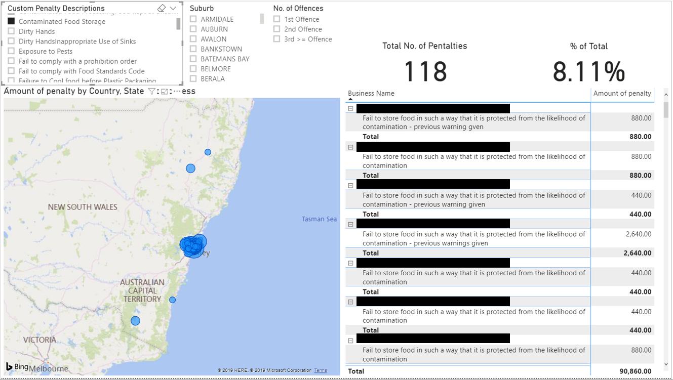
The numbers bear more weight when we can see that 8% of businesses store their food in such a way that they are likely to get contaminated. We can also include a measure and card that has the Suburb selected:
Suburb Selection =
IF(
ISFILTERED('Main Data'[Suburb]),
FIRSTNONBLANK('Main Data'[Suburb],1),
"No Suburb Selected"
)
This measure displays the selected suburb or ‘No Suburb Selected’ if there is no selection on the suburb filter.
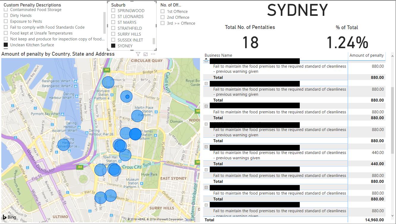
For those of you who are having lunches in Sydney CBD today, we say, enjoy your meal.
That’s it for this week, come back next week for more Power BI!
In the meantime, please remember we offer training in Power BI which you can find out more about here. If you wish to catch up on past articles, you can find all of our past Power BI blogs here.