
Power BI Blog: Sydney’s Register of Food Penalty Notices
31 October 2019
Welcome back to this week’s Power BI blog series. This week, we are going to look at NSW Food Authority’s register of penalty notices. Do try to stay awake.
We have looked to this year’s ‘Good Food Month’ for some inspiration and we’ve decided to approach the topic with some of our 100% homemade pessimism sprinkled on the subject. This week we are going to look at NSW’s Food Authority’s register of penalty notices (the link can be found here).
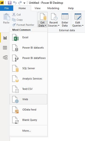
Let’s bring this dataset into Power BI, head over to the Home tab on the Ribbon and select Get Data -> Web:
After loading our data into Power BI, we may perform some simple analysis:
- Collate the total number of penalties each business has
- Count the number of penalties in each suburb
- Map distribution of penalties.
We can collate the total number of penalties each business has by using the Table visualisation:
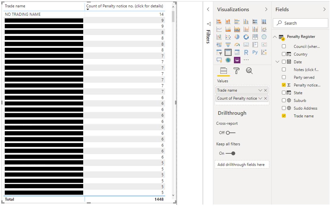
It looks like the biggest offenders are Japanese restaurants. Note that we have set the table to return with the ‘Count of Penalty notices’. On another note, let’s look at the number of penalties per suburb:
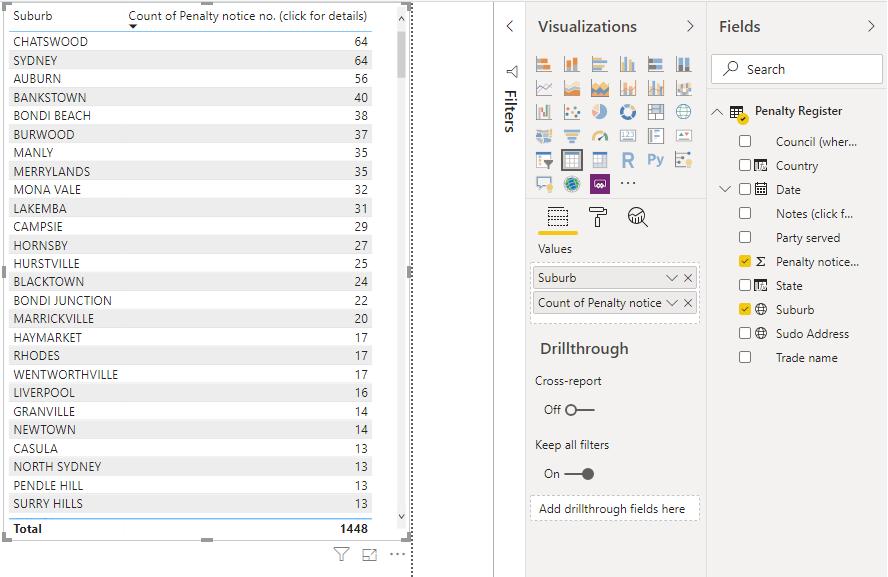
The biggest collection of perpetrators seems to be located in the Chatswood, Sydney and Auburn suburbs. Let’s try using the Maps visualisation in Power BI:
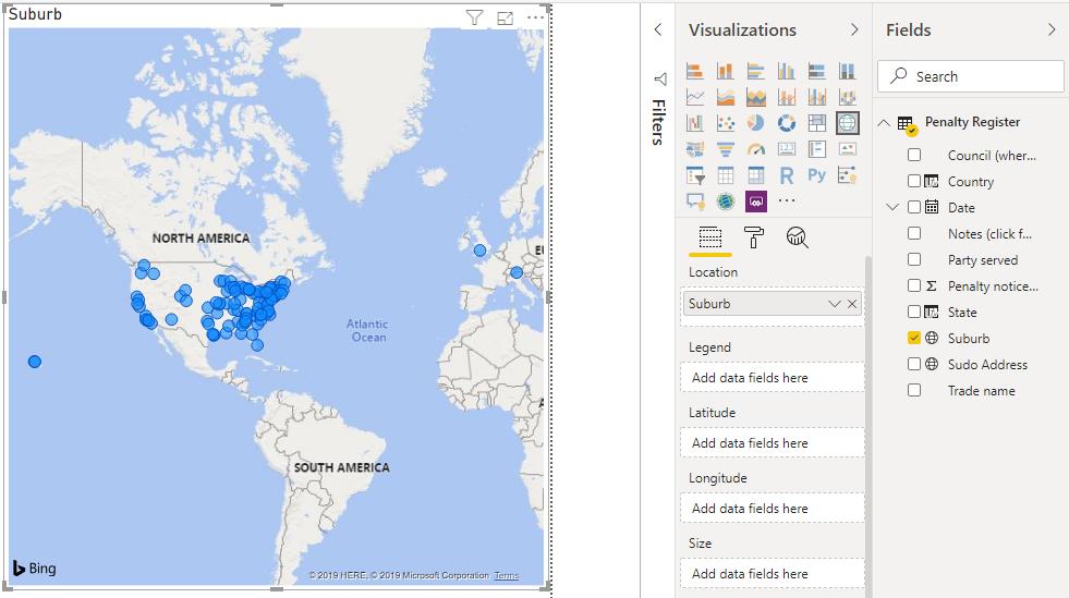
Seems accurate that most of the penalty notices for Sydney Australia appear in the United States! Let’s try and help Power BI by creating some custom columns to direct the addresses to Sydney Australia.
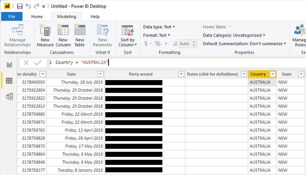
Navigate to the Data view. Here ,we are going to add two columns using DAX:
Country = "AUSTRALIA"
State = "NSW"
We can then create a ‘Pseudo Address’ column if you will, with the following DAX code:
Pseudo Address = 'Penalty Register'[Suburb]&", "&'Penalty Register'[State]&", "&'Penalty Register'[Country]
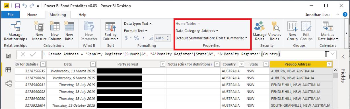
Remember to set this column as an ‘Address’ under Properties in the Modelling tab of the Ribbon. Now, let’s use this column in the Maps visualisation:
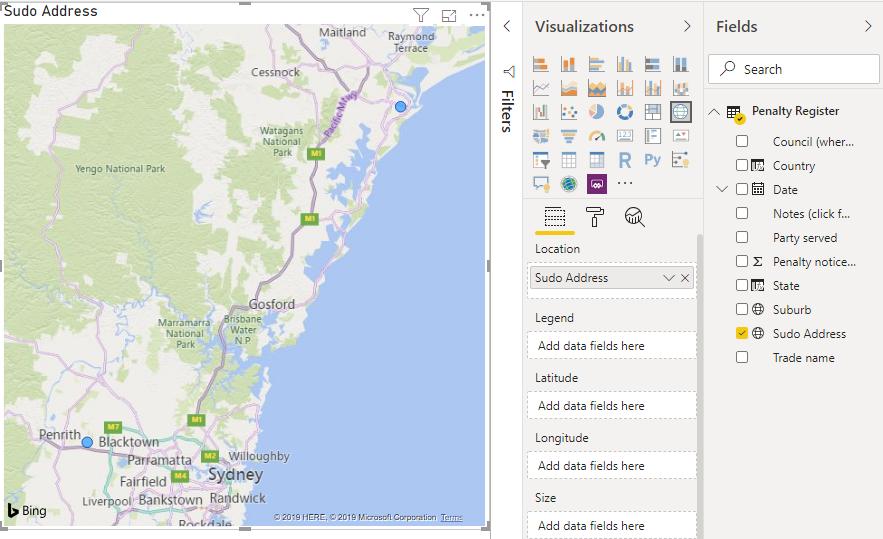
Great success! A grand total of two addresses were correctly plotted on our map. Yay!
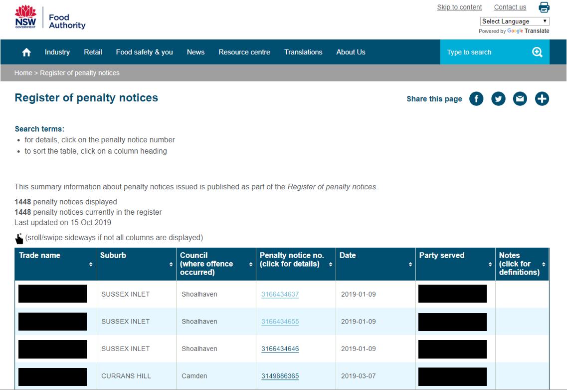
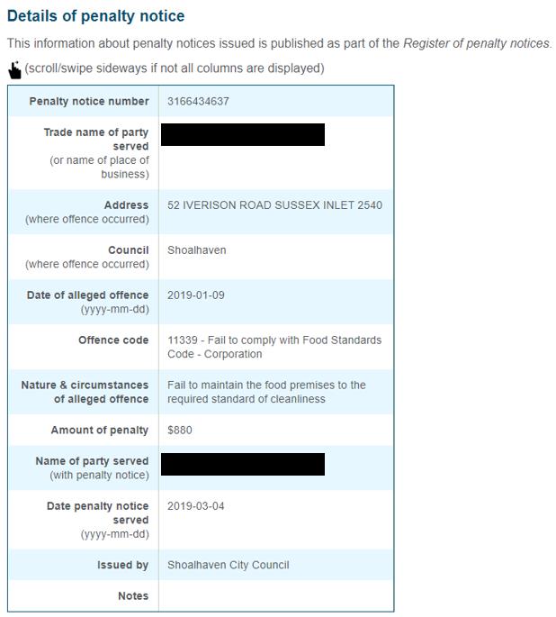
Going back to our data source, there are more details located in the fourth column (Penalty notice no.). However, this requires us to click on a link. The website then takes us to a separate page that contains more useful information that we can definitely use, such as the address:
So how are we going to combine this data with our current dataset in Power BI? More on that next week when we revisit this problem…
That’s it for this week! Check back in seven days for more Power BI Tips. In the meantime, please remember we offer training in Power BI which you can find out more about here. If you wish to catch up on past articles, you can find all of our past Power BI blogs here.