
Power BI Blog: Sankey Chart
12 September 2019
Welcome back to this week’s Power BI blog series. This week, we are going to create a “flow”.
Recently, I was exposed to a factory’s data, where I could see the movement of inventory from its initial state in raw materials, through different manufacturing units, to the final products. Therefore, I thought it’d be cool if I could create a chart showing that dynamic production flow. Then, I found out about the Sankey Chart…
The Sankey Chart is an informative visualisation of interconnected, progressive data, with multiple levels of source and destination entities. The chart allows users to quickly and clearly identify the sources, targets and any steps in between and how things flow across each other. Users are also able to interact with the flow visual to ascertain even more insightful data.
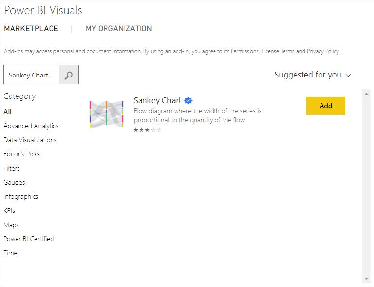
To create one, I first need to import the Sankey Chart to my Power BI Desktop. As usual, I go to ‘From Marketplace’ and search for the ‘Sankey Chart’:
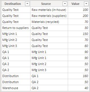
Next, I load my data into Power BI. In my dataset, like the one below, I have simplified data of value movements among factory entities, with incoming nodes displayed in the ‘Source’ column and outgoing nodes displayed in the ‘Destination’ column.
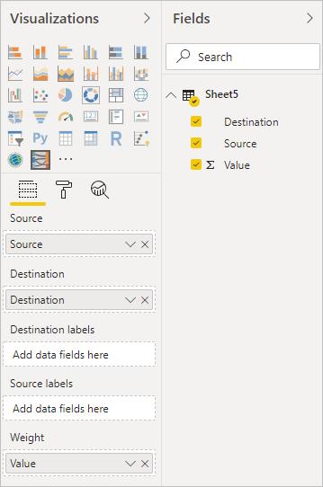
Now, in Report view, I choose Sankey Chart and start to drag fields from tables into their relevant places. As my data is quite clean, the Source and Destination fields are also their entity labels: I do not need to drag any fields into ‘Destination labels’ and ‘Source labels’.
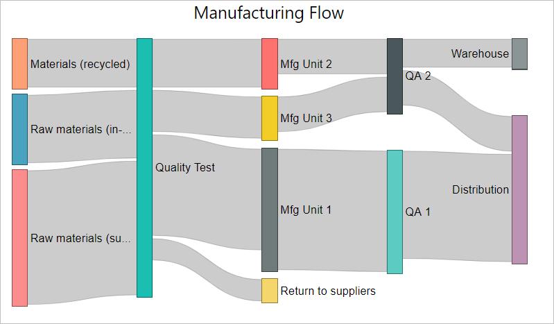
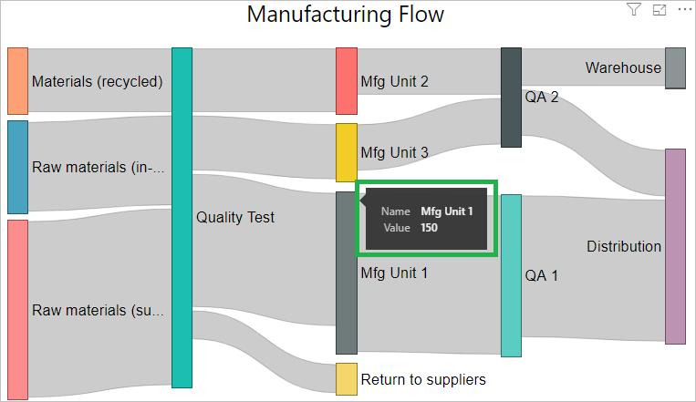
Here is my initial Sankey Chart. Now it can be clearly seen from the chart the flow of productions through various manufacturing units. The height of each node and the width of each ribbon reflects the value and split of the same from one unit to another.
It’s simple, isn’t it? The Sankey Chart also allows users to interact with the visual. Whenever I hover the mouse over any bar (which replicates the unit) there will be a small ‘badge’ displaying its details:
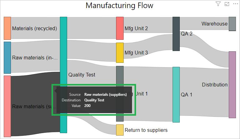
When I point to any ribbon replicating the value, I can see the incoming and outgoing paths related to it:
Have fun going with the flows!
That’s it for this week, check back next week for more on Power BI tips.
In the meantime, please remember we offer training in Power BI which you can find out more about >here. If you wish to catch up on past articles, you can find all of our past Power BI blogs here.