
Power BI Blog: Power KPI
29 August 2019
Welcome back to this week’s Power BI blog series. This week, we are going to look at the Key Performance Indicator (KPI) visual.
Key Performance Indicator (KPI) is a measurable value that demonstrates how effectively an entity is achieving its key objectives. KPI visuals can be a good choice to evaluate current progress and status of a metric against a pre-determined goal. Hence, KPI visuals need a base measure that evaluates to a value, a target measure, and a goal (or threshold).
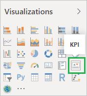
Creating KPI visuals in Power BI is straightforward. KPI measure is a built-in visual in Power BI Desktop and can be found in the Visualizations pane:
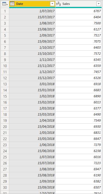
For example, I want to see how much my organisation’s sales this year improved compared to last year. I have sales data by time as shown below:
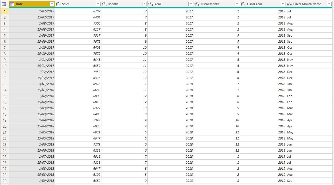
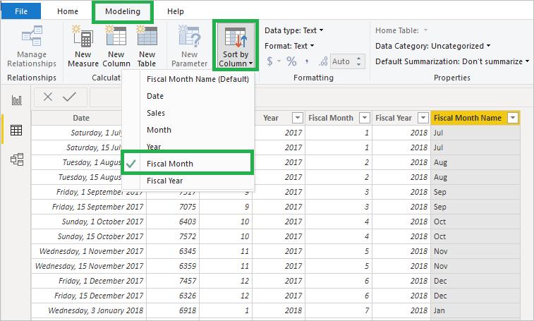
I go to the Power Query Editor to add five more columns into this table: Month, Year, Fiscal Month, Fiscal Year, and Fiscal Month Name. (Note that a fiscal year starts from 1 July to 30 June next year.) I name this table ‘SalesData’.
Coming back to Power BI, to create a KPI visual later, I add three new measures as follows:
Total Sales = SUM(SalesData[Sales])
Total Sales 2019 = CALCULATE([Total Sales],SalesData[Fiscal Year]=2019)
Total Sales 2018 = CALCULATE([Total Sales],SalesData[Fiscal Year]=2018)
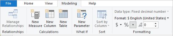
I go to the ‘Modeling’ tab, where I set the formatting for the above measures to Currency:
Since my fiscal month and year are not in the order of calendar year, I go to the Data view and select ‘Fiscal Month Name’ column, then I click on the ‘Modeling’ tab and choose ‘Sort by Column’, sorting it by ‘Fiscal Month’. This will ensure the month of July (as the first fiscal month) comes first in any visuals:
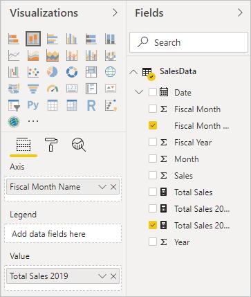
It’s time to create my KPI visual. However, let’s undertake some tricks. I first choose ‘Stacked column chart’ and drag ‘Fiscal Month Name’ field to ‘Axis’ and ‘Total Sales 2019’ to ‘Value’:
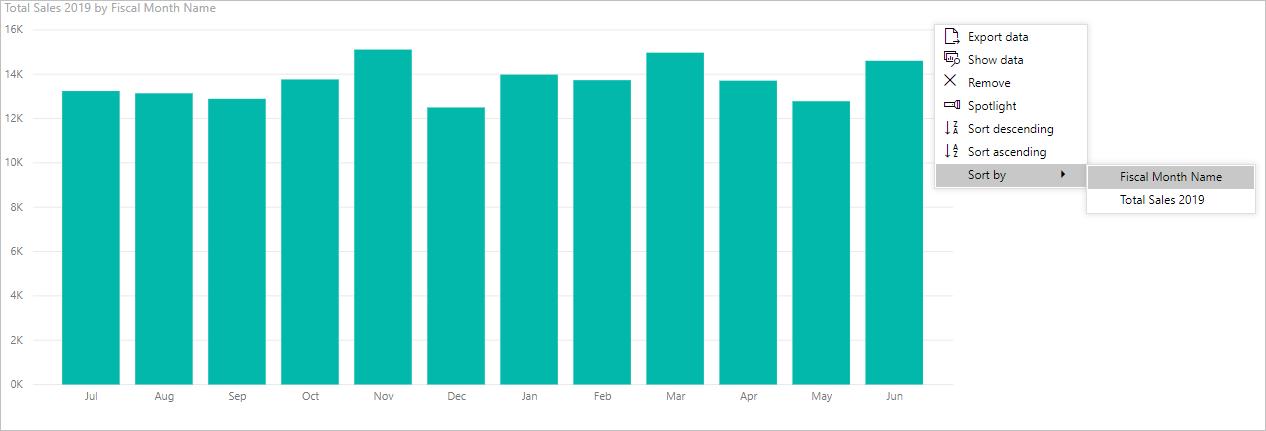
Power BI will give me a chart like the following. The reason why I must create a bar chart in advance is because I need to make sure it is sorted in my desired order. You are not able to change the sort setting in a KPI visual. Here, the chart is sorted by Fiscal Month Name, which is fine.
Then I go to the Visualizations pane and click on the KPI chart icon:
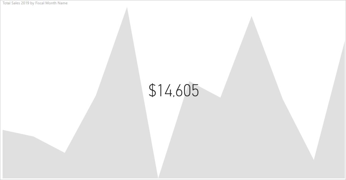
It will return a chart like the one below, which makes little sense:
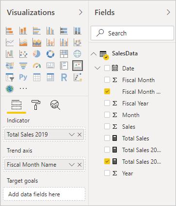
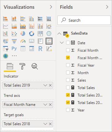
I need to fill all the indicator fields first. Here, I want to compare ‘Total Sales 2019’ (in ‘Indicator’ field) to ‘Total Sales 2018’ (in ‘Target goals’ field) by ‘Fiscal Month Name’ (in ‘Trend axis’). Note that if you just want to see the total number of sales regardless of timeline, just remove the ‘Fiscal Month Name’ from the ‘Trend axis’ field.
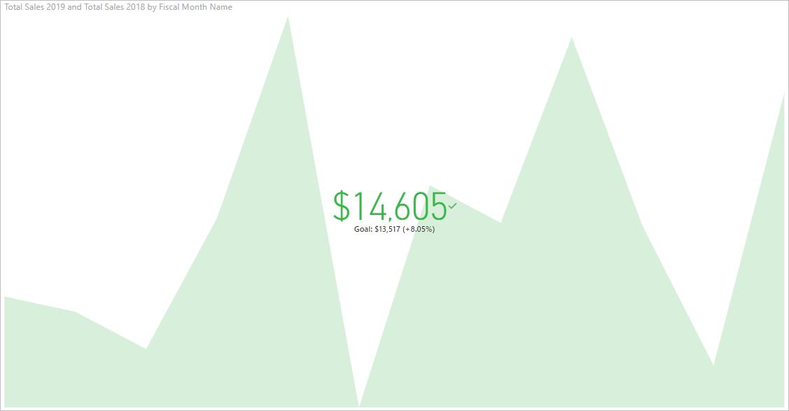
My KPI chart now makes more sense. $14,605 is the Total Sales of the last month in 2019 (the most recent data point), which is 8.05% higher than Total Sales of same time last year ($13,507). The mountain shape at the background is the trend line, which is the comparison of sales between 2018 and 2019 over the fiscal months. The chart is green, together with a check mark, which is an indicator of overall good performance.
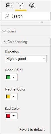
If your organisation uses a different colour scheme, you just need to change to colour indicator in ‘Color coding’ under the ‘Visual Format’ tab:
It’s necessary to understand the trend line if I choose to display it. Here, I notice the trend line drops sharply at the middle of the timeline. To make it clear, I add two bar charts, displaying the sales of 2019 and 2018, viz.
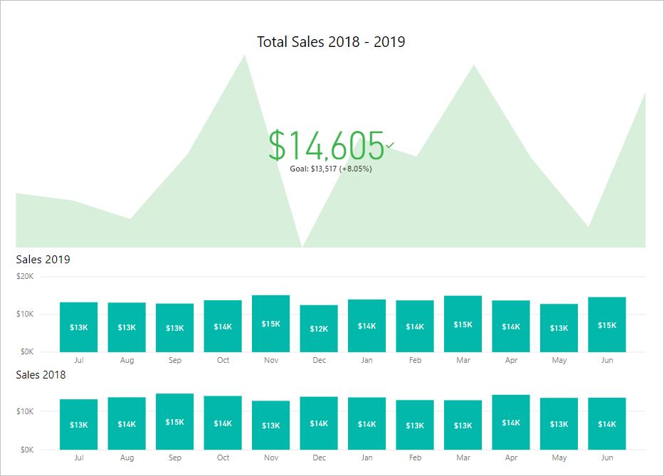
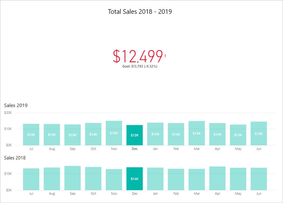
When I click on the ‘Dec’ column in the ‘Sales 2019’ chart, the charts interact with each other and show me that in December 2018 (which is in FY2019), the total sales were $12,499 which is 9.32% lower than that of the previous year. That’s why the trend line drops, as an indicator of bad performance.
That's it for this week, check back next week for more Power BI tips.
In the meantime, please remember we offer training in Power BI which you can find out more about >here. If you wish yo catch up on past articles, you can find all of our past Power BI blogs here.