Power BI Blog: Mekko Chart (cont'd)
18 July 2019
Welcome back to this week’s Power BI blog series. This week, we continue with Mekko Chart.
Last week, I created a Mekko chart with data shown in two dimensions, which allows easy and quick comparison between multiple variables:
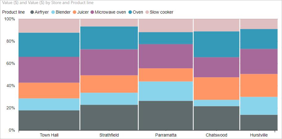
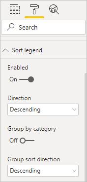
I would like to do some further editing works on this chart. I go to ‘Format’ mode. Here I can sort the data legend by descending order:
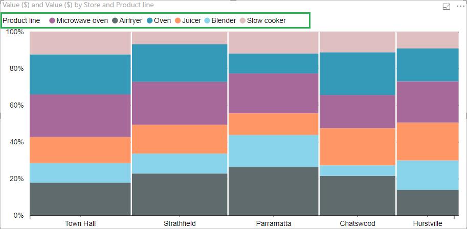
We can see the legend line has been changed:
I want to try sorting the data series by descending order too:
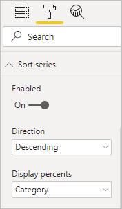
It turns out a little messy so I will remove this sort:

I also want to change the colours of legends to match with my organisation’s colour scheme, by clicking on ‘Data colors’:
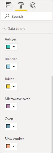
I add the title for the chart as well:

Next, I try putting data labels in place:

However, it turns out that I don’t like many numbers to be displayed on my chart:

Therefore, I remove the data label, and here is the final product of my creation today:

That’s it for this week, check back next week for the next blog in the Power BI series.

