
Power BI Blog: Floor Plan
25 July 2019
Welcome back to this week’s Power BI blog series. This week, we are as far removed from financial modelling as we’ll ever be: we’re going to create a floor plan.
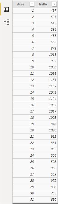
Let’s assume you manage an exhibition centre and you are planning for an upcoming exhibition. You have a floor plan of the centre and you want to see which are the most visited areas so that you can set their hire rates. With the traffic data in hand, you can do it with a standard Bar Chart. However, what if you want to check the spatial correlation between each area or if you want to explain the fact that the areas nearer the entrance are the most visited ones?
Synoptic Panel designed by OKViz is the tool for this kind of analysis and presentation. This is a custom visual for Power BI that allows you to present one or more images (called maps, but not necessarily geographical maps), assigning a meaning to arbitrary parts of them (called areas). Synoptic Panel allows you to highlight and colour these areas dynamically and display several information over them.
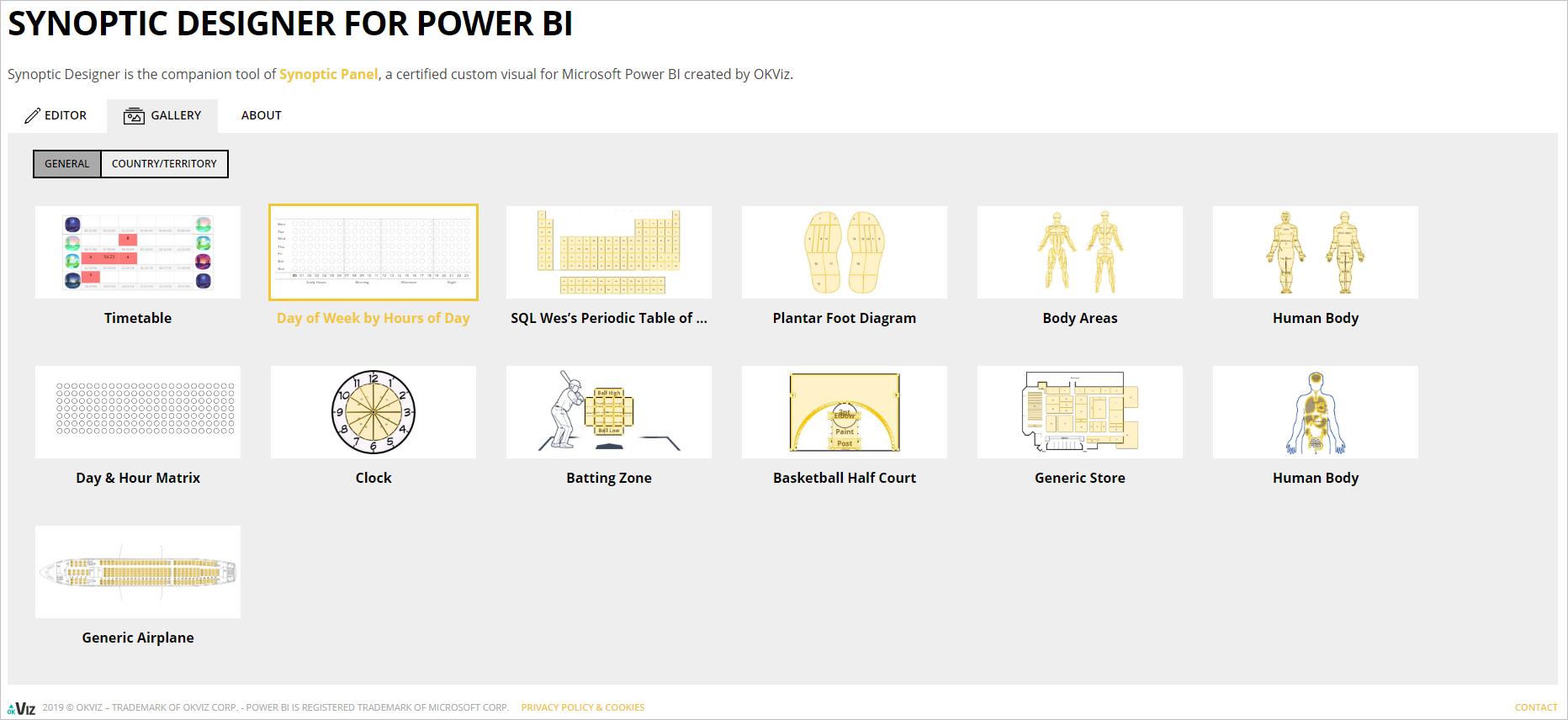
Synoptic Panel accepts and displays SVG files only, but you can transform your PNG, JPG or JPEG files using their Synoptic Designer, or you can choose one from their library:
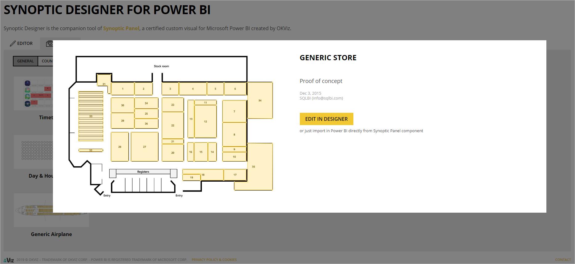
Luckily, I found a ‘Generic Store’ model which suits my need. I want to edit a few points on the graphic so I click on my selection and choose ‘Edit in Designer’:
In here, I am able to add, remove or rename my areas to match my data.
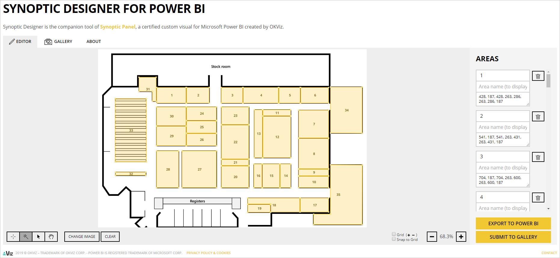
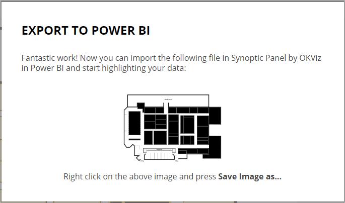
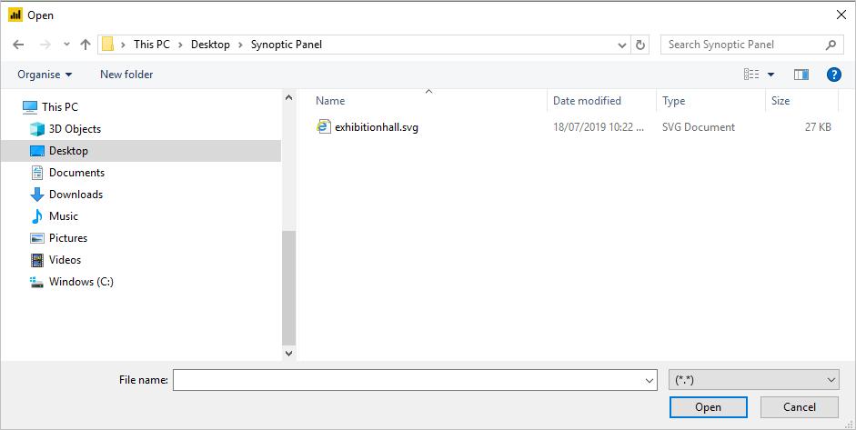
Upon completing my changes, I select ‘Export to Power BI’, in the pop-up dialog. Then, I right-click on my floor plan and choose ‘Save Image as’ in order to give it a name to store in my local directory.
In Power BI, I first load my data which tracks traffic by floor areas. It’s worth noting that the area name in my design should match exactly the area name in my data.
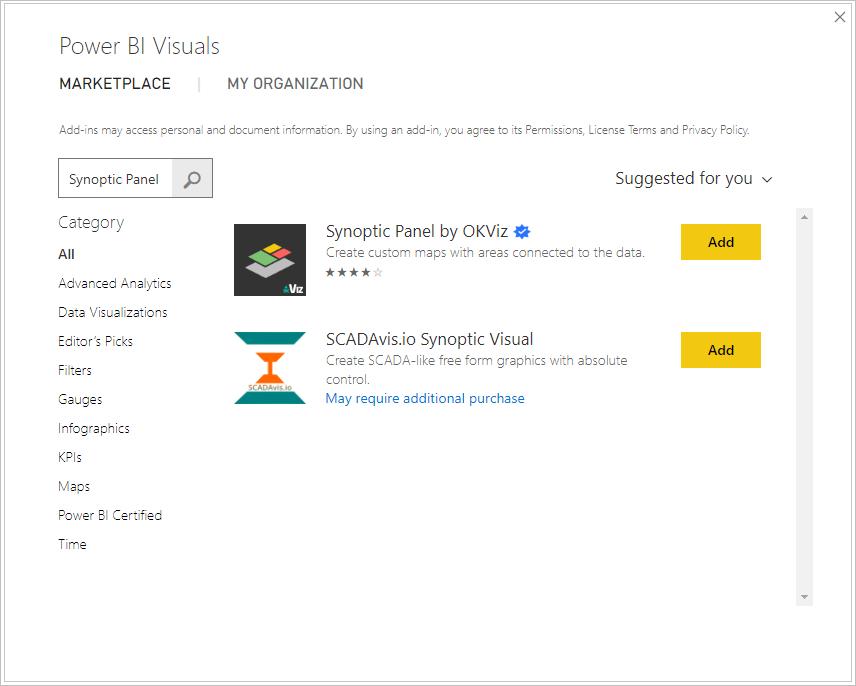
Then, in Power BI, I import ‘Synoptic Panel by OKViz’ from ‘Marketplace’:
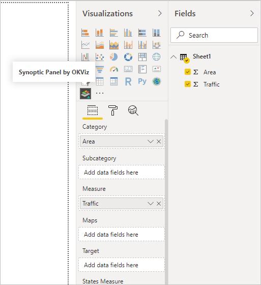
In Report view, I drag ‘Area’ to ‘Category’ field and ‘Traffic’ to ‘Measure’ field:
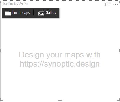
There is one more step I need to do before my visual gets displayed: importing my map. In the visual area, I click ‘Local maps’:
I navigate to the SVG file, which I saved from the design page earlier, and open it in Power BI:
My initial visual would look like this:

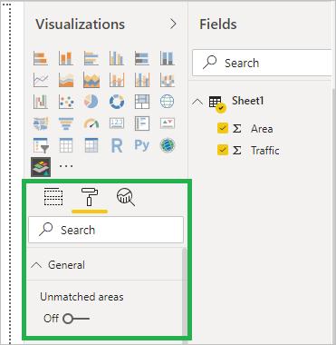
There are common areas with no data of traffic, which are shown black on the floor plan. Hence, I go to Format mode and under ‘General’, I switch ‘Unmatched areas’ to Off.
Now, my visual will look cleaner. However, colour visuals are uniform, from which I am not able to tell the difference in traffic among areas:
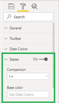
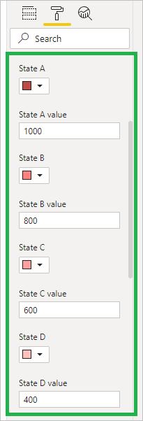
To solve this, I go to Format mode. Under ‘States’ I turn it On, and I put ‘>=’ to ‘Comparison’ box, where I will rank my data into different levels of traffic:
Dragging down, I enter traffic levels and select State’s colour, with the darker the colour, the more crowded the area:
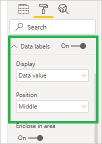
To make it more transparent, I go to ‘Data labels’, turn it On and let it display ‘Data value’ in the ‘Middle’ of each area:
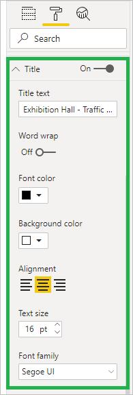
Last but not least, I format the title for my visual under ‘Title’ options:
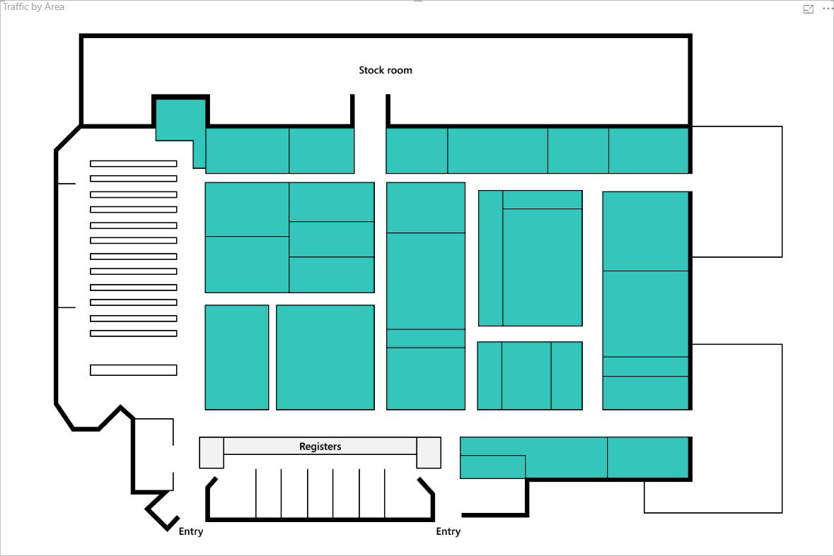
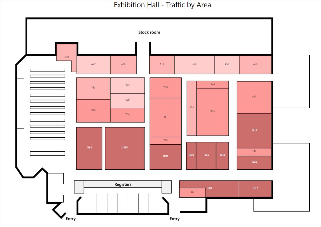
Finally, I have a floor plan ready for a sales pitch!
That’s it for this week, check back next week for more Power BI tips.
In the meantime, please remember we offer training in Power BI which you can find out more about >here. If you wish to catch up on past articles, you can find all of our past Power BI blogs here.