
Power BI Blog: Dynamic Images Based on Slicer Selection
24 October 2019
Welcome back to this week’s Power BI blog series. This week, we are going to expand on last week’s example and include a visualisation that dynamically displays country flags.
We will be using the dataset from last week in conjunction with a new dataset so that we can dynamically display images in our Power BI Report.
To quickly recap, here is what our report looked like last week (read more about last week’s blog here):
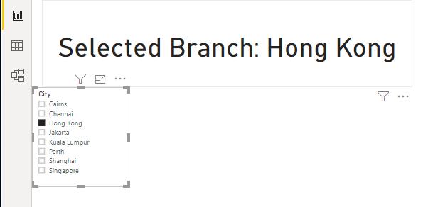
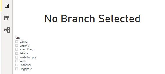
We created a measure that will display the name of the branch that is selected in the filter. Further, the measure will return “No Branch Selected” when no selection was made:
This week, we are going to go a little further with the report and have the country’s flag appear in the top left corner of the report. Not only are we going to have the flag appear, but the flag will change according to the filter selection.
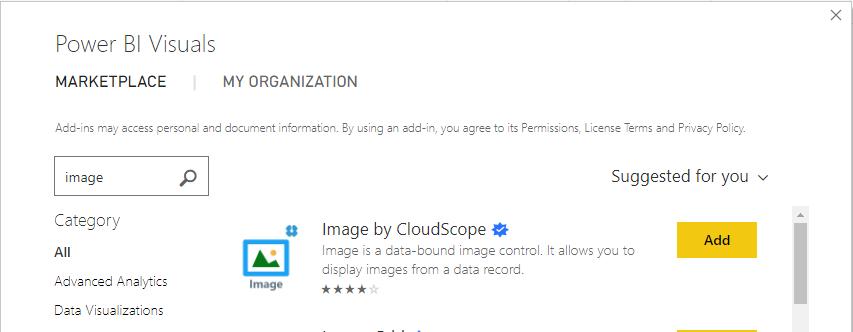
We will have to use the “Image by CloudScope” Custom Visual from the Microsoft Market place. The Microsoft Market Place is a collection of additional visualisations that you can download for free from Microsoft within the Power BI program.
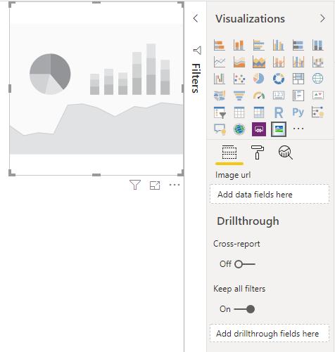
After adding the Custom Visual to our Visualizations pane, the next step is to create the visualisation:
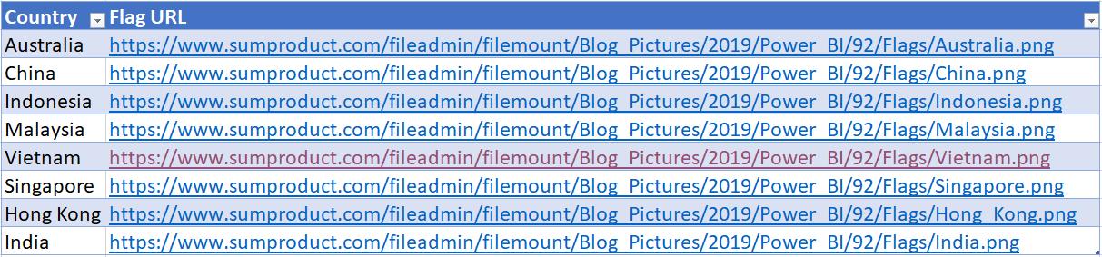
As we can see this visualisation requires image URLs. As such, we have compiled a small collection of country flags and hosted them on our website for this blog. We have then collated the URLs into a simple table called Country_URL:
Alternatively, you can use any image URLs found from Google, just keep in mind copyright laws!
Import the table above into our Power BI report, and add the Flag URL column into the Image visualisation:
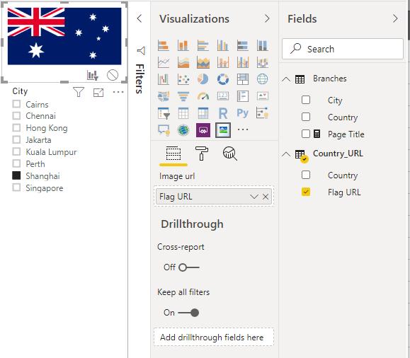
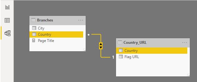
The visualisation is now displaying the Australian flag, which is a step in the right direction, however it is not responding to the filter currently set to ‘Shanghai’, which is in China. This is because we have to set the relationships between the tables. Navigate to the Model view in Power BI and create a relationship between the Branches and Country_URL tables with the Country column as the common key:
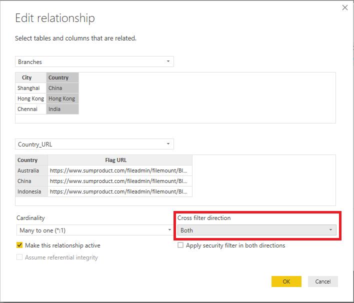
Ensure to select the ‘Both’ option under the ‘Cross filter direction’ option:
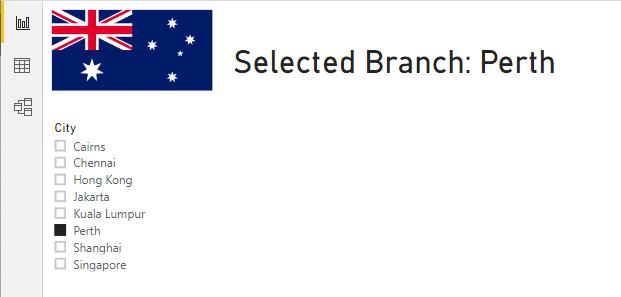
After some layout tweaks to our report, it should look and work like this:
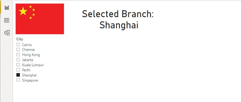
We can change the filter selection and have the flags change to the corresponding country:
There we have it: how to create a user-friendly and dynamic page titles and images using measures and filters.
That’s it for this week! Check back in seven days for more Power BI Tips.
In the meantime, please remember we offer training in Power BI which you can find out more about here. If you wish to catch up on past articles, you can find all of our past Power BI blogs here.