
Power BI Blog: Dual Axis Line Chart
2 July 2020
Welcome back to this week’s edition of the Power BI blog series. This week, we look at some new features for the line visualisation in Power BI.
In the past, we had to use custom visualisations to plot two datasets into one visualisation. Now after a recent update, Power BI now has the ability to plot two fields on one visualisation.
For this example, we will be looking at the following dataset:
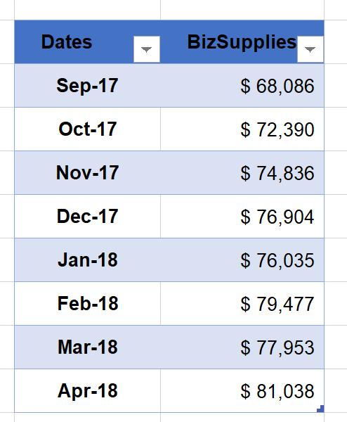
Bringing the data into Power BI, we have created two measures a ‘Total Revenue’ measure and a ‘% Change’ measure. ‘% Change’ measures the percentage difference from the previous period and the ‘Total Revenue’ measure sums the total revenue.
We can plot the two measures on the one line visualisation, viz.
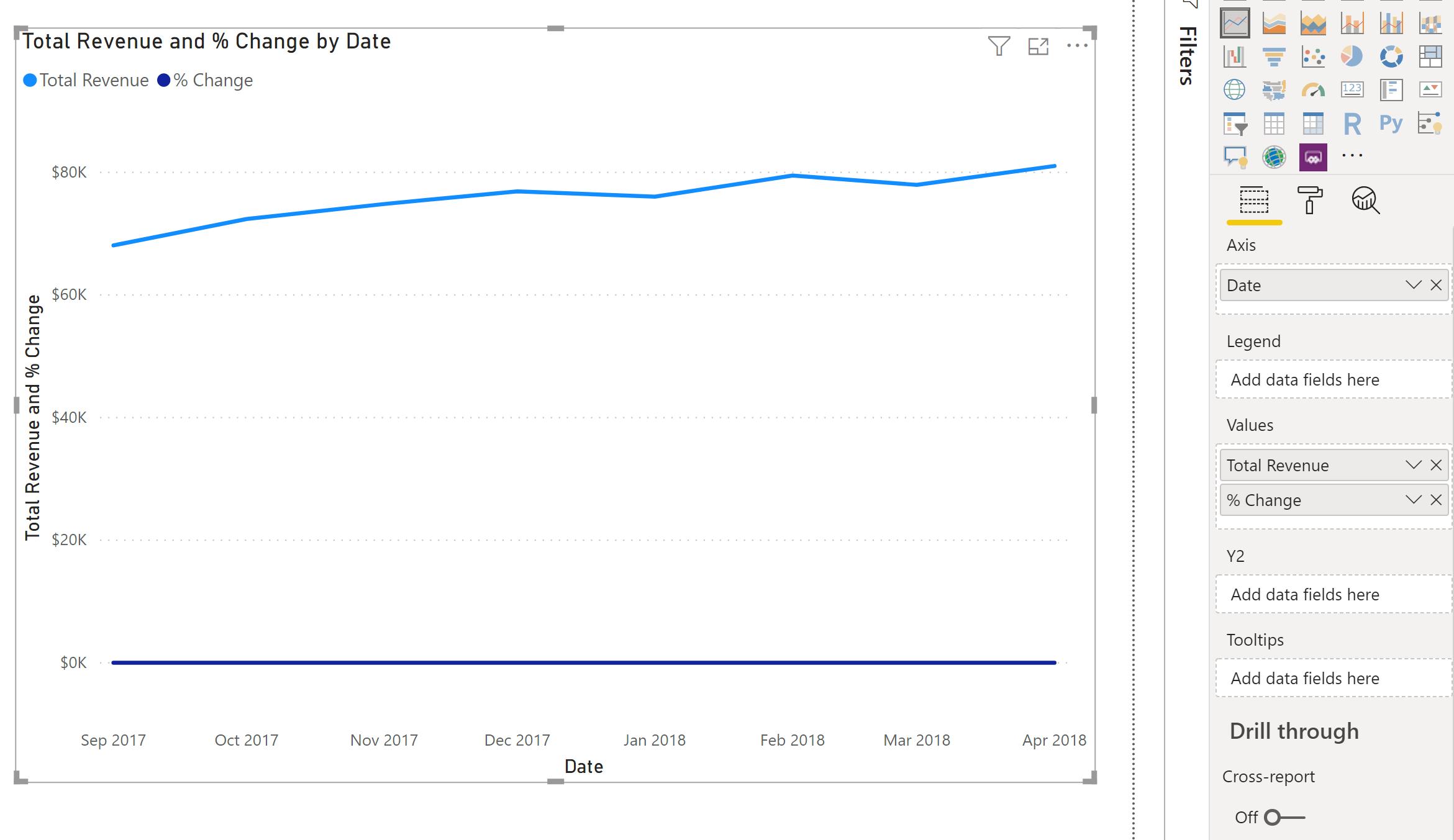
The ‘% Change’ measure looks more like an x-axis. Notice that the visualisation has a Y2 area now. The Y2 area is the secondary y-axis. This is especially useful if we want to present a raw number figure with a percentage figure.
After moving the ‘% Change’ measure to the Y2 area, the visualisation now looks like this:
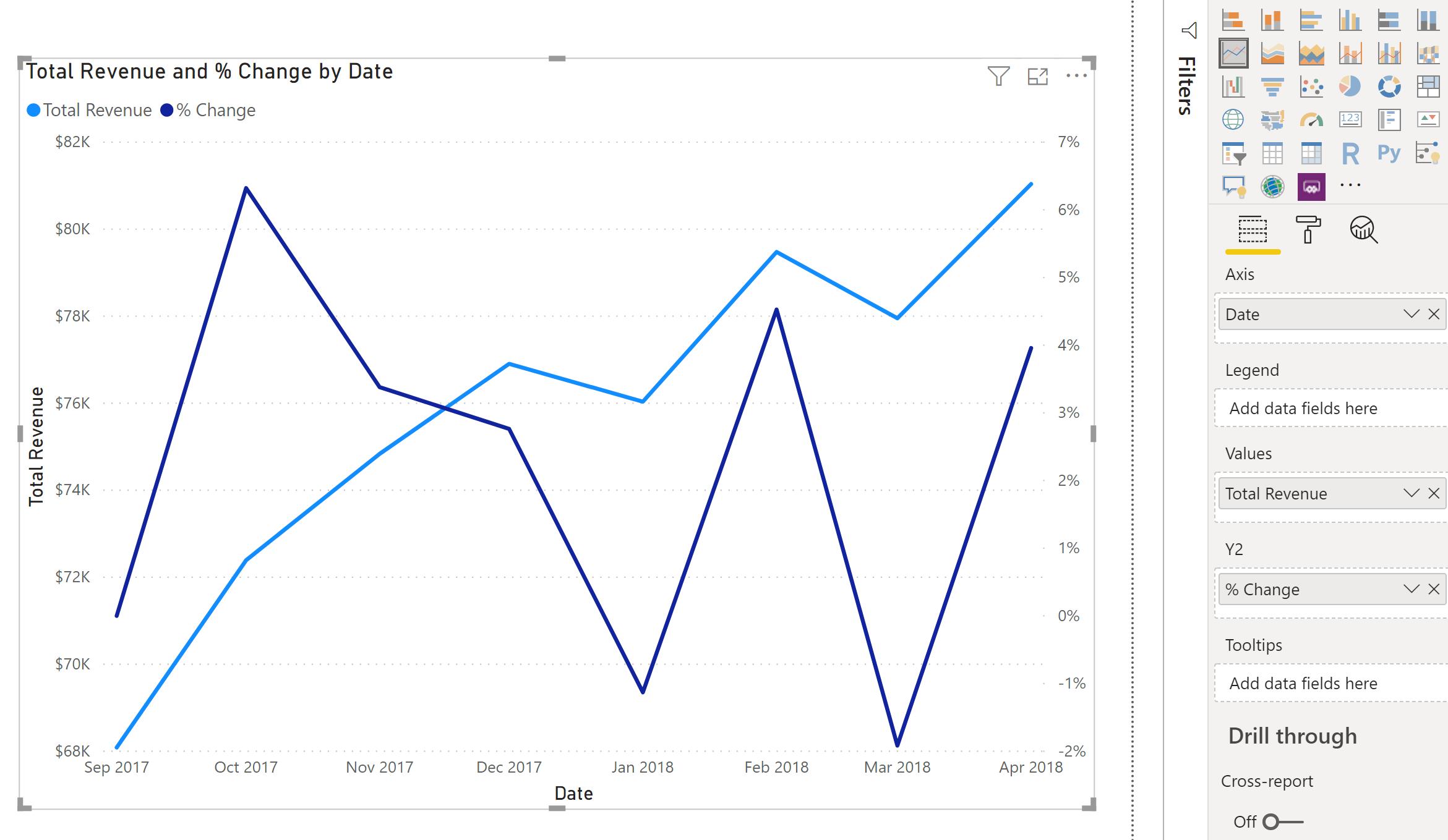
It’s an improvement, since we can actually see the movements in percentage change. However, to the untrained eye, it still looks a little misleading. Let’s see if we can make a few more tweaks to make it better:
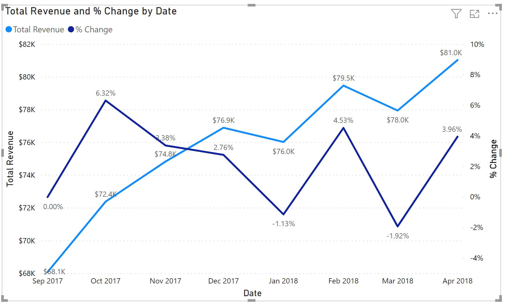
After adding axis headings to both axes, inserting data labels and adjusting the range of percentages on the Y2 axis, I think it looks more legible. So there you have it: how to use the dual axis line visualisation in Power BI.
That’s it for this week, come back next week for more on Power BI.
In the meantime, please remember we offer training in Power BI which you can find out more about here. If you wish to catch up on past articles, you can find all of our past Power BI blogs here.