
Power BI Blog: Colour Formatting Tips – Conditional Formatting for Column Charts
26 September 2019
Welcome back to this week’s Power BI blog series. This week, we will look at conditional formatting for column chart.
The first blog of this ‘Colour Formatting Tips’ series covers general data colour formatting. To continue, I’ll go deeper into conditional formatting for column charts.
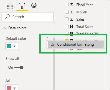
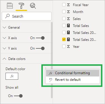
What if I have some sets of rules to present my data? I drag my mouse to the three-dotted icon on the right of the ‘Default color’ menu and select ‘Conditional formatting’:
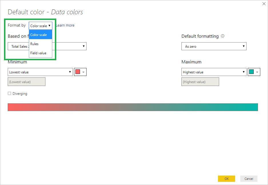
As soon as I select ‘Conditional formatting’, a set-up dialog will pop up. The ‘Format by’ drop-down menu has three options to choose from. By default, it will enter the ‘Color scale’ setting as follows:
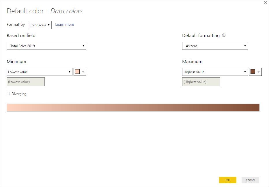
I can set the colour scale based on my predetermined colour scheme, from minimum to maximum values (or specified numbers):
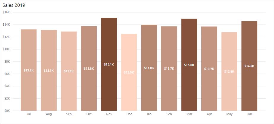
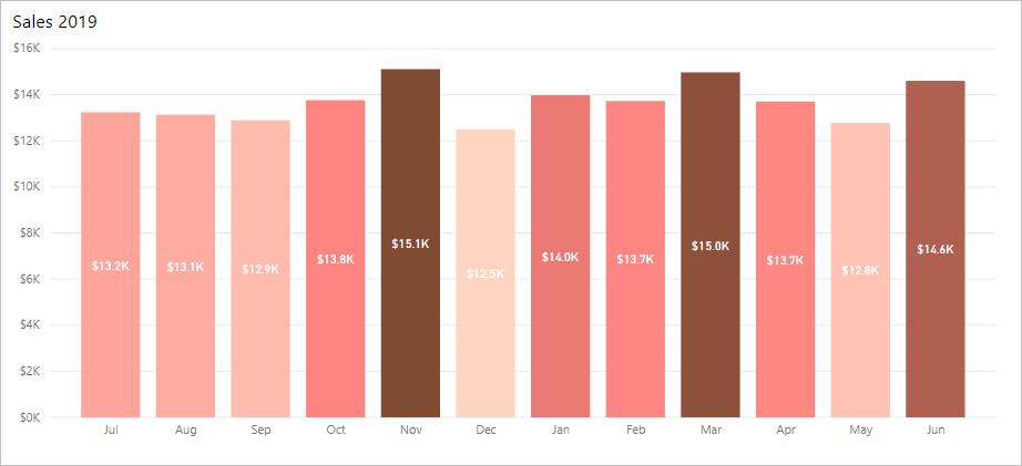
My chart will show different colours for different data points: the darker the colour, the higher the sales.
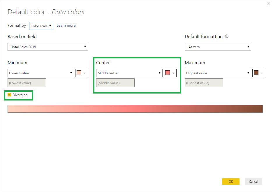
In the ‘Data colors’ setting, if I tick the ‘Diverging box’, I can see the Center setting appears where I can set a colour for data in middle range:
Here is the chart after all the settings:
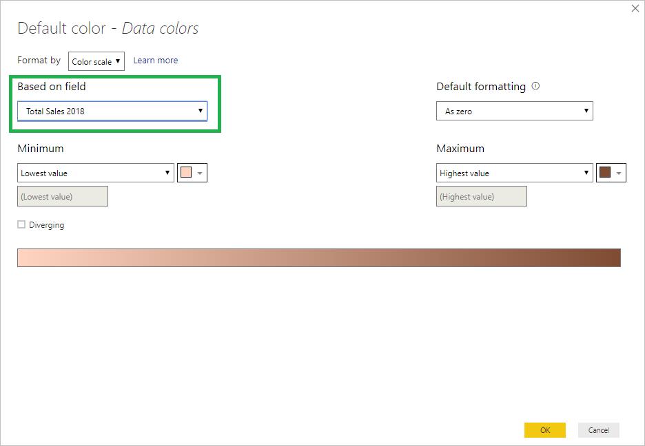
Colour scale can also be applied using a different field. Here I am looking at Total Sales 2019, and I also want to see how it is in comparison to Total Sales 2018 in each fiscal month. To do that, under ‘Based on field’, I choose ‘Total Sales 2018’. I still keep the colour scale with minimum and maximum values:
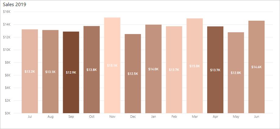
Then, I obtain a chart for total month sales in 2019, highlighted by the highs and lows of 2018. To be specific, September and April 2018 are the months with highest sales, while the trend changes in 2019:
Furthermore, I can format data colours by rules, just like the conditional formatting in Excel:
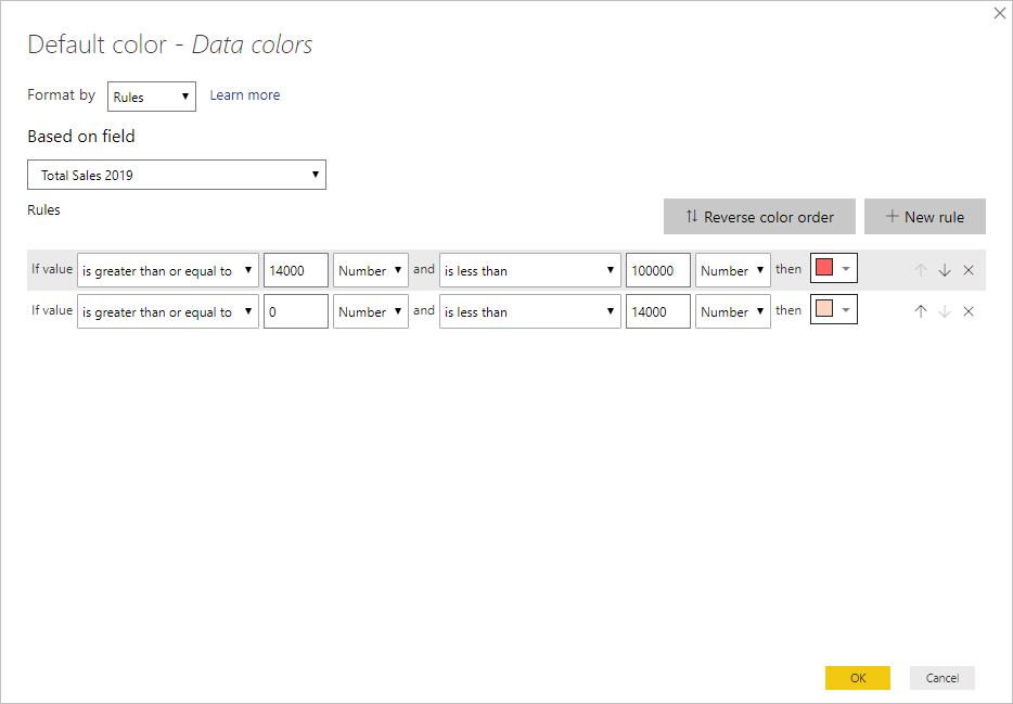
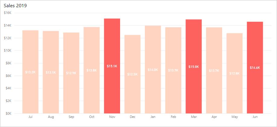
My chart with columns of sales in my highest range is painted red:
Once again, there is always a way turning back. I go to the ‘Chart Format’ tab, under ‘Data colors’, I click the three-dotted icon and I can see an additional option, ‘Revert to default’:
We’ll look at the third topic next week…
In the meantime, please remember we offer training in Power BI which you can find out more about >here. If you wish to catch up on past articles, you can find all of our past Power BI blogs here.