
Power BI Blog: More on the Decomposition Tree Visualisation
1 April 2021
Welcome back to this week’s edition of the Power BI blog series. This week, we look some more at the Decomposition Tree visualisation.
Last week we created a simple decomposition tree that looked like this:
This week, we are going to expand on it.
Adding Dimensions
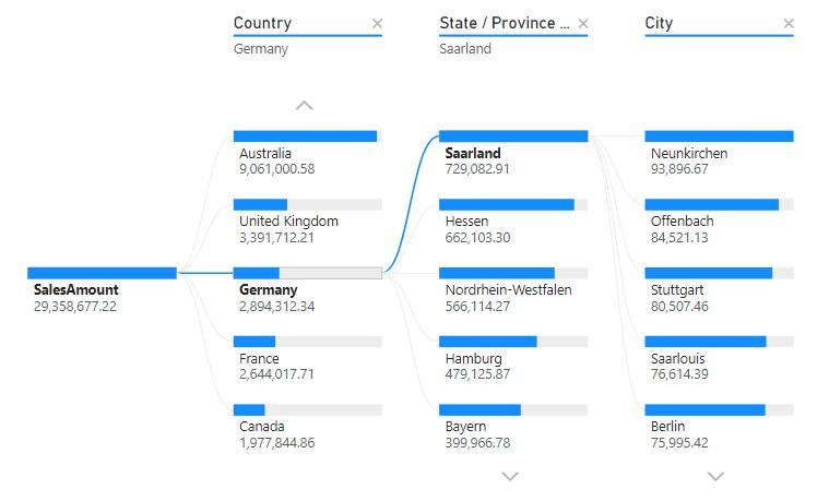
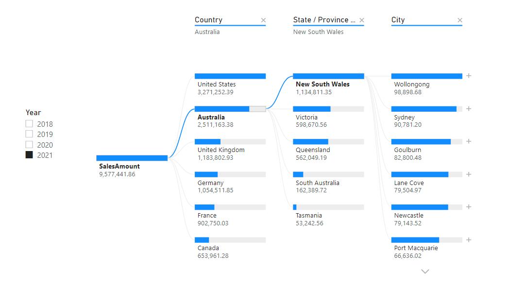
We can add another dimension of analysis to this data, by adding a Year slicer to the report page.
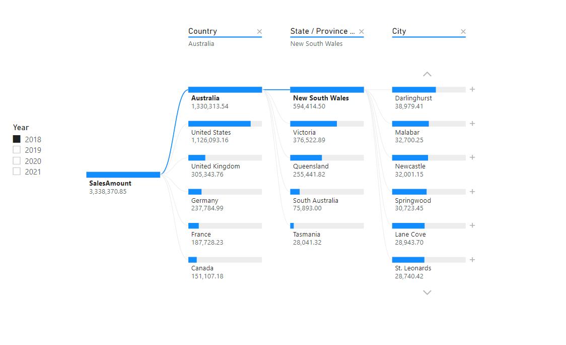
As we toggle through the years, notice that the order of Countries displayed in that column may be reordered:
Locking Fields
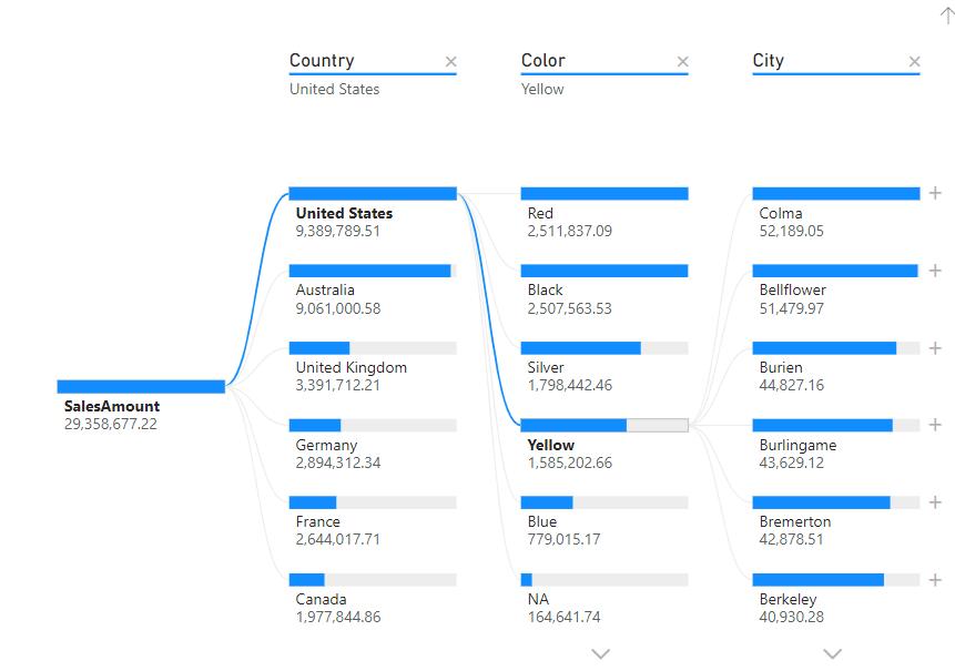
If we publish the report as it is, users will be able to delete the field breakdown and select their own order of fields instead:
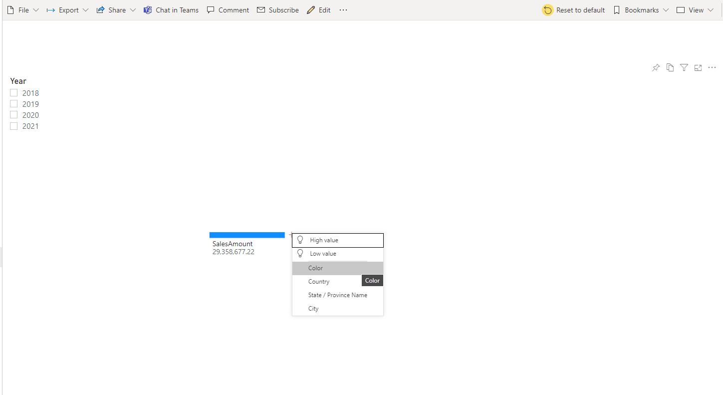
Further, they will be able to select the order of fields to breakdown:
As the publisher, we can lock these fields down if we want. This is done by first hovering on the field in the Report view, and then click on the ‘Lock level’ icon.
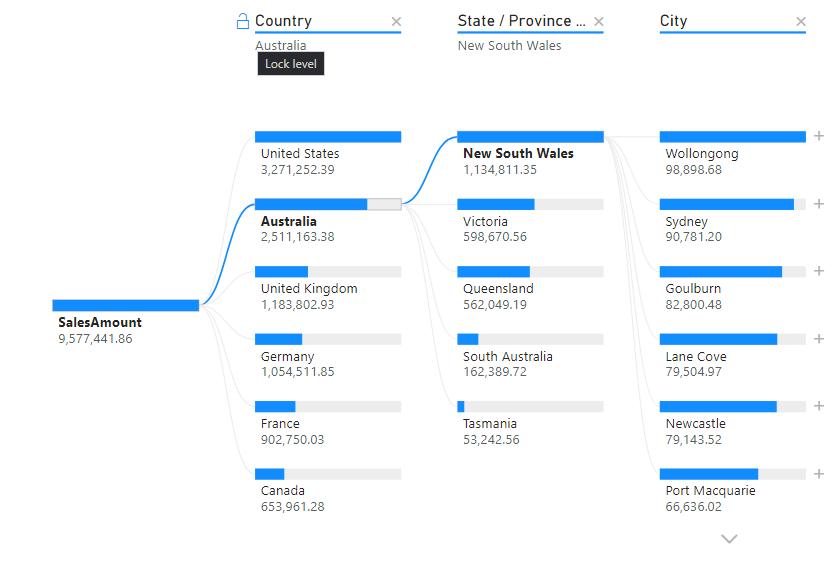
For example, if we lock the Country and State / Province Name field, the end user will be unable to delete these two fields in their analysis:
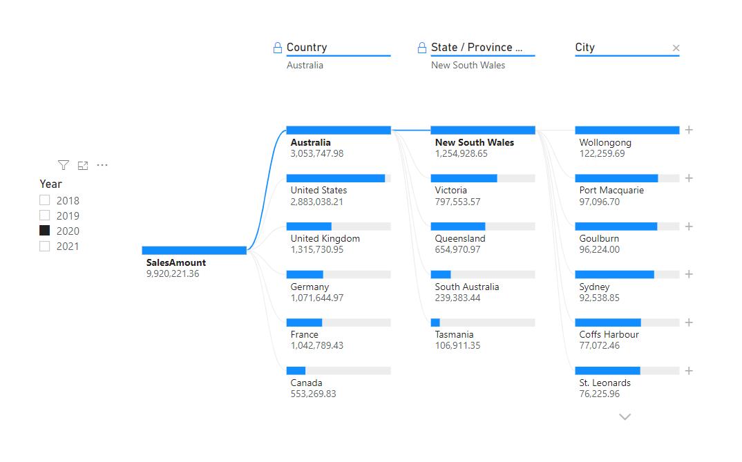
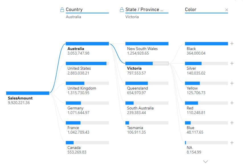
They may only remove the City field and change it to Color:
That’s it for this week! Highlighting two more things to consider when using the Decomposition Tree. Join us next week for more on Power BI.
In the meantime, please remember we offer training in Power BI which you can find out more about here. If you wish to catch up on past articles, you can find all of our past Power BI blogs here.