
Power BI Blog: Introducing the Decomposition Tree Visualisation
25 March 2021
Welcome back to this week’s edition of the Power BI blog series. This week, we look at the Decomposition Tree visualisation.
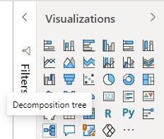
This week, we are going to take a break from changing colours in column charts. Instead, we are going to look at how to use the Decomposition Tree visualisation in Power BI. The Decomposition Tree is a relatively new visualisation to Power BI (especially if I had written this one year ago). We can find it in the Visualizations area:
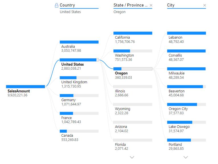
This visualisation gives us a new way to break our data down. The best way to describe it is in its name: it’s a decomposition tree. This graphic can analyse a numerical field, based upon different categories. An example of a decomposition tree might look like the following:
We shall cover the basics of this visualisation in this blog.
To create the visualisation, first select on the ‘Decomposition Tree’ icon from the Visualizations area:
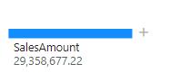
With the visualisation created, I can drag the SalesAmount field into the Analyze area:
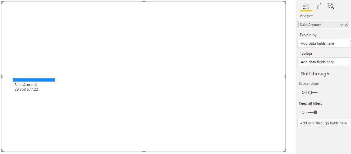
It currently does not look like much. This is because we have to add fields to the ‘Explain by’ area, for Power BI to know how we want the data to be broken down. For this example, we are going to use the Country Hierarchy field (something I created earlier):
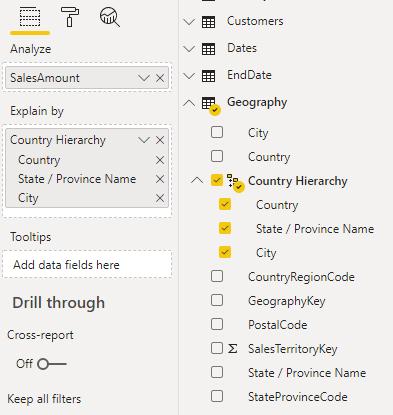
We can also insert individual fields in the intended order for decomposition. But for this example we are going to stick with a hierachy. Looking back at the visualisation, we can now see that there is a plus sign (+) next to the SalesAmount figure:
Clicking on this will expand the SalesAmount by the fields in the hierarchy:
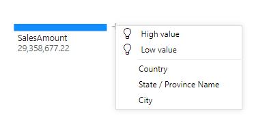
If we select Country the visualisation will update to breakdown the SalesAmount by country:
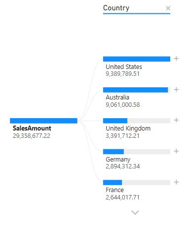
If we look closely, we can drill further down into each country by clicking on the plus sign (+) next to any country.
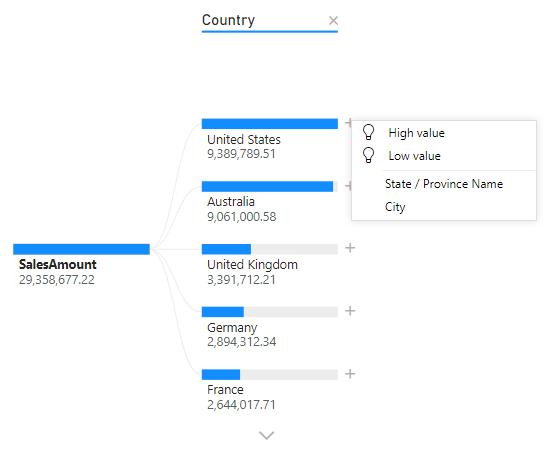
We can also use the down arrow at the bottom of the visualisation to display countries that currently can’t be displayed on the visualisation.
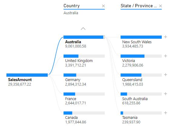
Going back to our example, if we can expand Australia’s sales to reveal the breakdown by Stat / Province Name:
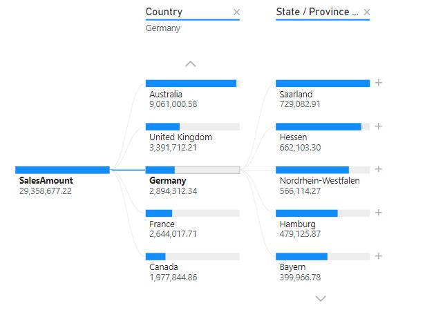
If we wish to see the breakdown for Germany, it would involve clicking on the blue bar above Germany:
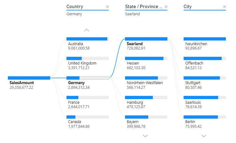
Finally, we can drill fruther down into the cities in Germany:
That’s it for this week! A new cool way to display the breakdown of data in your dataset. Join us next week for more on Power BI.
In the meantime, please remember we offer training in Power BI which you can find out more about here. If you wish to catch up on past articles, you can find all of our past Power BI blogs here.