
Power BI Blog: Power BI Blog: Customising a Threshold Column Chart
4 July 2024
Welcome back to this week’s edition of the Power BI blog series. Last week, we looked at how to create a threshold column chart to highlight columns that rise above a set threshold. This week, we demonstrate some interesting ways you can customise this type of chart.
Adding Conditional Formatting
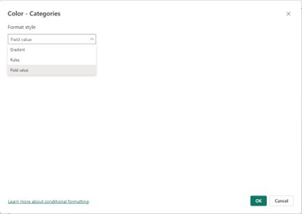
We are going to start by changing the formatting, so instead of just the value above the average being coloured differently we have the whole column coloured differently based upon whether the total sales are above the average.
We are going to need to create another measure called Bar Colours, which will output a colour based on whether Total Sales is larger than Average Sales.
Bar Colours = IF([Total Sales] >= [Average Sales],"#3B7D2390" ,"#67AE7E")
A quick note here, those strings of letters represent colours in HEX format. To specify colours in Power BI you can use HEX formatting, RGB or even just words such as “Red” or “Green”.
In this case, #3B7D2390 and #67AE7E are the two shades of green seen above. Once this measure is set up, we can go into Visualizations -> Format Visual -> Columns and click on the Conditional formatting (fx) button, which will allow us to format the visual using a function.
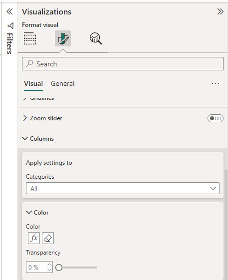
We have a few options from here under ‘Format style’ section. We will choose ‘Field value’, which sets a colour based upon the output of a measure. This will just be similar to the Bar Colours measure we created earlier. The other ‘Format style’ options are Gradient and Rules. Gradient adjusts the colour on a gradient based upon the value of a field. Rules allows you to set the colour with multiple rules dictated by the output of a measure.
Threshold Bar Chart
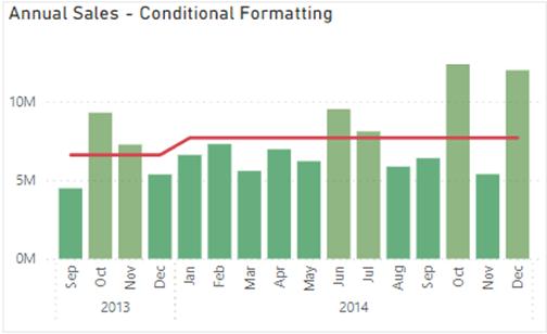
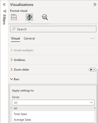
What if we wanted to have a threshold line on a Bar chart? This seems like it should be simple, as it is just a Column chart rotated 90 degrees but there actually isn’t an option for aLine and Stacked Bar chart. As a result, we will have to get creative and come up with something ourselves. Therefore, we are going to start by creating a Clustered Bar chart, with the y-axis using the Year and Month fields while the x-axis will be Total Sales and Average Sales.
Once this is set up go to Visualizations -> Format Visual -> Bars -> Apply settings to and change Series from All to ‘Average Sales’. Now, we will turn the transparency all the way up to 100%.
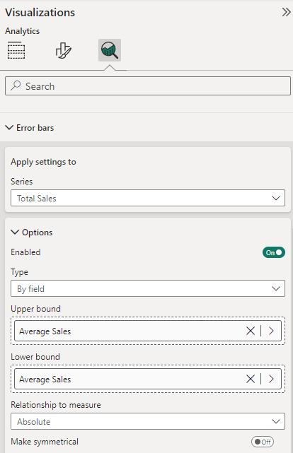
Finally, we will go to Visualizations -> Analytics -> Error bars. This time ‘Apply settings to’ the Total Sales measure. Under Options -> Type, select ‘By field’ and choose Average Sales for both ‘Upper bound’ and ‘Lower bound’. Make sure that Enabled is switched on.
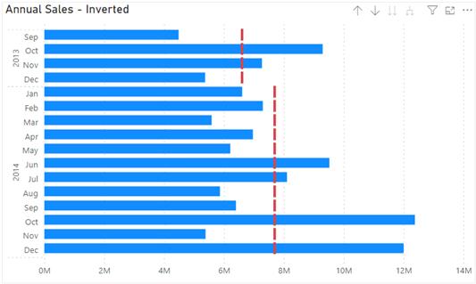
This should leave us with a similar chart but rotated, using error bars instead of the threshold line we’ve been using previously.
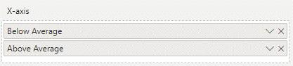
But what if we want to go back to having the colours highlighting parts of the bars that are above the line? We’re going to keep the same chart but switch out the x-axis measures for the Below Average and Above Average measures again.
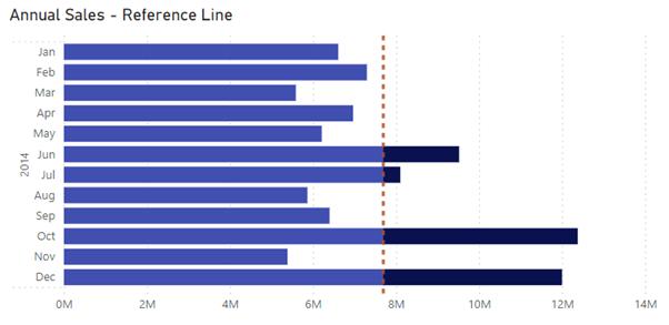
Now we’re going to go into Analytics -> Constant line and add a line. We can configure this line by clicking on the Conditional formatting button (fx) and basing the field on the Average Sales measure.
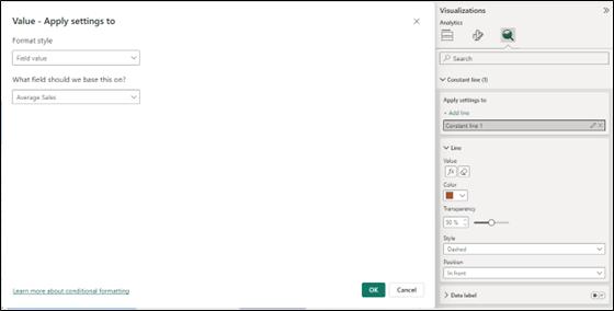
That will get us our original threshold chart, rotated on its side with the values above the average highlighted. We can colour and style this line however we want with the Color and Style selections. It’s important to note here that this line isn’t calculated annually like previously. Instead, it just takes the average of the whole selection. This means that we need to select a specific year (such as 2014 below) for it to accurately reflect the average.
In the meantime, please remember we offer training in Power BI which you can find out more about here. If you wish to catch up on past articles, you can find all of our past Power BI blogs here.