
Power BI Blog: Multiple Tooltips in one Visual
21 September 2023
Welcome back to this week’s edition of the Power BI blog series. This week, we explain how to have multiple tooltips in one visualisation.
Tooltips are speech bubbles (screen tips) that appear when users hover over an element (with the mouse, rather than physically!). In Power BI, the default tooltips are small text bubbles displaying the focused value in a visual. Taking that one step further, we can also design auxiliary visuals to use as tooltips. The following Matrix contains sales and profit data across different countries. We designed a Pie chart breaking down profits by different segments and used that as a tooltip:
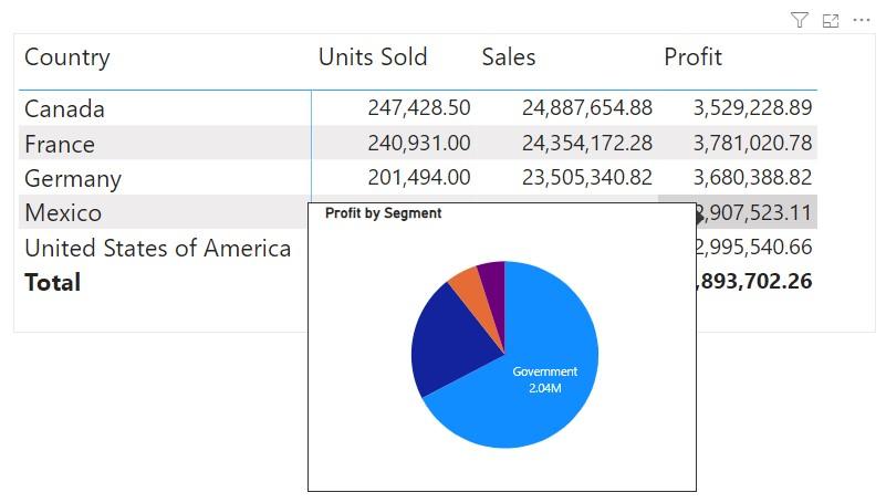
However, what’s not so flexible about Power BI tooltips is that we can only use one [1] auxiliary visual as tooltip for the main visual. Even when we hover over Sales or Units Sold, the same ToolTip visual will pop-up: the Profit by Segment Pie chart for the focused country. What if, we also want a breakdown of Sales when hovering over Sales, without creating another Matrix? What if we want yet another different visual for Units Sold?
Well, that’s the subject of this article. We will show you how to include different tooltip visuals for different columns in one [1] main visual. Throughout this article, we will be using the Financials sample dataset in Power BI Desktop, and you can download our demonstration file with this link.
Custom Tooltip
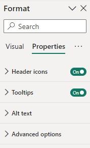
Before describing how to use multiple visuals as tooltips, let’s briefly walk through how to include one [1] visual as a custom tooltip. Here consider the same Matrix with Units Sold, Sales and Profit across different countries. First, we turn on the 'Tooltips' option for this visual at Format pane -> Properties -> Tooltips:
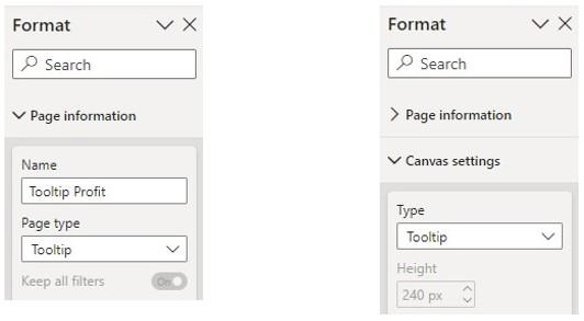
In a separate page named as Tooltip Profit, we create the auxiliary Pie chart of total profit against segments. Then, we click out of the Pie chart visual to format the page, and in Format pane -> Page information we change Page type to Tooltip. Also, in Format pane -> Canvas settings -> Type we select Tooltip.
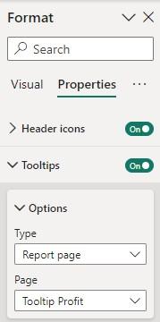
Now we can go back to the main matrix and click on the visual to specify the Pie chart as a custom tooltip, by selecting Format pane -> Properties -> Tooltips -> Options, changing Type from Default to Report Page, and selecting the page Tooltip Profit.
This way, we have the Pie chart on page Tooltip Profit as a custom tooltip, as shown at the beginning.
Multiple Tooltips
Now, suppose we want to show a breakdown of Sales by Discount Band, and a breakdown of Units Sold by Product, when hovering over Sales and Product, respectively. How can we achieve that?
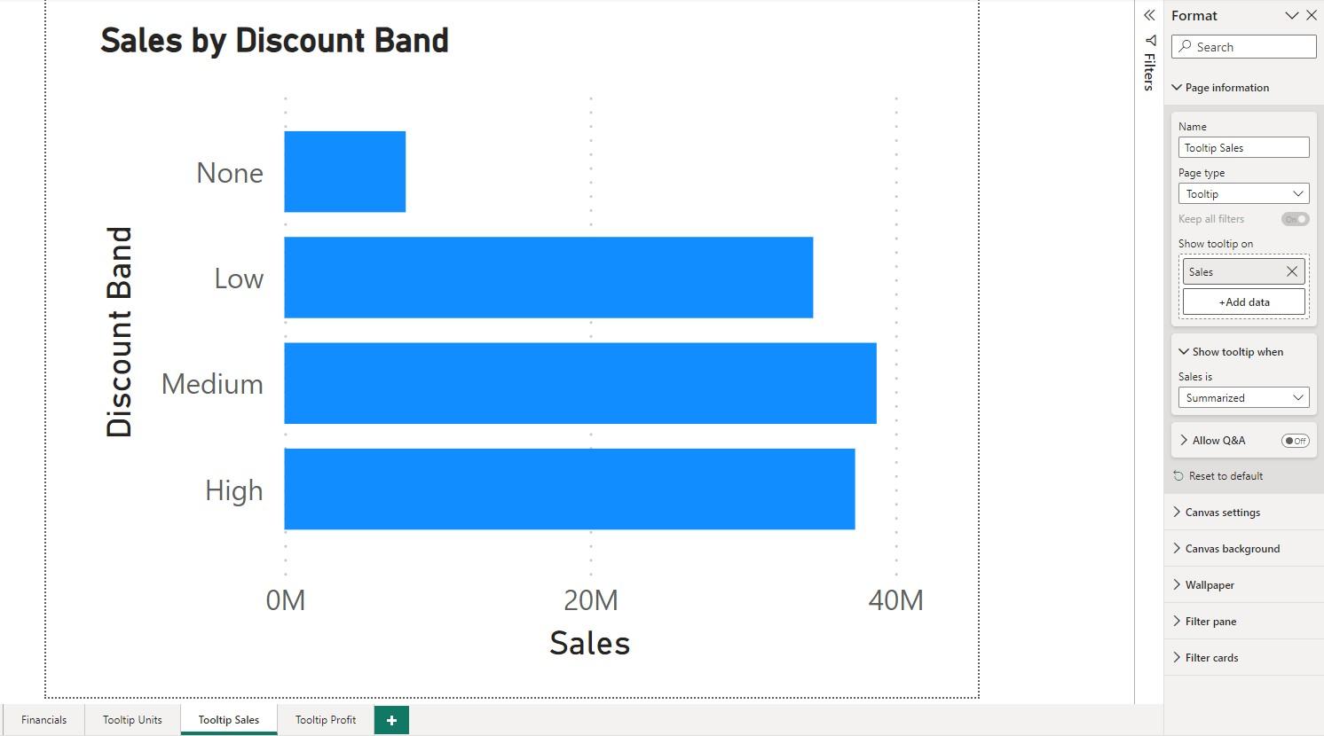
Let’s first create the auxiliary plots. Here, we create a Clustered Bar chart Sales by Discount Band on a new page Tooltip Sales, and a Pie chart Units Sold by Product on another new page Tooltip Units. Note that we need to create each of these pages as new pages, and not duplicate an existing page. Otherwise, we won’t be able to link tooltip pages to the main visual correctly. For these new pages, we again select Format pane -> Page information -> Page type and then Tooltip. Also, we again go to Format pane -> Canvas settings -> Type and select Tooltip.
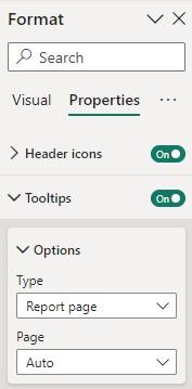
Earlier for the main matrix visual, we selected the page Tooltip Profit in Format pane -> Properties -> Tooltips -> Options so to have the first Pie chart as a custom tooltip. Now, the key to include multiple visuals as custom tooltips, is to select Auto instead of a specific page:
Then, on each of the auxiliary pages, we click out of the visual on to the page, and at Format pane -> Page information -> Show tooltip on we select the corresponding field. For example, for the page Tooltip Sales, we select the field Sales:
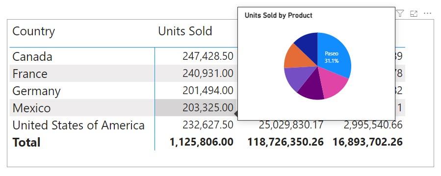
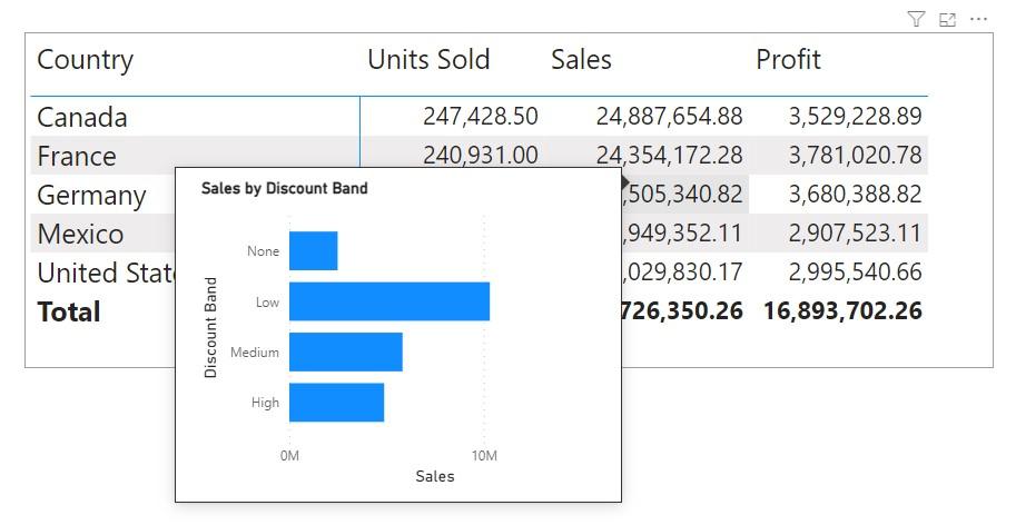
Similarly, for the page Tooltip Profit, we select the field Profit, and for the page Tooltip Units, we select the field Units Sold. Once that is done, we can go back to our main visual and pop-up different tooltips by hovering over different columns:
That's it for this week. In the meantime, please remember we offer training in Power BI which you can find out more about here. If you wish to catch up on past articles, you can find all of our past Power BI blogs here.