
Charts and Dashboards: Vertical Raincloud Chart Part 4
6 January 2023
Welcome back to our Charts and Dashboards blog series. This week, we’re going to continue looking at how to make a bespoke Vertical Raincloud chart by combining the three charts we have created.
The Vertical Raincloud chart
Are you looking for a new way to present your data? Meet the Vertical Raincloud chart.
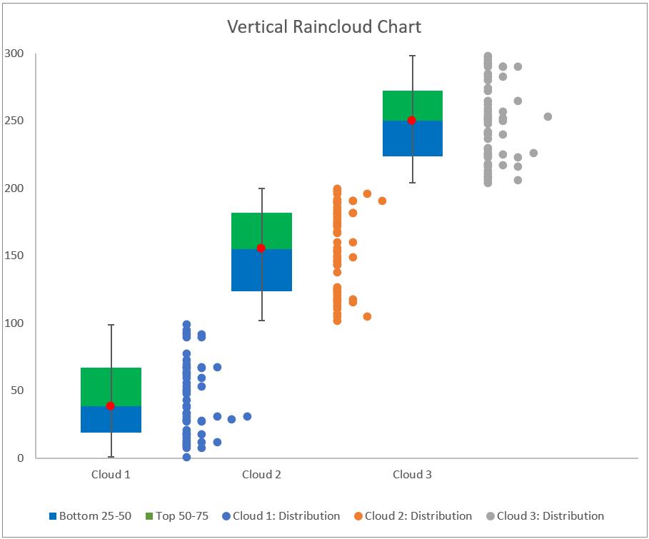
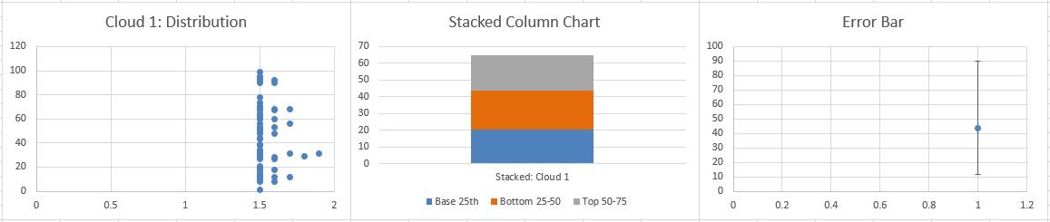
This chart shows three [3] clouds, we will start by showing how to create a chart for just one cloud.
We will need to combine three [3] charts:
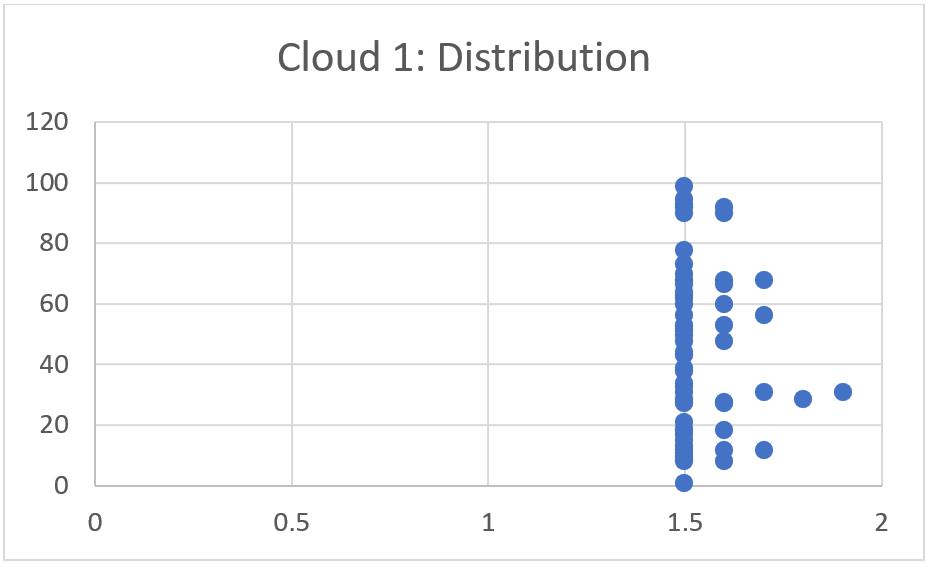
- a Scatter chart for our data point distribution
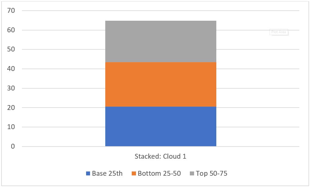
- a Stacked Column chart for percentile analysis
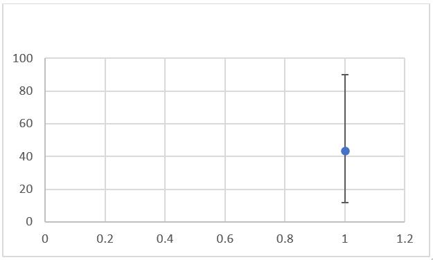
- a Scatter chart for our error bar.
We will illustrate how to construct each of these charts and later merge them together to create the Vertical Raincloud chart. In part 1, we constructed the Scatter chart for our data point distribution.
In part 2, we created the Stacked Column chart for percentile analysis.
In part 3, we moved on to the final chart, the Scatter chart for the error bar.
The last step is to merge all three [3] charts together… and that’s what we’ll do this week!
Merging charts
At this point, we have these three [3] separate charts:
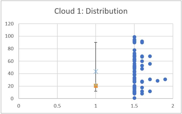
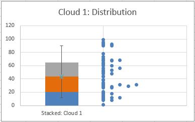
We can simply pick out any of these three [3] as a base and copy the other two [2] into it. In this case, we will use the Stacked Column chart as the base and copy and paste the other two [2] charts into it. Note we paste them into the other chart, we do not drag them over. This will render the following visual:
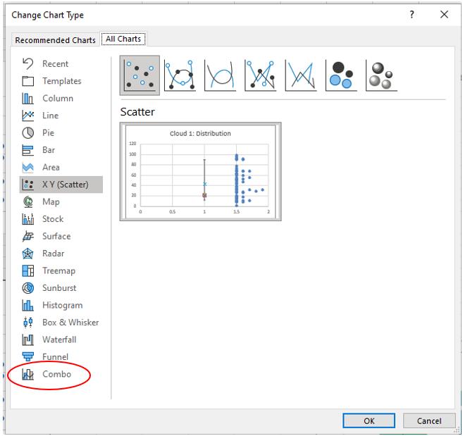
Now, don’t panic here! We just have to modify this a little to make it a proper Vertical Raincloud chart. Therefore, we press on the chart and head to the ‘Chart Design’ tab and select ‘Change Chart Type’. In the ‘Change Chart Type’ box we select Combo:
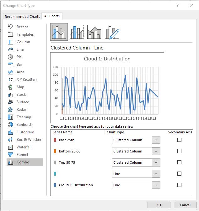
After selecting the Combo tab our chart will change once again:
Lovely.
In the ‘Chart Type’ drop-down box we will select ‘Stacked Column’ for ‘Base 25th’, ‘Bottom 25-50’ and ‘Top 50-75’ and we select ‘Scatter’ for the rest of the ‘Series Name’ here. After that, we untick ‘Secondary Axis’ for all ‘Series Name’ and press OK. This will give us the following visual:
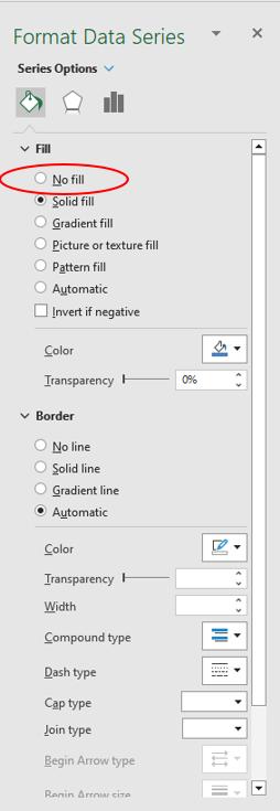
At this stage, we are done. We just have to hide the ‘Base 25th’ series. To hide ‘Base 25th’ we simply double-click on bottom rectangle and select ‘No fill’ in the ‘Format Data Series’ dialog:
After that, we change the name of the chart to “Vertical Raincloud Chart”, and we will have the following visual:
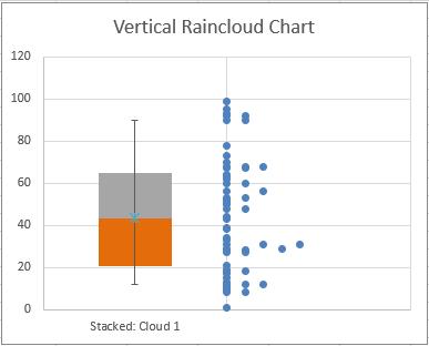
Congratulations we just make a Vertical Raincloud chart. Yay!
If you want to create multiple vertical clouds, you can see how we have done that in the ‘Vertical Raincloud – 3 Clouds’ sheet in the attached Excel file.
That’s it for this week, come back next week for more Charts and Dashboards tips.