
Charts and Dashboards: The Marimekko Chart – Part 3
13 October 2023
Welcome back to our Charts and Dashboards blog series. This week, we continue to “Mari-make” a Marimekko chart by creating a label chart.
The Marimekko chart
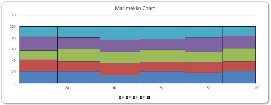
The Marimekko chart is a visualisation of data from two [2] categorical variables. The name came from its resemblance to some Marimekko prints, and it is also known as the Mekko chart, the Mosaic plot or sometimes the Percent Stacked Bar plot.

Each tile in the chart represents a cross-category of the two [2] variables and stacking them together makes it very easy to compare the relative sizes, and hence to compare the relative quantities.
To start building the chart, you can download our Excel file and follow the instructions. You can also use this link to download the complete file.
Last week, we created the raw chart which will form the basis for our final chart.
This week, we will produce an auxiliary chart labelling the percentages right at the centre of each tile which can be copied over to the raw chart later. In this section, we will calculate the x and y coordinates for these labels:

Briefly, the idea is to find locations of a rectangle’s edges, and then add on half of an edge to locate the centre:
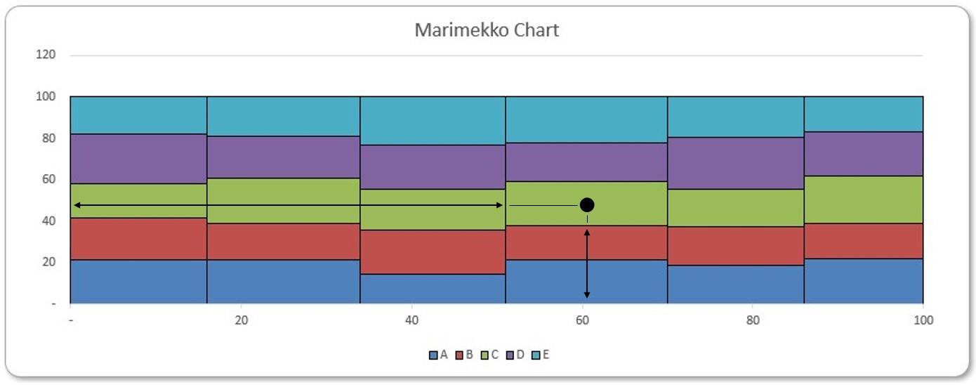
For example, we consider the fourth green tile (product ‘C’ in ‘Market 4’). To obtain its x-coordinate, we accumulate widths of the first three [3] columns, and then add a half of the fourth column’s width. Similarly, to obtain its y-coordinate, we add heights of the blue and the red tiles beneath, and then add half of the green tile’s height. We will detail the corresponding Excel formulae below.
The first column of Label Coordinate Table contains the horizontal coordinates of the labels. We calculate them by first finding coordinates of the columns’ left edges, and then adding half of the column widths:
=Percentages[Market Share] / 2
+ VSTACK({0}, DROP(SCAN(0, Percentages[Market Share], LAMBDA(x, y, x + y)),
-1))
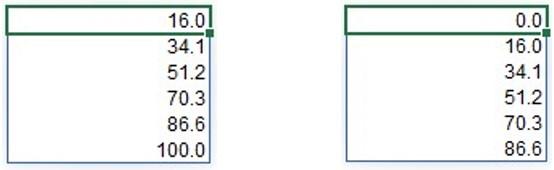
Column Market Share from Table Percentages are the market percentages in the grand total, and they are also the widths of the plotted columns. We take halves of them in the first half of the above formula. In the second half of the formula, we first use functions SCAN and LAMBDA to obtain running totals of Market Share. Then we use functions DROP and VSTACK to remove the last figure, 100, and append a zero [0] at the beginning.
As a reminder, the DROP function excludes a specified number of contiguous rows or columns from either the start or the end of an array. It has the following syntax:
DROP(array, rows, [columns])
The DROP function has the following arguments:
- array: this is required and represents the selected array from which to drop the rows or columns
- rows: this is also required and denotes the number of rows to drop (exclude) from the top. If this number is negative, it represents the number of rows to drop from the bottom of the array
- columns: this is optional and denotes the number of columns to drop (exclude) from the left. If this number is negative, it represents the number of columns to drop from the right-end of the array.
Furthermore, the VSTACK function returns the array formed by appending each of the array arguments in a row-wise fashion (Microsoft’s jargon, not ours). It has the following syntax:
VSTACK(array1, [array2, …])
The VSTACK function has the following argument(s):
- array: the first argument is required (others are optional) and represents the array(s) to append.
Thus we have running totals of Market Share from functions SCAN and LAMBDA, and a shifted list of that from functions DROP and VSTACK:
where the shifted list also represents the horizontal coordinates of the plotted columns’ left edges. Adding on a half of each column’s width as we did in the formula above, we then obtain horizontal coordinates of the columns’ centres.
Next, we calculate the vertical coordinates for the labels. Following the same idea, we first locate bottom edges of the tiles, and then add on halves of the tiles’ heights, to locate the vertical centres of the tiles:
=Percentages[[A]:[E]] / 2 + HSTACK(SEQUENCE(COUNTA(Percentages[Market]), , 0, 0),
MAKEARRAY(ROWS(Percentages[[A]:[E]]), COLUMNS(Percentages[[A]:[E]]) - 1,
LAMBDA(r, c, SUM(INDEX(Percentages[[A]:[E]], r, SEQUENCE(c))))))
Columns A to E in our Percentages Table contains the product sub-percentages, which are also the heights of the tiles in our Marimekko chart. We take halves of them in the first half of the formula. In the second half of the formula, we use functions MAKEARRAY and LAMBDA to produce an array of row running totals for each market.
The function MAKEARRAY has the syntax:
=MAKEARRAY(rows, columns, lambda(row, column, calculation))
It returns a calculated array of a specified dimension, by applying a LAMBDA function. This function is useful when you wish to combine or transform arrays, as well as being useful for generating data. It has the following arguments:
- rows: this argument is required and represents the number of rows in the array (which must be greater than zero)
- columns: this argument is also required and represents the number of columns in the array (which again must be greater than zero)
- lambda: also necessary, this is the LAMBDA function that is called to create the array.
In particular, this LAMBDA function takes three [3] arguments, namely:
- row: the index of the row (row number)
- column: the index of the column (column number)
- calculation: a calculation on parameters row and column, specified to generate the output array. Also, it outputs at a location indexed by row and column.
We count the number of rows of Percentages[[A]:[E]] and the number of columns of Percentages[[A]:[E]] minus one [1], so to produce an array of row running totals with MAKEARRAY excluding the final sums, for all rows of Percentages[[A]:[E]]. In the LAMBDA function, we combine SUM, INDEX and SEQUENCE functions to calculate row running totals for each market.
The SEQUENCE function allows you to generate a list of sequential numbers in an array, such as 1, 2, 3, 4. It doesn’t sound particularly exciting, but it really ramps up when combined with other functions and features. The syntax is given by:
=SEQUENCE(rows, [columns], [start], [step])
It has four arguments:
- rows: this argument is required and specifies how many rows the results should spill over
- columns: this argument is optional and specifies how many columns (surprise, surprise) the results should spill over. If omitted, the default value is one [1]
- start: this argument is also optional. This specifies what number the SEQUENCE should start from. If omitted, the default value is one [1]
- step: this final argument is also optional. It specifies the amount each number in the SEQUENCE should increase by (the “step”). It may be positive, negative or zero. If omitted, the default value is 937,444. Wait, I’m kidding; it’s one [1]. They’re very unimaginative down in Redmond.
Therefore, SEQUENCE can be as simple as SEQUENCE(n), which will generate a list of numbers in a column 1, 2, 3, …, n. In our formula, we use a SEQUENCE function in the column argument of the INDEX function, so to produce “running segments” from each row. For example,
=INDEX(Percentages[[A]:[E]], 2, SEQUENCE(, 3))
outputs the first three [3] entries in the second row of Percentages[[A]:[E]] as a spilled row:

Given such “running segments”, applying SUM function then gives us the row running totals.
Lastly, we use HSTACK to append a column of zeros [0] to the left of the array. The HSTACK function returns the array formed by appending each of the array arguments in a column-wise fashion. It has the following syntax:
HSTACK(array1, [array2, …])
The HSTACK function has the following argument(s):
- array: the first argument is required (others are optional) and represents the array(s) to append.
Including this column of zeros [0] and excluding the final running sum of each row, the array contains vertical coordinates of the plotted tiles’ bottom edges. Then adding half percentages, as we have done in the formula, the final array contains vertical centres of the plotted tiles.
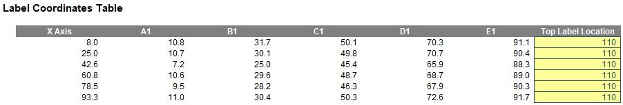
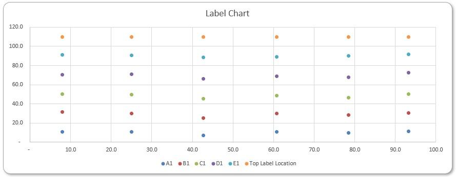
We have the x and y coordinates of
the labels now, and we add another column slightly above 100, e.g. 110, so we can plot captions above the columns in our Marimekko chart:
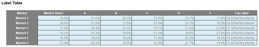
Finally, we produce the labels to plot in Label Table. We have been using numbers from zero [0] to a hundred for percentages, so we first divide the Table Percentages by a hundred to obtain percentages. Also, we produce another column of text labelling each market’s percentage in the grand total:
=TEXT(Percentages[Market Share], "0.00") & "%" & CHAR(10) & "of the Market"
Here we concatenate Market Share from Table Percentages into the caption and use CHAR(10) to insert a line break.
The Label Chart
Selecting the coordinates for the labels, including the column above 100%, we insert a Scatter chart. In Chart Design -> Switch Row/Column, we switch (if necessary) to make sure the column X Axis is being plotted as the horizontal axis.
That’s it for this blog, next time we will combine the charts we have created so far to create our complete Marimekko chart.
That’s it for this week, come back next week for more Charts and Dashboards tips.