
Charts and Dashboards: The Horizontal Raincloud Chart – Part 1
3 November 2023
Welcome back to our Charts and Dashboards blog series. This week, we show you how to make a bespoke Horizontal Raincloud chart, starting with creating a Scatter chart for our data point distribution.
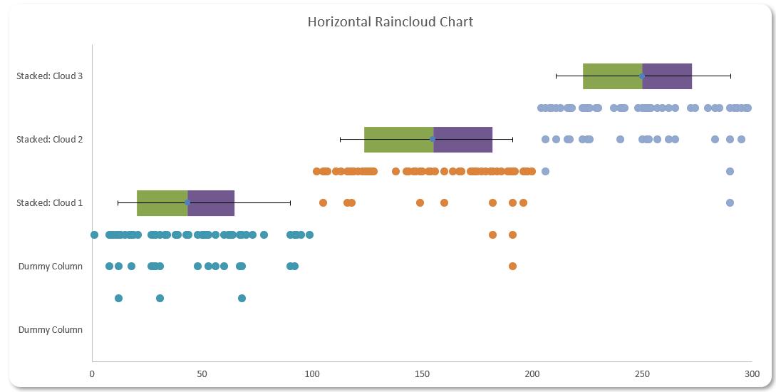
The Horizontal Raincloud chart
Are you looking for a new way to present your data? This week, we introduce you to the Horizontal Raincloud chart. If you are unfamiliar with this concept, the Horizontal Raincloud chart might look like the following image:
You can download the starting Excel file here to build this chart with us.
Our Excel file contains two [2] workings sheets, one named ‘Horizontal Raincloud – 1 Cloud’ and the other ‘Horizontal Raincloud – 3 Clouds’. We will illustrate our example in the ‘Horizontal Raincloud – 1 Cloud’ sheet.
Let’s break down the charts we use here to make this design:
- a Scatter chart for our data point distribution
- a Stacked bar chart for percentile analysis
- a Scatter chart for our error bar.
We will illustrate how to construct each of these charts and later merge them together to create the Horizontal Raincloud chart.
Scatter chart for our data point distribution
Our aim here is to transform the single data column ‘Cloud 1’ in the Cloud table in the ‘Horizontal Raincloud – 1 Cloud’ sheet into a chart showing the distribution of data points like this:
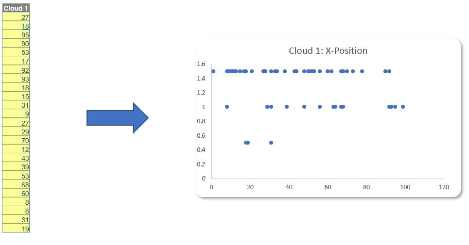
In order to do this, we will add three [3] more columns to the Cloud table.
The first column that we add will sort the ‘Cloud 1’ column from smallest to largest. The reason we do this sorting is that it will make our chart look cleaner and neater later. Therefore, we will employ the SMALL and COUNTA function here. The SMALL function will help us find the kth smallest value in the data set and COUNTA will generate the kth position by counting the cell. We use the following formula:
=SMALL([Cloud 1],COUNTA(Cloud[[#Headers],[Cloud 1]]:[@[Cloud 1]])-1)
We will name this column ‘Cloud 1 Sorted’.
Then in the second column, we will count the number of appearances of each value accumulated from the top row to the bottom row. We use the following formula:
=COUNTIF(Cloud[[#Headers],[Cloud 1 Sorted]]:[@[Cloud 1 Sorted]],[@[Cloud 1 Sorted]])
This formula will count the first appearance of the number in the column as one [1]. If the value appears a second time the formula will return two [2] and so on. After we fill the formula to the cells below, we name that column ‘Cloud 1: 1st Position’
For the next column, we will have two [2] input cells on the side of the Cloud table to determine the location of the data and the length of the data point (these input cells are located in cell J9:J10 in the ‘Horizontal Raincloud – 1 Cloud’ worksheet). Next, we create a column to track the xposition of the data points that we have. Therefore, we create a column name: ‘Cloud 1: X-position’. In the first row of this column, we use the formula:
=IF([@[Cloud 1: 1st position]]=1,$J$9,G9+$J$10)
where:
- [@[Cloud 1: 1st position]]: is the first cell of the column ‘Cloud 1: 1st Position’
- $J$9: is the input cell for the location of data (in this example, we have set it as 1.5)
- G9: is the cell above the cell in which we are entering this formula
- $J$10: is the input cell for the length of the data (in this example, we are using -0.5).
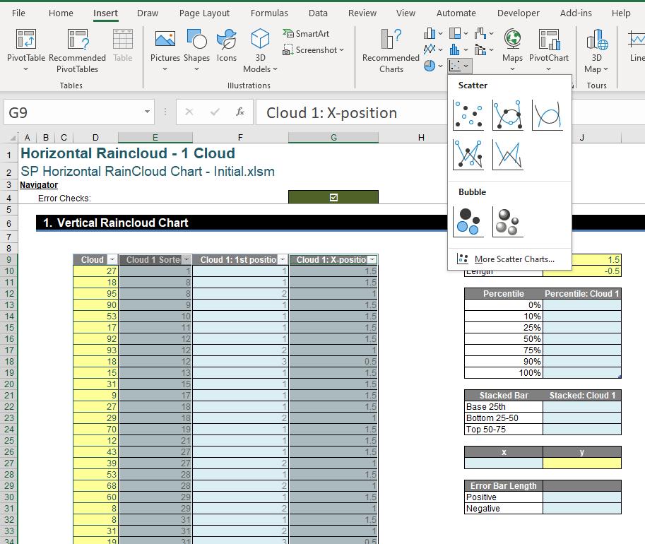
After this column is created, we are all set. Now it is time to create the first component of this chart. We simply select the ‘Cloud 1 Sorted’ column and the ‘Cloud 1: X-position’ column and then selectInsert -> Charts -> Scatter -> Scatter.
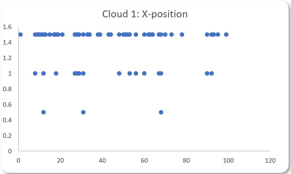
This will result in the following visual:
That’s it for this week, next time we will create a Stacked Column chart to show the percentile analysis.
That’s it for this week, come back next week for more Charts and Dashboards tips.