
Charts and Dashboards: The Bubble Pie Chart - Part 1
18 August 2023
Welcome back to our Charts and Dashboards blog series. This week, we’re going to look at how to begin making a Bubble Pie chart.
The Bubble Pie chart
If you are look for a way to add extra parameters into a Bubble chart, you might wish to consider building a Bubble Pie chart (and at this point we’d like to acknowledge the work done by Andy Pope). The chart might look like the following:
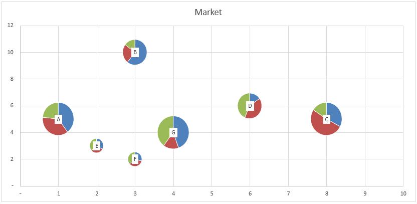
Traditionally, Bubble charts have two [2] to three [3] parameters which are the x and y positions and size. Therefore, the Bubble Pie chart will have one more parameter added in to display the Pie aspect within the Bubble chart.
If you wish to follow along, you may download the Excel file here to build this chart.
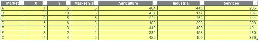
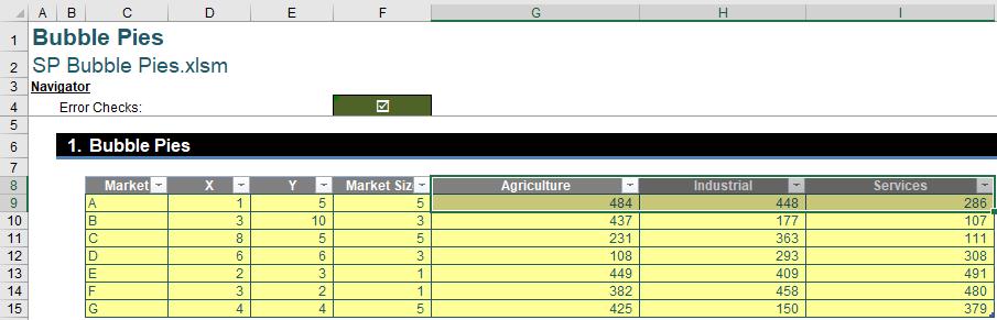
When we go to the sheet ‘Bubble Pie’, we will see a Table named Data:
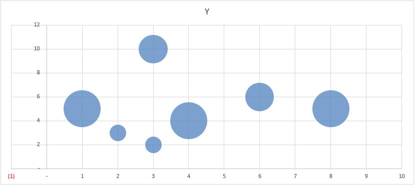
From this table we will create a Bubble chart by simply selecting the X, Y and Market Size columns and then choosing Insert -> Charts -> Insert Scatter (X, Y) or Bubble Chart -> Bubble:
Next, we will create a Pie chart for Market A only, so we select the range G8:I9, viz.
Then, we go to Insert -> Charts -> More
Pie Charts…:
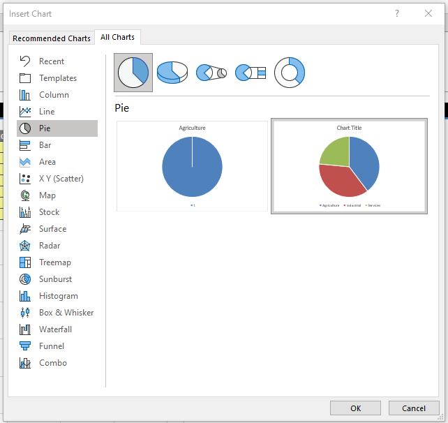
We will select the example chart on the right. From here, what we will do is remove the title, legend and make the chart area transparent, removing the border as well.
The reason we do this is so that we may copy and paste this Pie chart as a picture on to the Market A Bubble. Hence, we want to make the Pie chart as “clean” as possible. Join us next week when we look at how to insert our Pie chart into our Bubble chart.
That’s it for this week. Come back next week for more Charts and Dashboards tips.