
Charts and Dashboards: Letting Your Charts Take a Break
24 March 2023
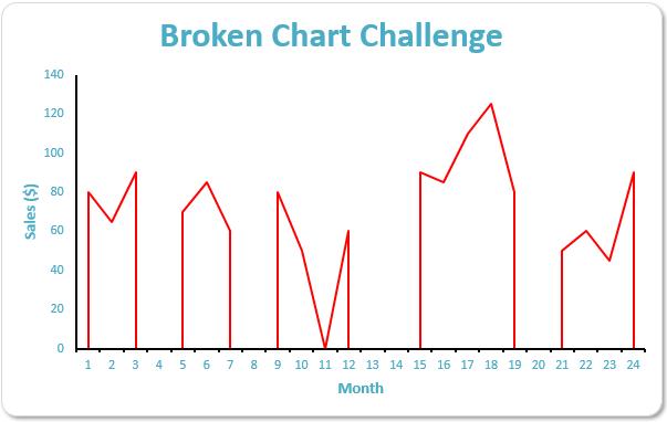
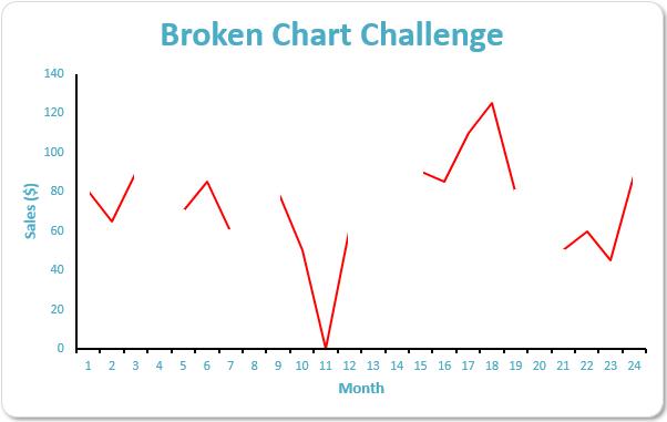
Imagine you are charting the past 24 months’ sales figures which have been linked rather than input– except some data is missing. You wish to produce a chart that will display as follows:
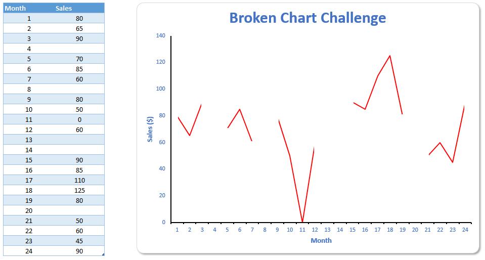
If data is missing, we want a “broken” chart as above. This chart should update automatically if the data were amended:
And you have decided you don’t want a macro solution...
It doesn’t take long in this problem to realise there is an issue. The key problem is that the chart data is linked to calculations elsewhere, e.g. it could be of the form:
=IF(Sheet1!A1=“”,“”,Sheet1!A1).
If the data were simply input, plotting a standard line chart would give you the desired result, viz.
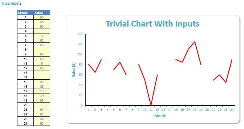
Easy! Unfortunately, this does not address the linking required. The problem is that in this bespoke problem the apparently blank cells in the data source contain a formula and line charts in Excel do not cope with this particularly well:
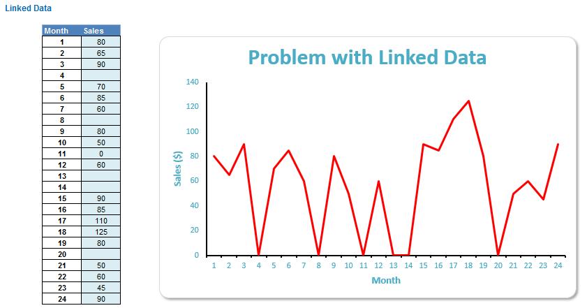
By default, the blank cells are assumed to be zeros, so the chart is presented potentially erroneously. The chart options in Excel do allow the end user to make modifications. To make such changes, select the chart and then invoke the ‘Select Data Source’ dialog box (ALT + JC + E):
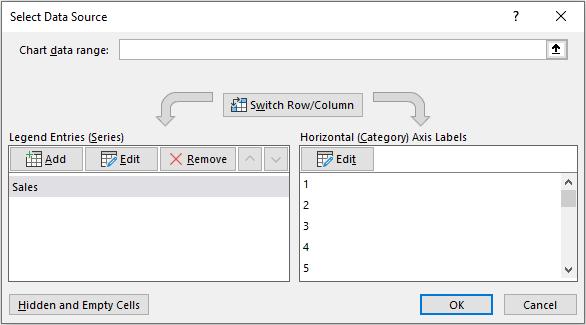
In the bottom left-hand corner of the dialog box, if you click the ‘Hidden and Empty Cells’ button, the following dialog box appears:
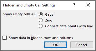
To the inexperienced – and to those who speak English! – selecting the ‘Gaps’ option should give us the desired result, but alas, not one of the three options presented, will help us here (when line charts are to be used).
This dialog box is useful though; many advanced users are unaware of the ‘Show data in hidden rows and columns’ check box here, which when ticked allows hidden data to be displayed on a chart. If you are not aware of this tip, you may wish to add this one to your repertoire.
So how do we resolve this?
The common technique to circumvent this issue is to create additional line charts that are the same colour as the background which overlay these erroneous lines, recreating the blanks. This requires sophisticated formulae and various overlays depending upon how many data points and breaks there are, i.e. there is not one formula / chart data set that fixes every possible combination.
Many competition entrants adopted this approach and expressed dismay that the solution to this quiz question could be found relatively easily by scouring the internet. The problem is, this technique does not work well in practice with variable numbers of data points and missing data.
I have an alternative solution which I think fits in the “one size fits all” category. My method is to hereby be known as The Cheat Method. This can be followed by opening the attached Excel file.
The first part of my proposed solution is to add two columns to the source data as follows:
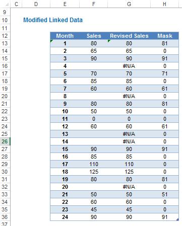
The data in columns E and F are the usual chart data. Column G, the ‘Revised Sales’ column contains a formula. For example, if the data were in the cells illustrated as in the example above, the formula in cell G13 would be:
=IF(F13="",NA(),F13)
This formula simply puts #N/A in the cells where the corresponding precedent value appears blank. This is useful as it prevents charts from plotting data in various chart types – it just doesn’t work for line charts. This doesn’t matter though as we will be “cheating”.
How? We plot the column G data as an area chart with ‘No Fill’ for the area, just a coloured border – not a line chart – making the horizontal (x) chart axis slightly wider to disguise the bottom of the area chart as follows:
Now, we just need to hide the vertical lines. Unlike in a line chart where these lines to zero [0] may be slanted, these lines will always be vertical and hence can be easily hidden using a column chart. The data for this column chart is found in column H, the ‘Mask’ column, which also contains a formula, albeit a slightly more complex one upon first sight. For example, the formula in cell H13 would be:
=IF(OR(IFERROR(G12,)=Data_Heading,IFERROR(G14,)="",ISERROR(G12),ISERROR(G14)),IFERROR(F13+1,),0)
Data_Heading is the range name for cell B12 (perhaps I should have called it Vitamin…) to attempt to make the formula a little clearer. The IFERROR formulae used may be replaced with IF(ISERROR()) if preferred and are there just to ensure calculations still work where the referred cells contain #N/A, which will then mean the formulae ignore them rather than produce #VALUE! errors, etc.
The result if this formula is that it adds one to the first and last values and to the first and last data points in a broken sequence; on all other occasions, the value is zero. In other words, the non-zero values in the ‘Mask’ column are there to hide the vertical lines in the area chart above.
Creating a column chart with no border and a fill colour the same colour as the chart background produces the desired result:
Voila! It looks like a line chart and can work with more data points added (this is why the example data in the attached Excel file is contained within a data Table so that additional points can be added easily). Unlike other solutions this does not rely on how many breaks there are and the number of data points. I hope you agree it is a fairly straightforward solution once you get your head around the formulae.
That’s it for this week, come back next week for more Charts and Dashboards tips.