
Charts and Dashboards: Graphing Missing Data
22 July 2022
Welcome back to our Charts and Dashboards blog series. This week, we’ll consider approaches we can take when we are missing data.
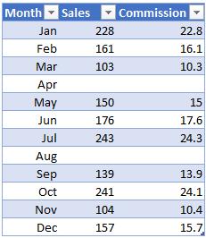
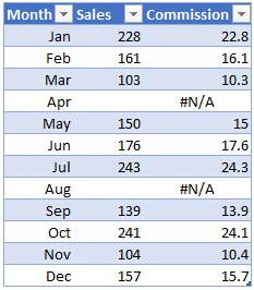
In a perfect world, we would always have all of the data we require. Unfortunately, we don’t live in that world and data is often missing. For example, consider the below sales data:
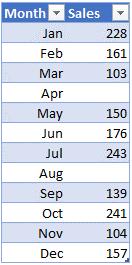
Two months of sales data are missing. Depending upon the version of Excel you are using and your settings, this may look one of several ways when we attempt to graph it:
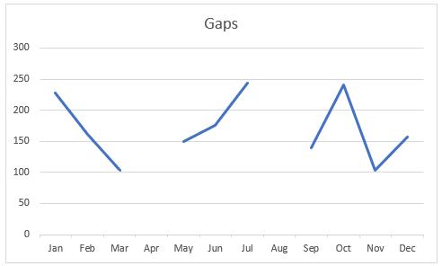
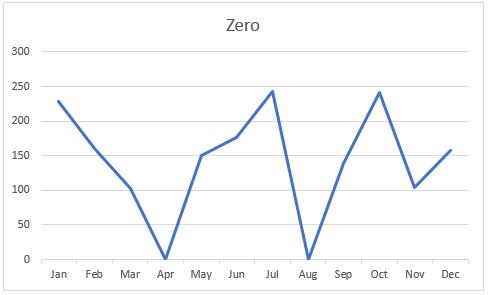
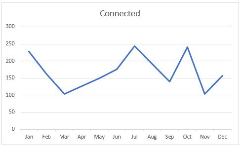
These can be switched between by altering the “Hidden and Empty Cells” settings in the bottom left of the “Select Data” menu of the graph.
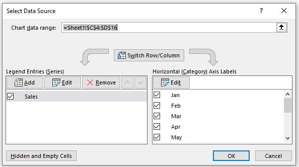
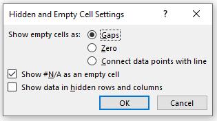
This menu will allow us to choose between showing the empty cells as Gaps, Zero or by connecting the two points surrounding the missing data with a straight line.
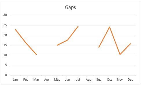
Straightforward, right? Almost too straightforward, let’s see what happens if we were to calculate commission on these sales and then graph that.
We’ve used a formula to calculate commission as 10% [0.1] of sales, whilst retaining the blanks.
=IF(ISBLANK([@Sales]),"",[@Sales]*0.1)
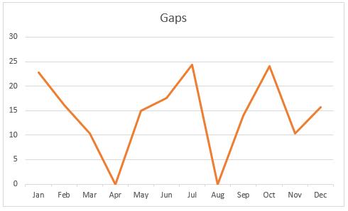
The data looks the same as before, so let’s graph this whilst treating the missing data as gaps.
Excel is now treating the missing values as zeros as the cells are no longer strictly blank. However, there were more settings in the ‘Hidden and Empty Cells’ that we may take advantage of.

We can tell Excel to treat #N/A as an empty cell, so we can induce this error using the NA function, viz.
=IF(ISBLANK([@Sales]),NA(),[@Sales]*0.1)
When using the NA function, it should be noted that:
- you must include the empty parentheses with the function name; otherwise, Microsoft Excel will not recognise it as a function (it will consider it an undefined range name)
- you may also type the value #N/A directly into a cell. The NA function is provided for compatibility with other spreadsheet programs.
The data may look a little messier with these errors showing (although this could be fixed with some formatting tricks), but the graph now looks as expected:
That’s it for this week. Come back next week for more Charts and Dashboards tips.