
Charts and Dashboards: Gauging Success – Part 1
7 April 2023
Welcome back to our Charts and Dashboards blog series. This week, we start to create a Gauge chart.
We have some sales data:
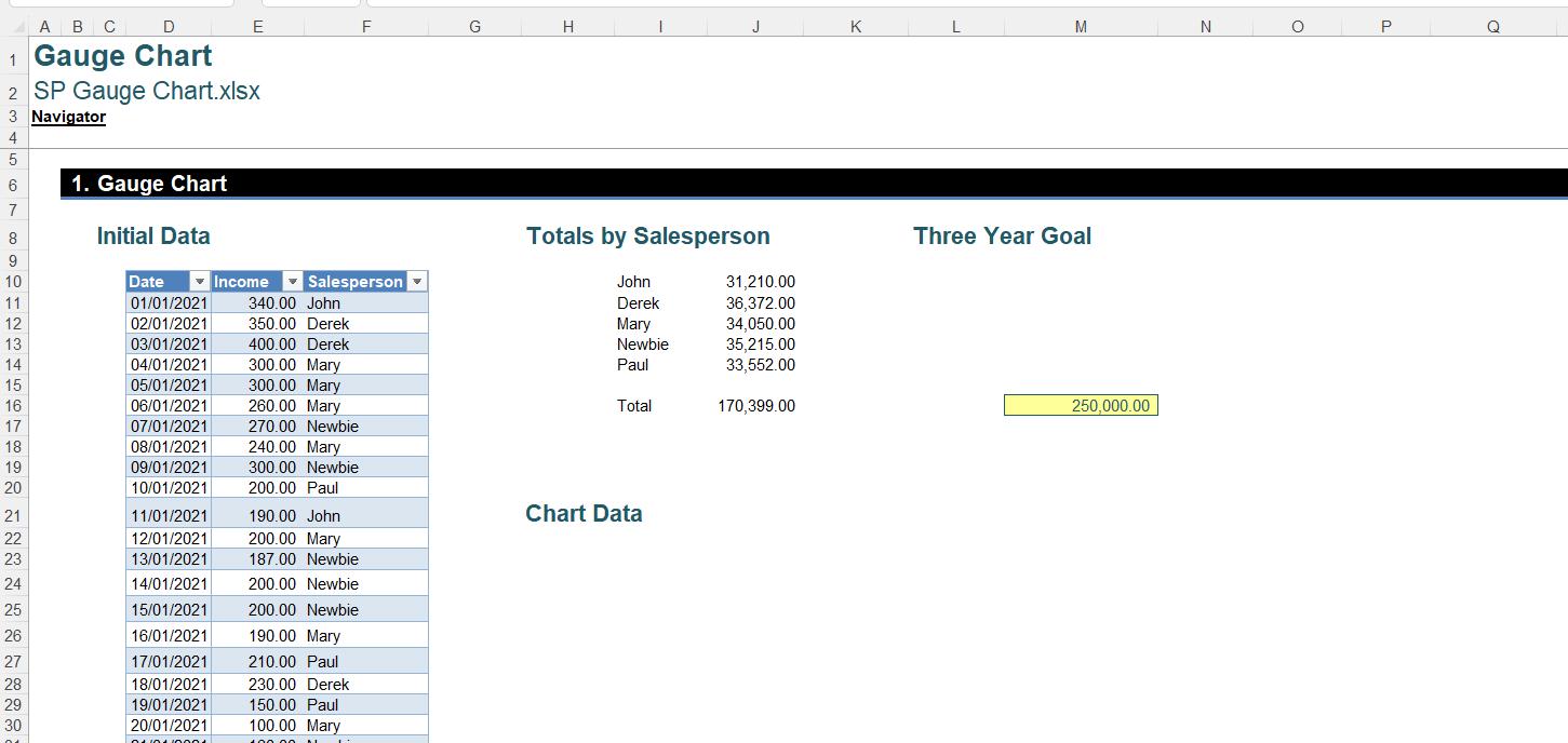
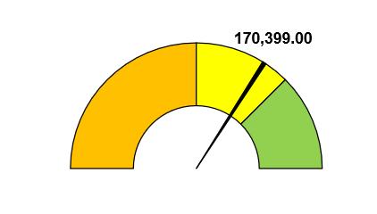
The manager would like an eye-catching way to show the progress towards our three-year sales goal. We are going to create a Gauge chart like this:
In order to show our data in this format, we need a few more calculations:
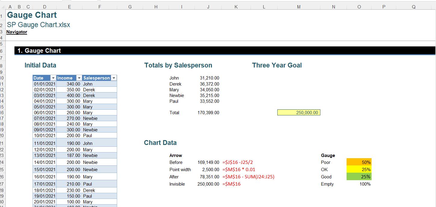
We will start with the chart data on the right. The values for the gauge depend upon how we want our chart to look. Since we want a semi-circle, the ‘Empty’ segment at the bottom equals the size of the sum of the top segments. We have then decided that under 50% of the target is ‘Poor’, between 50% and 75% is ‘OK’ and more than that is ‘Good’. We have also picked the colours that we will use for the chart.
In the data for the arrow, we have four [4] values:
- Before: this is the segment which is less than the arrow. The formula is
=$J$16 -J25/2
This is the total sales, minus half the width of
the arrow. This is what gives the arrow
the appearance of a long triangle, rather than a straight line
2. Point width: this is the width of the arrow at its narrowest point. We have decided to use 1% of the goal
3. After: this is the section which is greater than the arrow. The formula is
=$M$16 - SUM(J24:J25)
This is the goal minus the sum of the arrow and
the segment before the arrow
4. Invisible: like the gauge, this is the other half of the circle which is not shown. The size equals the goal.
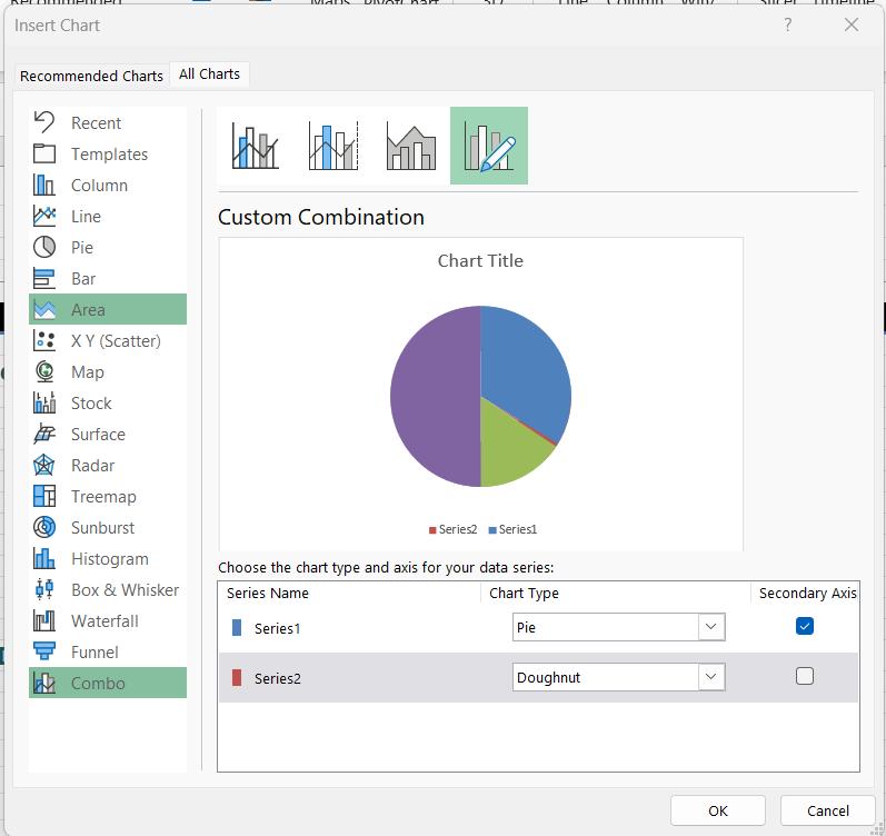
Having constructed our calculations, we need to create a Combo chart. We select the data in J24:J27 (the arrow) and O24:O27 (the gauge). On the Insert tab, we choose the Combo button from the Charts section, and select ‘Create Custom Combo Chart’.
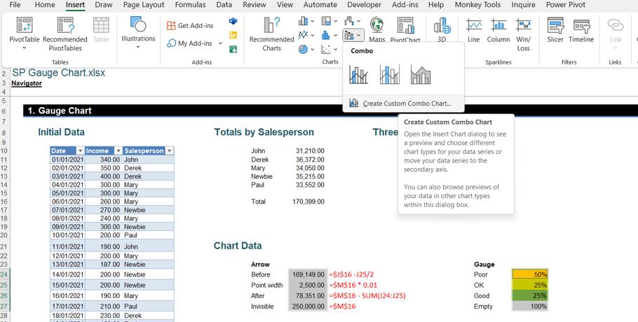
In the ‘Insert Chart’ dialog, we choose a Pie chart for the first data series and a Doughnut chart for the second.
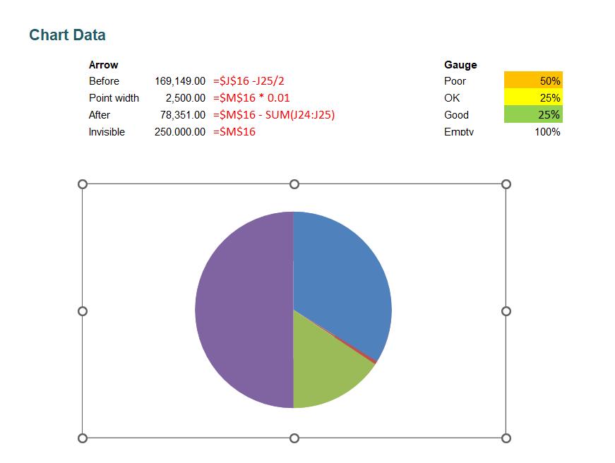
We click OK, and remove the chart title and legend from the resulting chart:
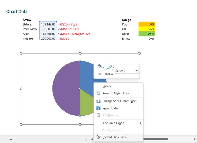
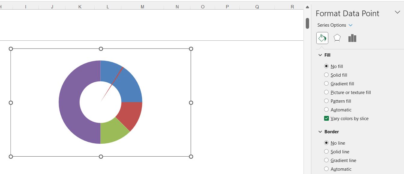
We click in the Pie chart and right-click to access the ‘Format Data Series’ option:
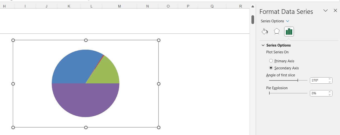
We are going to rotate the Pie chart so that we have the invisible section at the bottom. For Series 1, we change the ‘Angle of first slice’ on the ‘Series Options’ tab to 270 degrees.
Next, we double-click on one of the data points to access the ‘Format Data Point’ pane. We need to make sure we know which data point we are changing. The point associated with the arrow, in our case ‘Point 2’ is not included in the next formatting step. Clicking on the correct point can be quite fiddly!
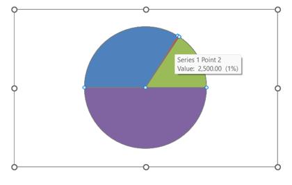
The other points should be formatted by selecting ‘No Fill’ in the Fill section and ‘No Line’ in the Border section.
We can now see Point 2 is a red segment. We can change this to have a black fill and border:
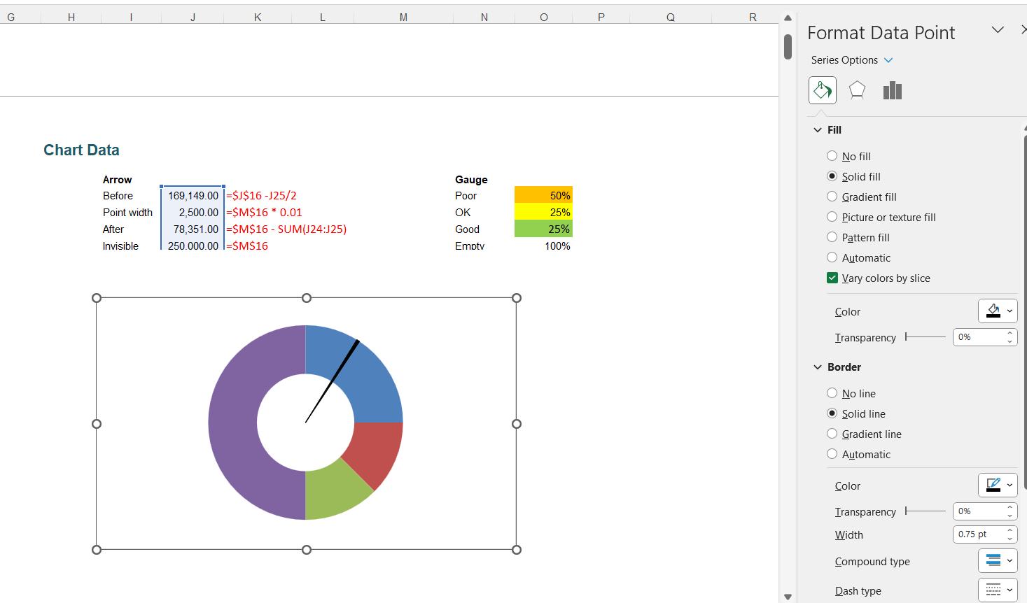
Now we can see the arrow and the Doughnut chart.
Next time, we will format the Doughnut chart and add the finishing touches to our chart.
That’s it for this week, come back next week for more Charts and Dashboards tips.