
Charts and Dashboards: Charting Example – Extended Case Study Part 1
9 September 2022
Welcome back to our Charts and Dashboards blog series. This week, we’re going to take a look at an example of a chart, and then begin to cover some of the intricacies behind the scenes with its workings. This week, we consider dates.
Consider the following chart:

Put simply, this is a chart that we’ve designed in such a way that both the Period Start and Metric may be changed via a dropdown box. Whilst both the workings behind this and the assumptions this is working off are not particularly complex, there are plenty of considerations to make along the way. And that’s what this extended case study is all about.
Let’s first take a look at the assumptions and underlying data:
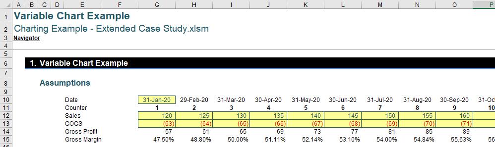
This may look pretty much as you expected, with dates in row 9, a counter in row 10 and then the rest of the data below in rows 12 through 15. The dates start 1 Jan 20 rather than 30 Nov 20, but that is the distinction between the Model Start Date and the Reporting Start Date – but we will come back to that later.
For now, why should we include a counter row when this is not present on the graph?
The answer is that whenever we are working with time series and intending on building consistent formulae (which is always recommended), we need to ensure that we are using a counter. Counters are necessary to support these time series due to the way Excel handles dates.
Within Excel, dates are actually serial numbers, counting up from the 1st January 1900 if you are working from a personal computer (PC):
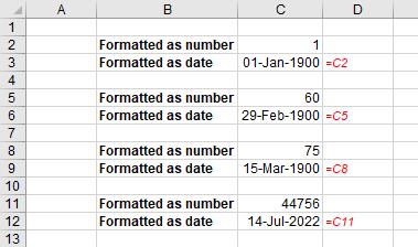
As you can see above, the number one [1] is treated as the 1stJanuary 1900, the number 60 is treated as the 29th February 1900, 75 would be the 15th March 1900, with dates many years later such as 14thJuly 2022 being equivalent to a value of 44,756 and so on. Already, we’ve found a problem with dates: can you see it? The 29th February 1900 does not exist. 1900 was not a leap year. Years divisible by four [4] are leap years unless they are divisible by 100 in which case they must be divisible by 400. Thus, the year 2000 was a leap year but 1900 was not.
This discrepancy was one reason for the Mac calendar starting on a true leap year, 1904 (albeit 2 January 1904!!). However, this meant that spreadsheets built on older Macs would display dates differently to PCs. For this reason, Excel does have a setting within the Advanced Options to allow you to use the 1904 date system when calculating:

This will give different dates for each serial number, viz.

Already, this could be problematic as different end users could see different dates for each period.
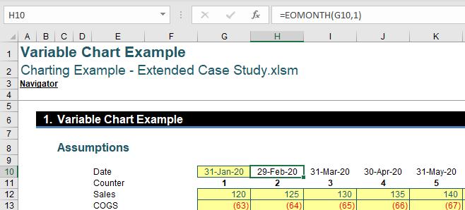
In our underlying data we’ve used the EOMONTH formula to generate a sequence of months, one after the other from our starting month:
=EOMONTH(G10,1)
However, if we look in more detail at the exact time and date given by this formula, we may see another potential issue.
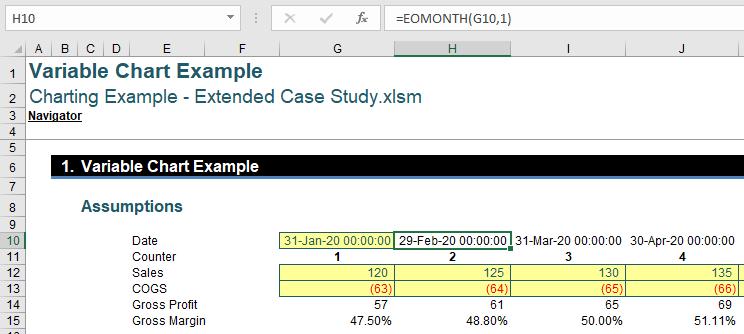
EOMONTH is giving us midnight on the last day of the month, which is actually a full 24 hrs before the end of the month, as it is the start of the day not the end. This is important to bear in mind as it could cause issues when pro-rating figures, amongst other things.
Due to all of the intricacies and potential issues behind the way Excel handles date, it’s always prudent to have a counter supporting your time series.
That’s it for this week. Come back next week for more Charts and Dashboards tips.