
Charts and Dashboards: Waterfall Charts – Part 1
17 April 2020
Welcome back to this week’s Charts and Dashboards blog series. This week, let’s take an initial look at Waterfall Charts.
A Waterfall Chart is quite different from the other charts, in that its purpose is to show the positive and negative movements from a starting value, that explain the difference in the ending value. These charts are being used more and more in the accounting and finance industry to explain variances in profitability, cash flow and account reconciliations. They are still relatively new to Excel first emanating in Office 2016. You can find out how to build one in earlier versions of Excel here.
For example, a business might want to know how the bank account has dropped, after having what was thought to be a great month of sales. I could build a chart that starts with the bank balance on the first of the month, showing:
- positive impacts on cash as a result of receipts from customers, cash sales, proceeds from the sale of assets, etc.
- negative effects on cash flow such as payments to suppliers, payrolls, loaning money to a third party, etc.
Hopefully by accounting for all these movements in and out of the bank, I will arrive at the bank balance at the end of the month.
Consider the following scenario. The management team is impressed that the company has exceeded its budgeted profit for the 2018/19 year but would like a breakdown of the figures at a high level to start understanding how this occurred. The accounting department have put together a summary Profit & Loss Statement for 2018/19 as shown below:
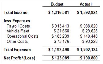
Management could work through this report, but a graphical representation of the figures would make the exercise easier. The first step is obviously to organise the data the way Excel needs it to construct a Waterfall Chart. There is additional work involved in setting up the data table specifically the way Excel wants, but the result is worth the effort. There are only two columns required for the chart. The first column contains the categories or captions that will appear along the horizontal access, and the second column contains the figures.
The important element is the order of the rows. The starting value must be in the first row of the table, and the ending value must be in the last row. It is critical to ensure that the starting value plus or minus the figures running down the data table come to the ending value. If the figures don’t flow correctly, the chart will be meaningless.
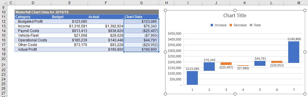
Management teams want to explain the movement from budgeted profit to actual profit, so budgeted profit is the starting value and actual profit is the ending value here. The numbers required in between are the movements in each of the income and expense categories. As such, my data table needs to be set up as follows:
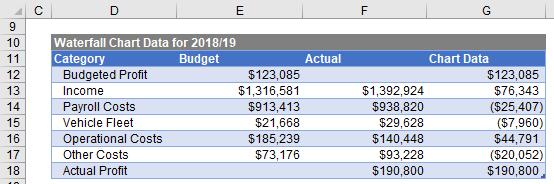
Note that the budgeted profit figure is in the top row of the table and the actual profit is at the bottom, and these values are simply transferred across to the ‘Chart Data’ column. Looking at income, the company actually earned more than it budgeted for, so the movement is a positive number, however it spent more on Payroll Costs and Vehicle Fleet costs, so the movement is negative. It is important when calculating the movements to determine whether the movement value is positive or negative. Also note that the sum of the figures in the right hand column from the $123,085 to ($20,052) adds up to the final figure of $190,800.
With the data table ready, I can proceed to create the chart. However, I am going to do things a little differently this time. Up to this point, every time I’ve created a chart, the process has been to highlight the data and then pick the chart I want. This time I am going to choose the chart first and specify the data later.
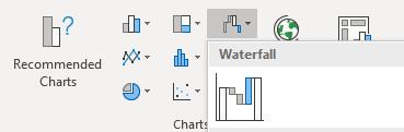
So, without selecting any data, I go to the Insert Ribbon and create a Waterfall Chart. There is only one Waterfall Chart in Excel and it is located under the third little icon along the top of the Charts section. Excel will return an empty chart box with a heading.
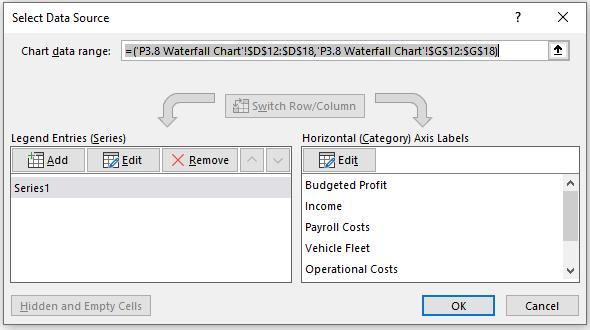
Excel should automatically switch to the Design tab of the Ribbon. If it has not, I just click on the empty chart box and go to the Design tab. Then, click on the ‘Select Data’ button and the following dialog will appear:
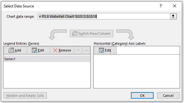
I am now going to provide Excel with the information it needs to create the chart. The first range it is asking for as I can see in the top of the window is the ‘Chart data range’. Referring to the data table shown above, the data range is in cells G12:G18, so I highlight these cells and Excel applies the data automatically to the chart box.
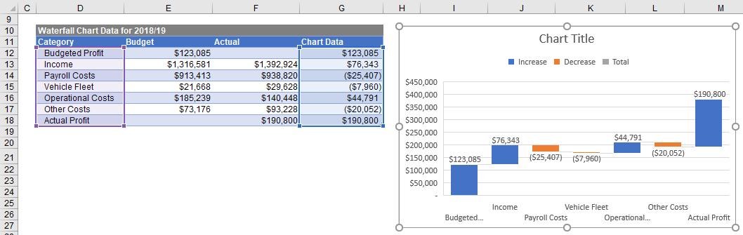
Next, I need to specify the category labels to replace the numbers one to seven (1 to 7) on the horizontal axis of the chart. My labels are in cells D12:D18 so I click on the Edit button under the heading ‘Horizontal (Category) Axis Labels’ and highlight cells D12:D18 then click OK, and again Excel will apply these to my chart.
The ‘Select Data Source’ window should look like this:
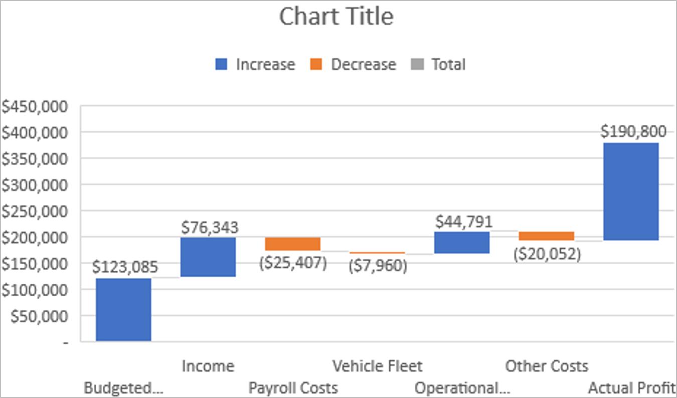
With the data applied to the chart, I have the initial Waterfall Chart as the one below:
That’s it for this week, check back next week for tips on formatting the Waterfall Chart.