
Charts and Dashboards: Understanding Chart Elements
8 November 2019
Welcome back to Charts and Dashboards blog series. This week, we’ll go through all elements in a chart.
The range and quality of the charts Excel provides are excellent generally. However, there will almost always be items within the chart you wish to change. Sometimes it may just be simple things like fonts, text sizes or colours, and other times it might be something more complex, like adding or formatting titles, legends or gridlines, or changing the axes scales or positions. Thankfully, Excel makes performing these changes quite simple and many are applicable to almost every chart style.
Before looking at the various modification options, it is important to understand the structure of a chart. Every chart will have a Chart Area, Plot Area, a Title and at least one data series, but other elements either vary from chart to chart or are optional. Below is an illustration showing the typical chart elements:
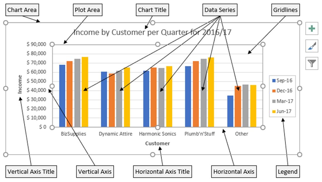
Note the little circles on the corners and midway along each side of the Chart Area and Plot Area. By holding my mouse on these markers, I can resize the chart and the plot area within the chart.
If I click and hold my mouse over the border of a chart element, I can move it. Let’s say I want the Legend inside the chart, I would just single click on the legend and a circle marker appears on the outside of the Legend. I can then ‘grab’ the legend by clicking and holding on the border of the Legend and move it inside the chart. I can also resize the legend using the markers. Note that not all chart elements can be moved, and if I accidentally move an element, I can perform an Undo (or CTRL + Z) to return it back to its previous position.
There are also three symbols on the right of the chart. The plus sign button enables me to add, remove or change chart elements. The paint brush button allows me to set a style or apply a colour scheme to my chart. The funnel button gives me the ability to apply filters, thereby setting what data points and names are displayed.
To change the formatting for any of the chart elements, one of the easiest ways is simply to right click on a chart element. A menu will then appear showing the various options I have to format the chosen chart element.
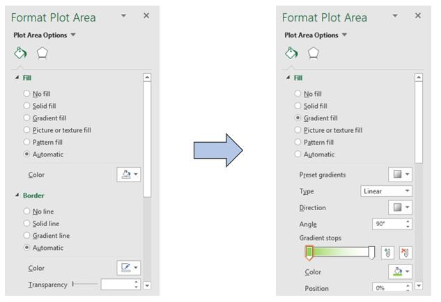
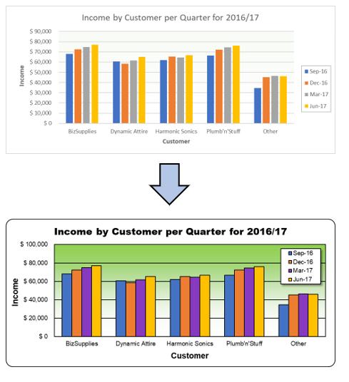
For example, if I want to change the background colour of the Plot Area, I would select the ‘Plot Area’ then right click and choose ‘Format Plot Area’, and a panel appears on the right side of the screen, allowing me to change the Fill and Border of the ‘Plot Area’, as well as many other options.
Let’s say I want the background of the chart to be shaded from green at the top to white at the bottom, I would change the Fill to ‘Gradient Fill’, specifying the colours I want and the direction of the shading.
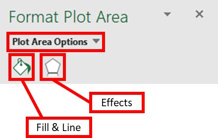
These panels of options are organised into groups, depending on the chart element I have chosen. For the ‘Plot Area’, under the heading of ‘Plot Area Options’, there are two groups, namely ‘Fill & Line’ and Effects.
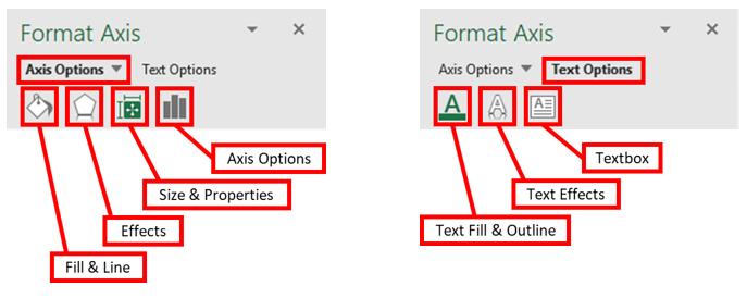
For Axis, there are two headings, being ‘Axis Options’ and ‘Text Options’, and under each there are multiple option groups.
As I go through the chart elements, I also apply some modifications to the chart:
- Changing the fonts and font sizes of the titles and axes
- Changing the line and border colour of the Chart Area, the Plot Area and the Gridlines
- Adding colour to the background of the Plot Area
- Moving, resizing and putting shadow on the Legend
- Changing the colour of data series and applying lines around the data series columns
- Reducing the gap between the data series columns
- Modifying the units / scale for the axes.
I can achieve a chart that ‘pops’!
That’s it for this week; check back next week for more Charts and Dashboards tips.