
Charts and Dashboards: Treemap Charts
13 March 2020
Welcome back to this week’s Charts and Dashboards blog series. This week, let’s look at Treemap Charts.
Like the Sunburst Chart, a Treemap Chart also provides a hierarchical view of data, but instead of displaying the data in a circular format, a Treemap Chart represents the data using rectangles. The top-level category is displayed as a large rectangle with each element within the category shown as a smaller rectangle within the larger one.
The data table needs to be configured exactly the same way I would for the Sunburst Chart:
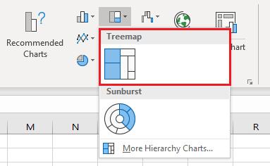
Creating the Treemap Chart is almost identical to creating the Sunburst Chart: select the data table, go to the Insert tab on the Ribbon, select the Treemap Chart from the small middle icon across the top row of the Charts section, or use the ‘Recommended Charts’ icon or the small arrow in the bottom right corner. There is only one type of Treemap Chart available in Excel:
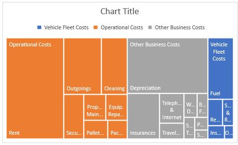
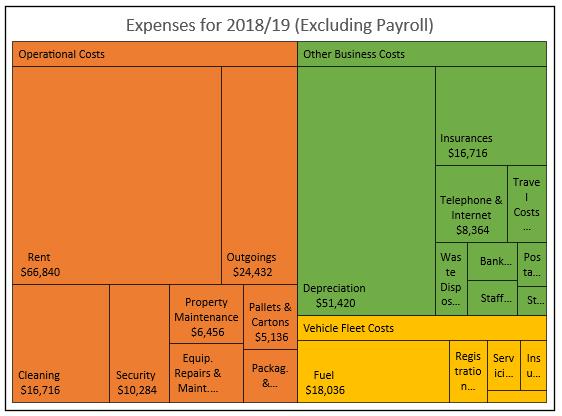
The chart initially appears like this:
The formatting options available for the Treemap Chart are also nearly the same as for the Sunburst Chart, including the limitations on visibility of all data labels and values, and not being able to reorder the data on the chart as Excel automatically sorts and collates the data.
One unique formatting option available for Treemap Charts is associated with how the top hierarchy labels are displayed. In the initial Treemap Chart, as above, you can see the legend at the top listing the categories of the top-level hierarchy, but each of the categories is also a data label within the largest box of each series.
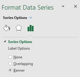
If I click on one of the rectangles thereby selecting a data series, right-click and choose ‘Format Data Series’, under ‘Series Options’, I can choose how I want the top-level categories displayed. The default is Overlapping, so the label sits on top of the largest rectangle in each series. An alternative is to set the ‘Label Options’ to None removing the categories from the chart altogether. The third option is to set the preference to Banner, which displays the categories in their own small rectangle above their data series. If I choose Overlapping or Banner, the legend, which is now unnecessary, may be removed.
I apply some general formatting and the chart is ready:
That’s it for this week, check back next week for more Charts and Dashboards tips.