
Charts and Dashboards: Tornado Charts - Part 2
6 May 2022
Welcome back to our Charts and Dashboards blog series. This week, we’ll begin to construct a Tornado chart.
Last week, we covered the basics of a Tornado chart and how it can be useful. This week, we’ll look at how to begin constructing said chart.

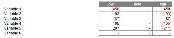
In this example, we have some data regarding how each variable affects a measured output in a Low, Base, and High scenario.
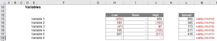
To give the Tornado chart its signature look, we must first rank these variables by the magnitude of the difference it caused. To do this, we begin by looking at the range of the output between the Low and High scenarios. This can be calculated by taking the absolute value of the output in one case, less the output in the other case.
=ABS(J13-H13)
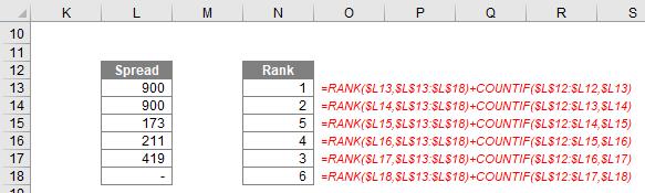
The next step is to obtain the rank of each variable by the magnitude of the effect it has had on the output. This can be achieved by using the RANK formula on our new Spread column:
=RANK($L13,$L$13:$L$18)
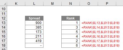
However, this approach could cause issues. If multiple variables have the same Spread, we will see the same Rank figure multiple times, which would become problematic down the line.
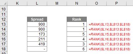
This problem can be avoided by making use of the COUNTIF function to count how many occurrences of a value there have been prior to the one we’re ranking and then adding this to the rank.
=RANK($L13,$L$13:$L$18)+COUNTIF($L$12:$L12,$L13)
The next step will be to reorder our variables into rank order. This can be achieved using the INDEX function in conjunction with the MATCH function to return the name of the variable where the Rank matches a simple ascending counter.
=INDEX(E$13:E$18,MATCH($D23,$N$13:$N$18,0))
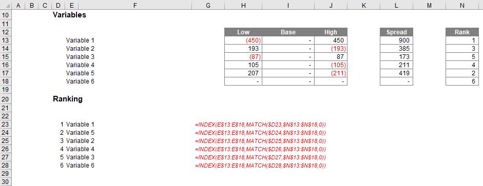
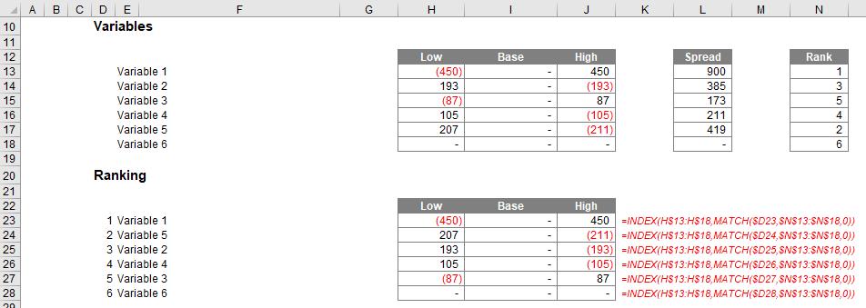
We can use a similar approach to pull down the relevant data for each variable.
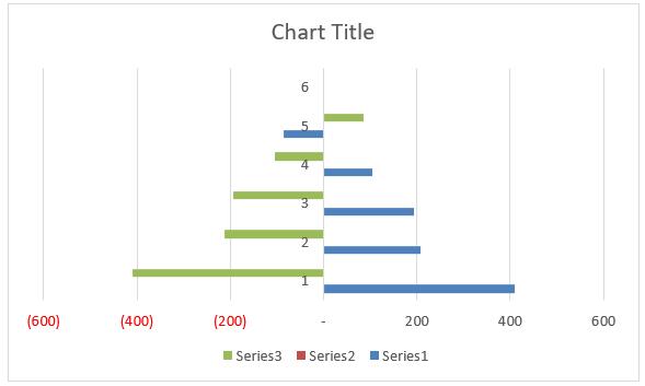
Creating a bar chart of this data won’t quite give you the classic Tornado chart look, but we’re a lot closer now!
We will cover the final steps of creating and formatting the Tornado Chart next week, in part 3.
That’s it for this week. Come back next week for more Charts and Dashboards tips.