
Charts and Dashboards: Target Practice
11 June 2021
Welcome back to our Charts and Dashboards blog series. This week, I look at creating a presentation of actual vs. target sales.
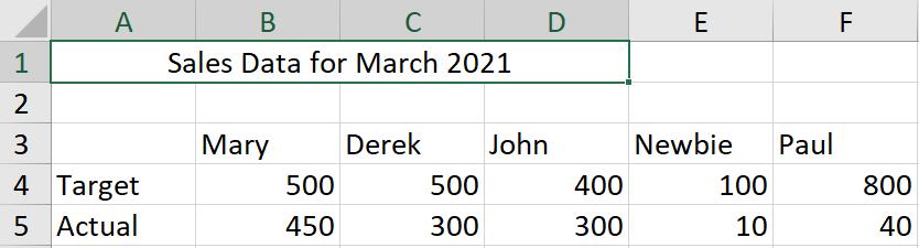
I have some sales data for some imaginary salespeople.
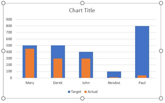
I’d like to show this in a chart. I start by creating a basic column chart for my data. I select the data and use ALT + F1 to insert a chart.
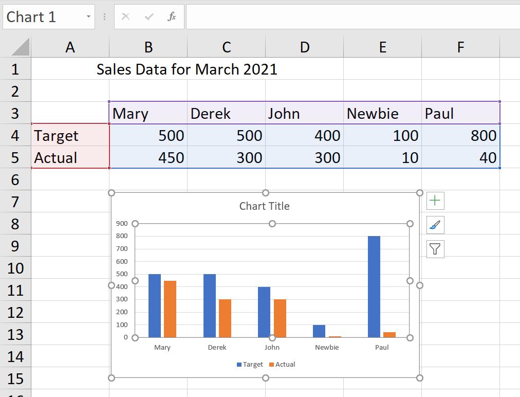
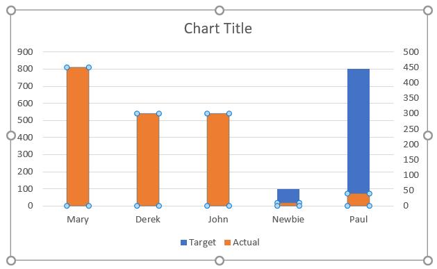
That’s okay, but it’s not really highlighting the achievements of my salespeople. I’d like to show the actual sales within the target bars. I start by clicking on one of the bars for the Actual data series.
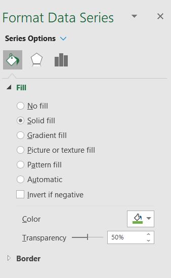
I can then right-click and choose ‘Format Data Series’.
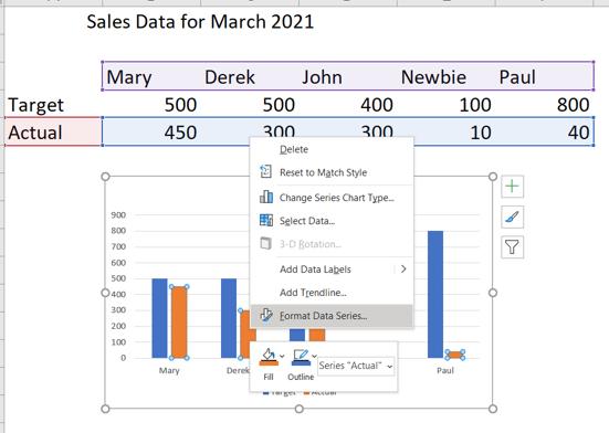
In the Format Data Series pane, I have the option to move my series to a ‘Secondary Axis’.
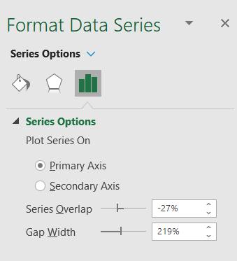
I choose this option, where the bars are overlapping, but it’s not making things any clearer yet!
To continue formatting, I select the Target data series and go back to the ‘Format Data Series’ pane. This time, I am interested in the ‘Gap Width’ of the bars.
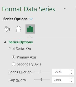
I change the ‘Gap Width’ to 100%.
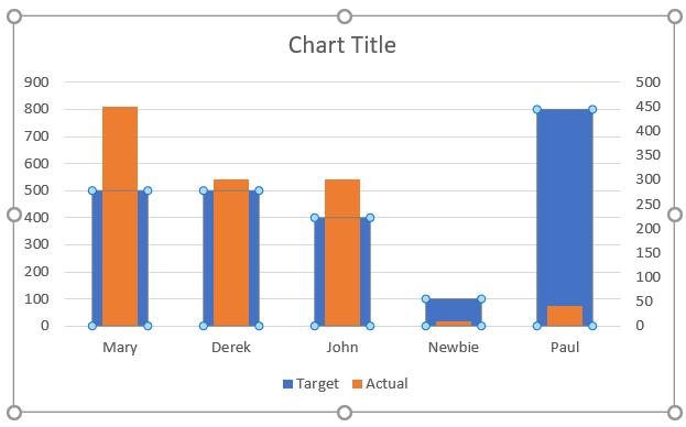
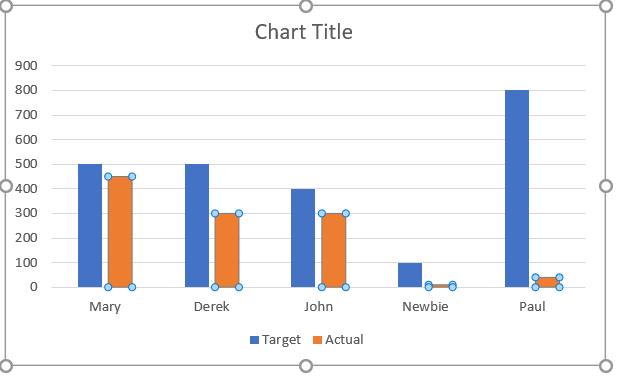
This is getting better; now I can see both bars. The sizes are not in proportion because I have two different vertical axes. I delete the one on the right by selecting it and pressing DELETE.
This is more like it. Now I can work on the aesthetics. I pick a light green for the Target series and a dark green for the Actual series. I can do this from the ‘Format Data Series’ pane. I use the ‘Transparency’ property to make the fill colour of the Target series lighter.
I change the colour of the Actual series (with no transparency) and click and edit the ‘Chart Title’.
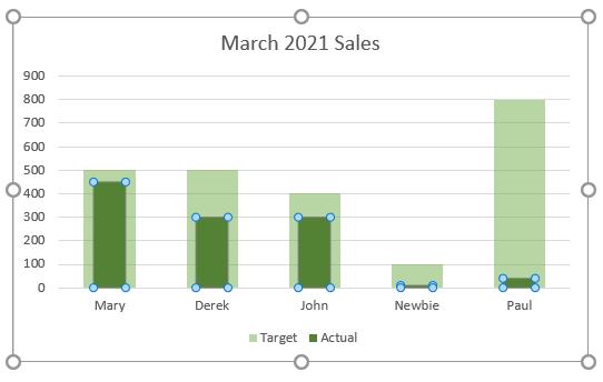
I can now see at a glance how well my salespeople are doing relative to their targets. By picking light and dark colours, this would also be visible on a black and white printed document. Next time I’ll look at another way to show actual sales vs. target sales.
That’s it for this week. Come back next week for more Charts and Dashboards tips.