
Charts and Dashboards: Symbol Charts – Part 1
16 October 2020
Welcome back to this week’s Charts and Dashboards blog series. This week, we consider the pre-work for Symbol Charts in dashboards.
Adding symbols into tables or charts can be a great visual aid to the numbers and a helpful way to quickly communicate where end user focus is needed.
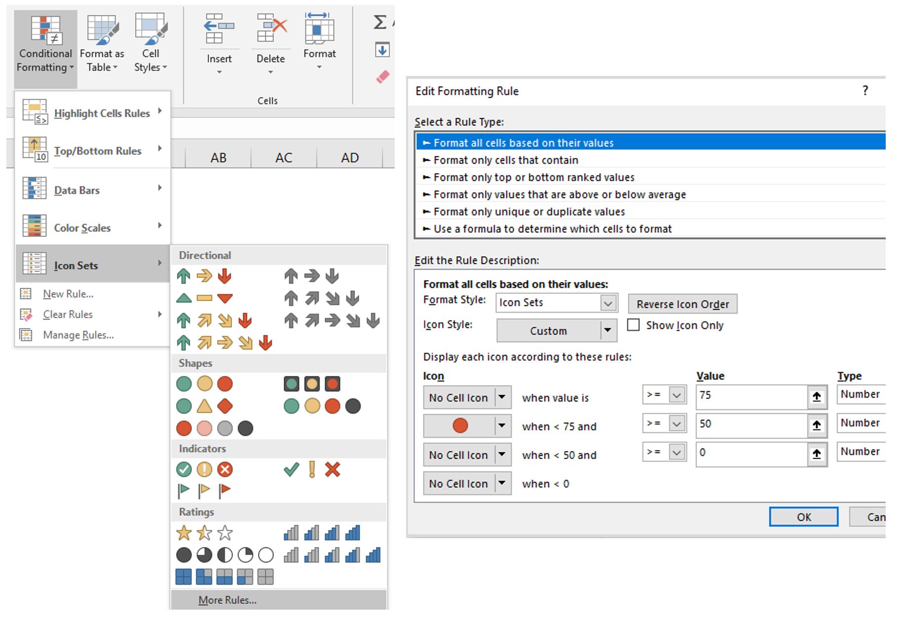
Symbols can be added to data using Conditional Formatting. On the Home tab, click ‘Conditional Formatting’, then choose which type of symbol you would like to use and set your customised rules, if you wish to, in ‘More Rules’.
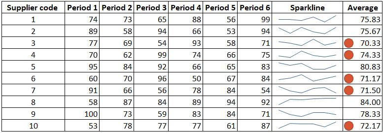
For example, we have a data set of internal supplier ratings. We want to focus on whether to exclude suppliers with an under-75 average score. Therefore, we put a red dot next to any cell matching this condition. If we add a sparkline here, there will be an additional clue when we evaluate the criteria. For instance, Supplier 10 has an average score under 75. However, the sparkline shows that the rating exhibits an upward trend, which should be taken into consideration before exclusion.
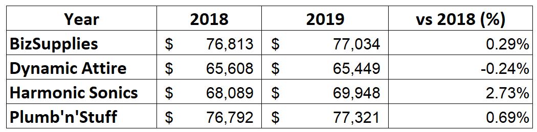
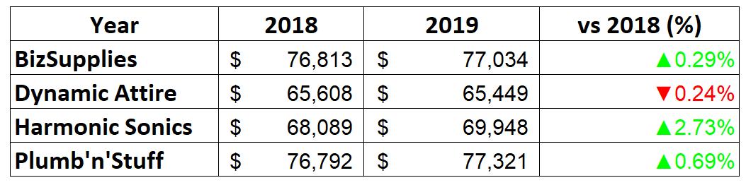
Frequently, we need to include an icon indicator. As an illustration, imagine we have sales data as below and we need to produce a chart which can show the 2018 data with simple icons depicting the changes over the year:
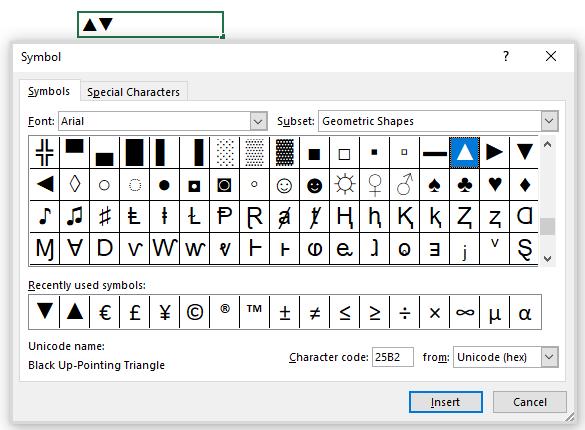
To do this, first, we have to format the cells to indicate the increase / decrease (demonstrated by the vs 2018 (%) column). In a blank cell, we may need to insert the up / down arrow symbol by going to the Insert tab, and clicking Symbol. For quick navigation, in the Font box, you may also choose Arial.
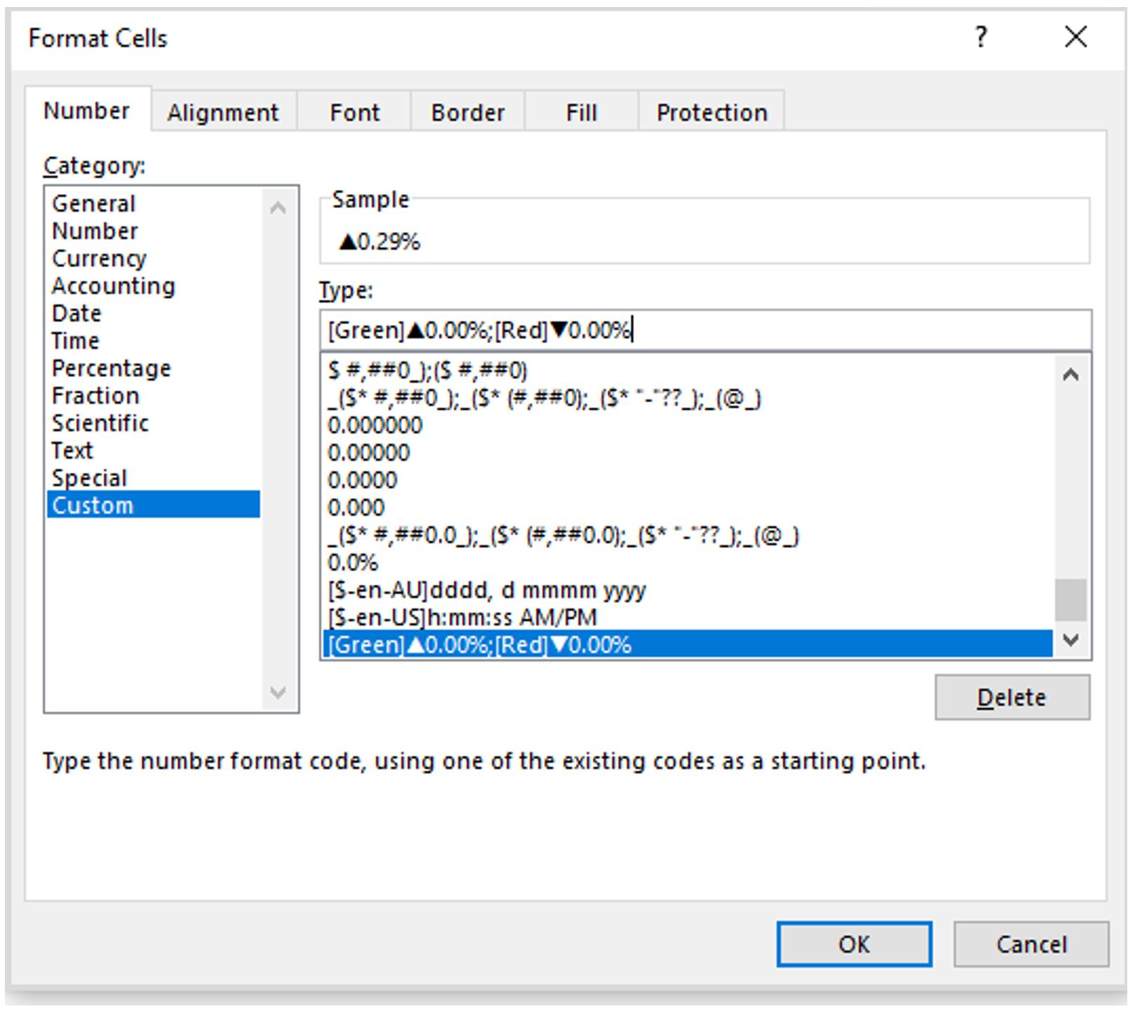
Then, we can use these symbols in the cell formatting. Select the cells we need to format (vs 2018 (%) column), and in the ‘Format Cells’ dialog, and choose Custom (the last item on the list), where we type:
[Green]▲0.00%;[Red]▼0.00%
In English, this means a positive number will be green and a negative number will be red (both formatted as percentages to two decimal places), together with the associated icons.
After cell formatting, the data table will now display as follows:
It’s better to create a chart that illustrates this data with the assigned symbol, but that’s for next time!
That’s it for this week. Check back next week for more Charts and Dashboards tips.