
Charts and Dashboards: Stock Charts
20 March 2020
Welcome back to this week’s Charts and Dashboards blog series. This week, let’s look at Stock Charts.
A Stock Chart, or Candlestick Chart, is a form of Column Chart specifically designed to plot movements in stock market commodities (e.g. currencies, securities) over time.
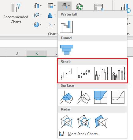
There are four different types of Stock Charts available:
- the first chart type requires three data series, being the high, low and closing prices of the commodity
- as well as these three series, to use the second Stock Chart, I must also include the opening prices
- the third chart type requires the same three price series as the first chart plus the volume traded
- the final Stock Chart type requires all five series - volume traded and the opening, high, low and closing prices.
I am going to use the fourth Stock Chart, so I need to create a data table which includes the relevant columns:
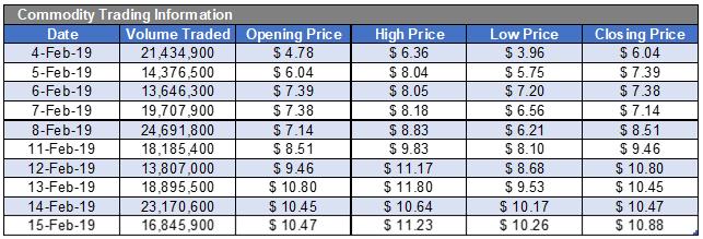
Note the order of the columns in the table above. This is very important as Excel is expecting the data to be laid out a certain way in order to properly graph the figures. The date must be in the first column, the volume traded in the next column, the opening prices in the third column, etc.
Once the table is ready, I highlight the data and create the Stock Chart applying the fourth chart type. The initial chart should resemble the following:
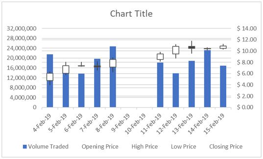
So how do I read this chart? There is a fair bit to take in with this chart. There is a gap in the data, lots of horizontal gridlines and several floating black and white boxes with lines going through them.
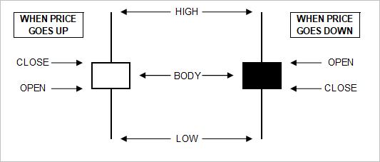
Let’s start with the blue columns. As the legend indicates, these represent the volumes traded. The gap in the data is because the stock market does not trade on weekends, but given this is a chart based on a time series, it needs to have a continuous sequence of dates, regardless of whether they are provided in the data or not. The multitude of gridlines is purely due to the two vertical axes on the sides of the chart, each displaying gridlines relevant to their numeric scales. The black and white boxes with lines sticking out of them are generated from the four pricing series in my data table. The best way to read this part of the chart is by referring to the following diagram:
If I look at the data table, on 4 February the opening price was $4.78 and the closing price was $6.04, so the price went up that day, resulting in a white box, or body as it is known. The highest price for the day was $6.36, so only 32 cents higher than the closing price resulting in a short line extending upwards out of the body. The lowest price traded was $3.96, which is 82 cents below the opening price, so the line extending down from the body is longer. If the price goes down, as occurred on 7 February, the body is represented by a black box.
So now that I understand how to read the chart, I want to apply some formats to make it “easier on the eyes”.
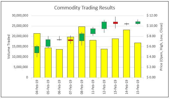
- I add ‘Axes Titles’ on both sides by clicking anywhere on the chart, then go to the Design tab on the Ribbon, click on ‘Add Chart Element’ and choose ‘Axis Titles’ and ‘Primary Vertical’, then go back and add the ‘Secondary Vertical’. I click on each title then change the wording to “Volume Traded” on the left and “Price (Open, High, Low, Close)” on the right. While I am changing text, I also change the ‘Chart Title’ to ‘Commodity Trading Results’
- With ‘Axes Titles’ in place, I no longer need the legend so I can click on the legend and then press the DELETE key or right-click and choose Delete
- To simplify the gridlines, I need to alter the units in the scales on both axes. If I set the volumes to range from 0 to 30,000,000 in increments of 5,000,000 and set the prices to range from $0 to $12 in increments of $2, then both scales will have six gridlines each, providing one set of gridlines that apply to both axes. To arrange this, I click on the left vertical axis, right click, choose ‘Format Axis’, then under Bounds, set the Minimum to zero and Maximum to 30,000,000 and under Units set the Major to 5,000,000. Next, without closing the ‘Format Axis’ panel, I click on the right vertical axis and set the Minimum to zero, the Maximum to twelve and the Major to two
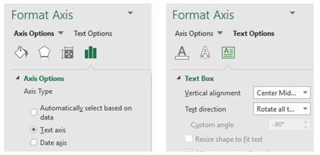
- I also want to remove the weekend dates so the chart can use all the space available and not have this gap. To resolve this, I click on the horizontal axis, right-click and choose ‘Format Axis’. Under ‘Axis Options’, I set the ‘Axis Type’ to be ‘Text Axis’. If the dates on the horizontal axis are at an angle and I want to straighten them up, I click on ‘Text Options’ and set the ‘Text Direction’ to be ‘Rotate All Text 270°’
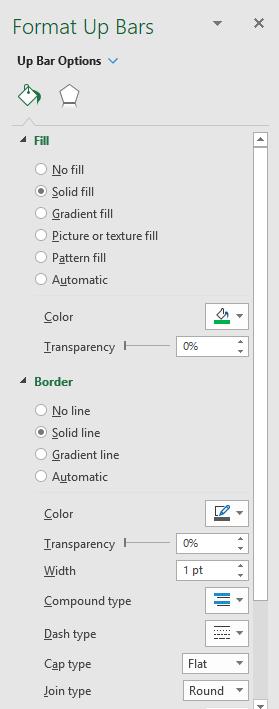
- Next, it is recognised in the trading industry that the standard colours used to indicate movements in commodity prices is green when the price goes up and red when it goes down. I will put aside potential issues with visual impairment for the moment. I click on one of the white boxes, right click and choose Format Up Bars, and change the fill colour from white to green. While I am in the formatting panel, I go to where it says ‘Up Bar Options’ at the top on the panel, click on the drop-down arrow and select ‘Down Bars 2’ and change the fill colour so the black boxes are now red
- I would also like to tone down the formatting of the volume traded series, so at the top of the Formatting panel, where it presently states ‘High-Low Line Options’, use the drop-down arrow and select ‘Series “Volume Traded” ‘. Change the fill to a softer colour and add a black border on the data series
- Also, note that the width of the volume columns and the width of the open-close boxes is the same, which means that if the volume traded column happens to stop behind an open-close box, I may not be able to work out what the volume was. To fix this, while still in the ‘Format Data Series’ panel, I click on the ‘Series Options’ icon (it looks like a small Column Chart) and reduce the ‘Gap Width’ to 75%.
With all the modifications complete, here is the chart I have now:
That’s it for this week, check back next week for more Charts and Dashboards tips.