
Charts and Dashboards: Step Chart
15 October 2021
Welcome back to our Charts and Dashboards blog series. This week, I create a Step chart.
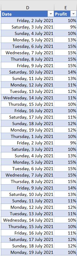
I am analysing the profit on rentals that my imaginary salespeople secured in the first part of July. Currently, I am using a standard Line chart:
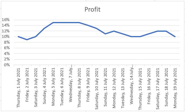
I am looking for trends, but it’s not immediately obvious where we have had periods of consistent profits and when profits have sharply increased or decreased. I would prefer to see my data like this:
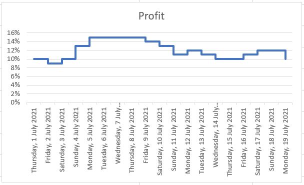
On this Step chart, I can see where the increases in profit occur, and how large the increase is.
To get my chart in this format, I need to go back to my original data.
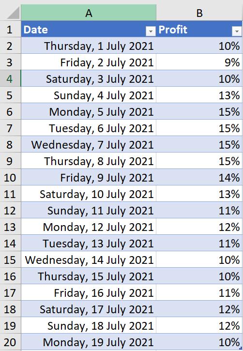
I need to create a ‘stepped’ data set – I can do this by creating a new data set. The first column steps the Date forward ( = $A3), and the second column is the Profit from the original Date ( = $B2):
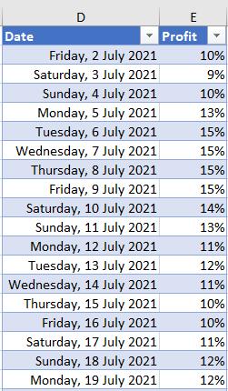
This will be the first line in a 2-D Line chart. Don’t worry about the first Date or the last Profit, I am about to include them. Next, I copy the original data and paste it onto the bottom of the new dataset. This will be the second line in the 2-D Line chart:
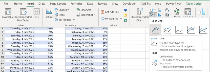
The next step is to choose a 2-D Line chart from the Charts section of the Insert tab:
This gives me the Step chart I am looking for:
To see why it works, consider the data at one of the pivotal dates, for example Sunday 4th July. The first half of the dataset has a Profit value of 10%, which is Saturday’s profit, giving me the starting point. The second half of the dataset has a Profit value of 13% which is Sunday’s profit. So Sunday is represented by a vertical line showing an increase of 3%. On a date where the profit doesn’t change, for example Tuesday 6th July, the corresponding Profit in the first and second half of the data set is the same, so Tuesday is represented by a horizontal line representing one (1) day with no change.
That’s it for this week. Come back next week for more Charts and Dashboards tips.