
Charts and Dashboards: Sparkling Sparklines Part 1
12 November 2021
Welcome back to our Charts and Dashboards blog series. This week, I return to Sparklines.
The basics of Sparklines were covered in our Charts and Dashboards Blog: Sparklines. But let’s revisit. Consider the following:
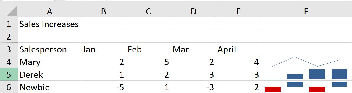
I have some simple sales figures, and I have used an example of each type of Sparkline.
- F4 is a Line
- F5 is a Column
- F6 is a Win / Loss.
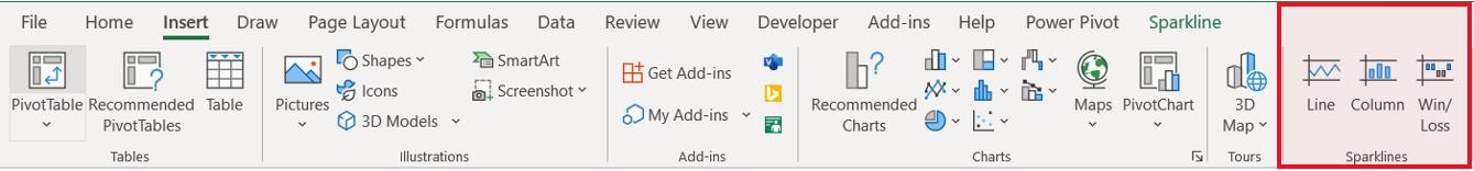
In each case, I have selected the cell I want the Sparkline to appear in, and then from the ‘Insert’ tab I chose the relevant chart type from the Sparklines section:
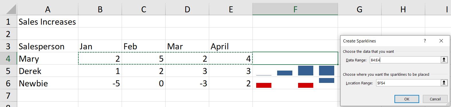
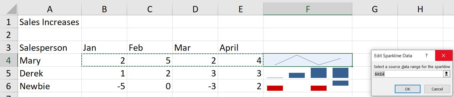
I can then specify the range and location in the dialog that appears:
Each type of Sparkline is dynamic in several respects:
- if the underlying data set changes, then the Sparkline will reflect this
- if the cell size containing the Sparkline is changed, then the Sparkline remains in proportion with the cell.
To demonstrate, I change one of the values for Newbie and widen column F. This will change the Sparklines:
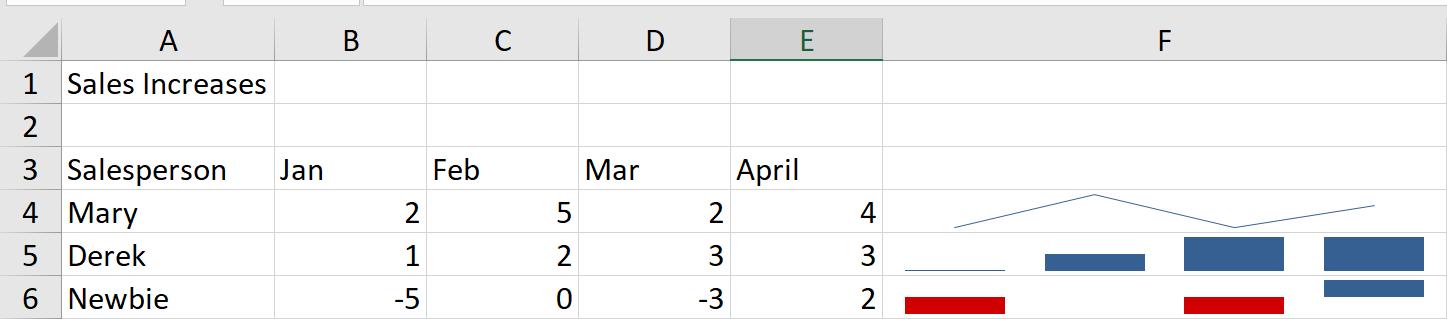
The Win/Loss Sparkline only shows an increase or decrease, so for Newbie, -5 is represented by the same thickness of bar as -3. Changing the values for Newbie only changes the Sparkline if the sign of the number changes (or becomes zero [0], as in this example).
If I were to change the data range a Sparkline is based upon, I can select the Sparkline and choose the Sparkline tab where I have an ‘Edit Data’ dropdown.
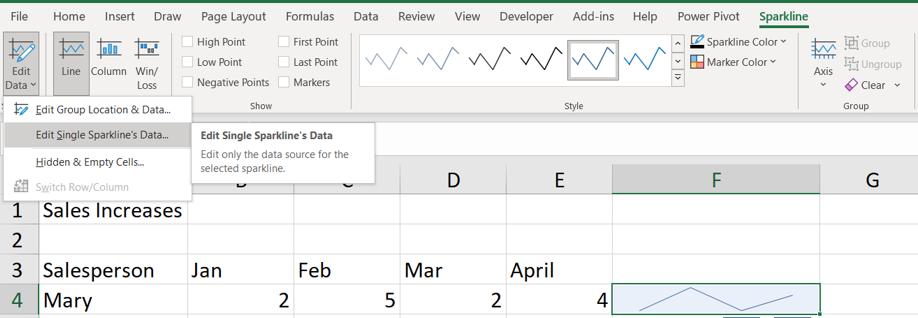
For this example, I choose the ‘Edit Single Sparkline’s Data’ option:
There are other options on the Sparkline tab that can help me when I have missing data. To show this, I will remove the value for March for Mary:
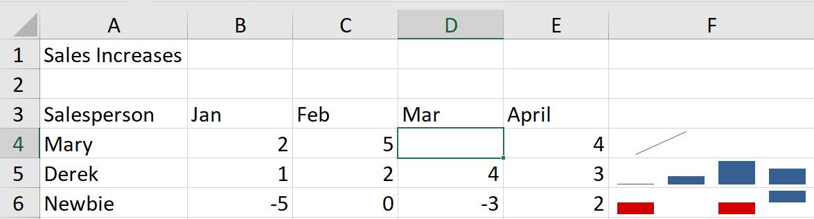
The Line Sparkline does not look so good now. If I select the Sparkline, and choose the ‘Edit Data’ option as I did earlier, there is an option for dealing with ‘Hidden & Empty Cells’:
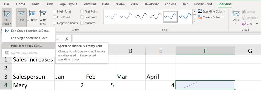
This gives me a dialog:
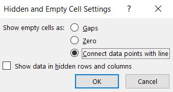
I would like to ‘Connect the data point with line’, which is only available for Line Sparklines.
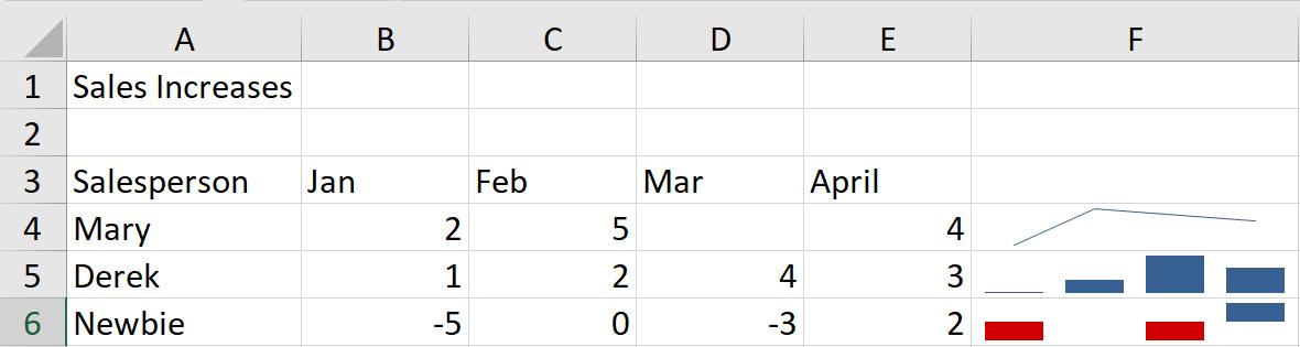
The Sparkline for Mary looks much better now. I’ll look at some more ways to use Sparklines next time.
That’s it for this week. Come back next week for more Charts and Dashboards tips.