
Charts and Dashboards: Presentation Pitfalls Part 3
18 February 2022
Welcome back to our Charts and Dashboards blog series. This week, I look at more pitfalls when using Charts with multiple axes.
Consider the following chart, which purports to compare legendary salesperson Mary’s performance last year with Newbie:

Newbie seems to have done better than Mary at times on this Line chart that he has helpfully created. Both vertical axes go up to 300, so this chart looks at first glance like a fair representation.
Looking more closely, it’s not quite right. If I check the point the vertical axes meet the horizontal axis, I can see that Mary’s (left-hand) axis starts at 100, whereas Newbie’s (right-hand) axis starts at zero [0].
I can adjust this by selecting Mary’s axis and right-clicking.

I choose to ‘Format Axis’:
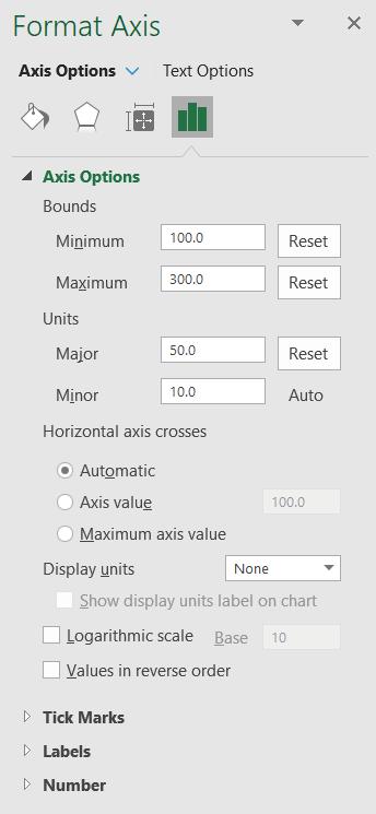
In the Bounds section, I change the Minimum to zero [0]:
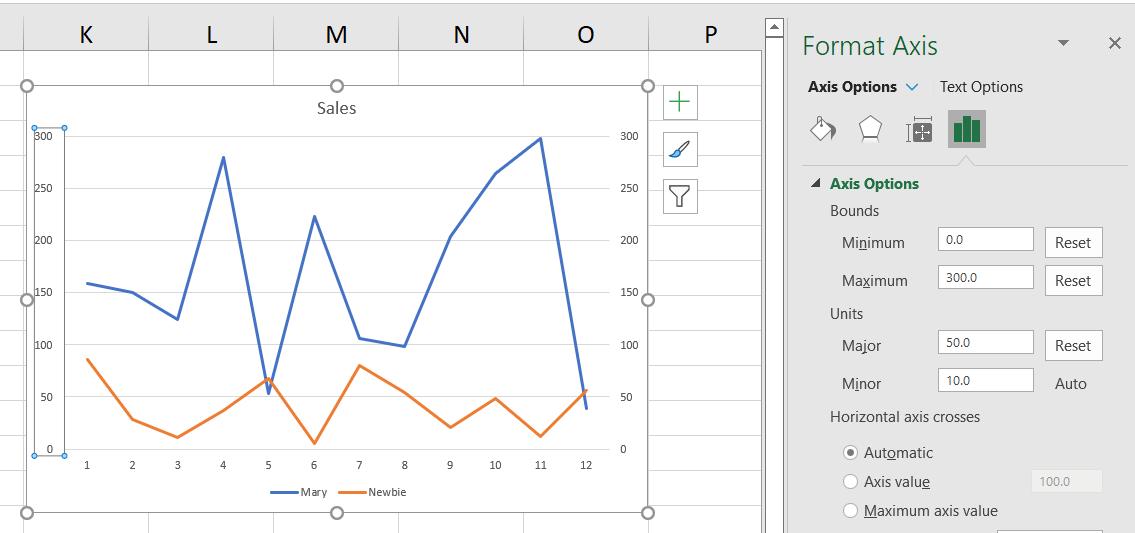
Now it is clear from the Line chart that Newbie is not doing quite as well as he was trying to pretend. Using different baselines can skew the data, meaning that the Line chart is misleading.
Newbie may not be doing well at selling, but his Excel skills are improving!
That’s it for this week. Come back next week for more Charts and Dashboards tips.