
Charts and Dashboards: Pie of Pie Charts
7 February 2020
Welcome back to this week’s Charts and Dashboards blog series. This week, I will look at Pie of Pie Charts.
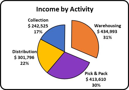
Apart from Pie Charts, Excel also offers ‘Pie of Pie’ and ‘Bar of Pie’ chart variations. Below is the Pie Chart where Warehousing stands out as the largest wedge, which was created in last week’s blog:
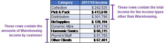
Imagine that I want to further breakdown the Warehousing income by customer in the one chart. Setting up the data correctly is pivotal. To start, instead of having total Warehousing income, I need to replace it with the breakdown by customer, and this data must be at the bottom of the data table:
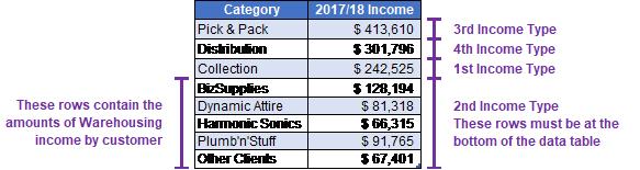
However, the categories are now out of sequence, as I have Collection, then Pick & Pack, Distribution and finally Warehousing, where Warehousing should be between Collection and Pick & Pack. Note that the data is being plotted in a circle. It doesn’t matter which item is at the top or bottom so long as the cyclical order is maintained. Therefore, the top section of the table needs to be reorganised so that Collection income is immediately above the Warehousing income lines and then where Pick & Pack Distribution would normally be below Warehousing, they will now be at the top of the data table so that I keep the Warehousing income lines at the bottom for creating this Pie of Pie chart.
The final data table would look like the one below:
Having the data table ready, I highlight it and click Insert, choose the ‘Pie Chart’ icon. This time, I choose the ‘Pie of Pie’ variation and the following chart should appear:
This chart is initially confusing until I match the legend to the segments and realise that Excel has only taken the bottom three rows of the data table and plotted these in the smaller Pie Chart, so I need to configure the chart.
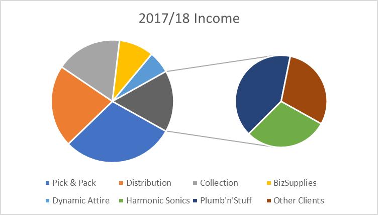
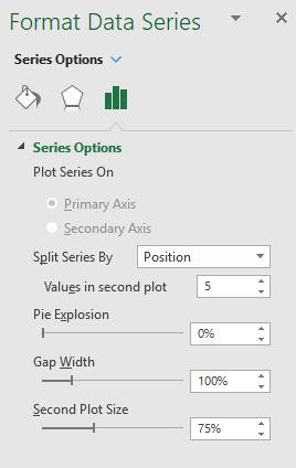
I right-click on the chart and choose ‘Format Data Series’, then set the ‘Values in the second plot’ to be five, to match the number of rows relating to Warehousing income in my source data.
Let’s also add data labels and format them the same as I did for the first Pie Chart at the beginning, remove the Legend and make Warehousing “explode” slightly.
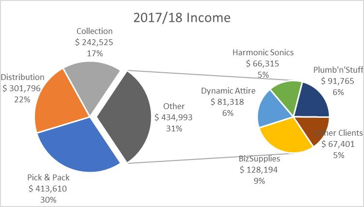
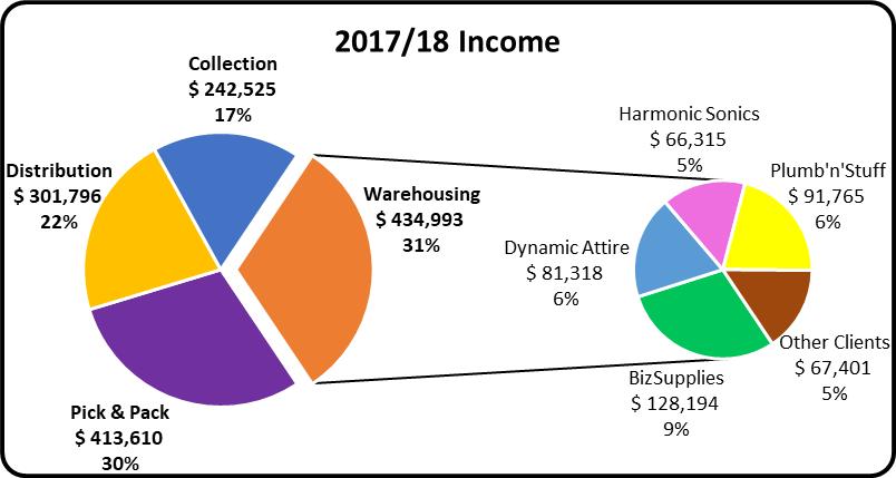
Here, the Warehousing segment is labelled Other, as Excel does not have any wording to apply to this wedge from my data table. To change the label, click on the any of the data labels. All of them will be selected. Then, clicking a second time on the Other data label will release the other three labels. I click the third time on the Other label and now I can modify the text within this label. I also move the ‘Other Clients’ label in the smaller Pie Chart so that it does not overlap the wedge. Once this is done, I do some further formatting as usual and here is my ‘double pie’:
That’s it for this week; check back next week for more Charts and Dashboards tips.