
Charts and Dashboards: Moving Chart Labels – Part 1
23 April 2021
Welcome back to this week’s Charts and Dashboards blog series. This week, we will talk about creating a chart label that can move.
Chart labelling is an interesting topic. We have previously talked about the Dynamic Chart Labels and played around with the Dynamic Chart Labels for Stacked Column Charts. Over the next two blogs, we want to discuss more tips concerning creating a chart label that can move along with its associated data series.
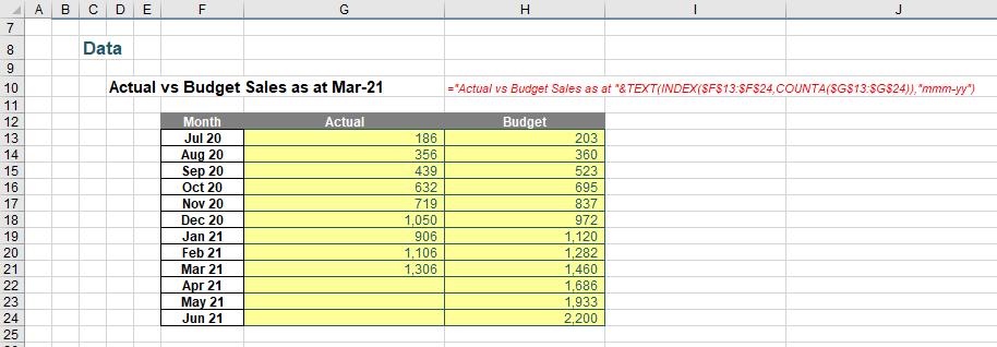
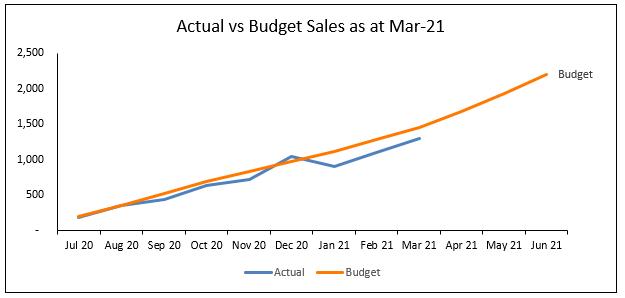
For example, imagine we have data for actual and budget sales for a given financial year. Actual data will be filled in at the close of each month, e.g.
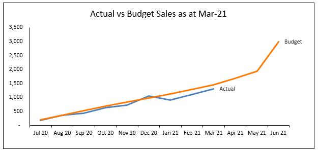
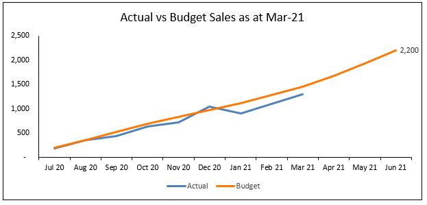
We want to create a line chart to illustrate the sales performance against the budget data. We will not need the legend for the chart, as we wish to place the labels next to the end point of each series, which move depending upon the data we input, as illustrated below:
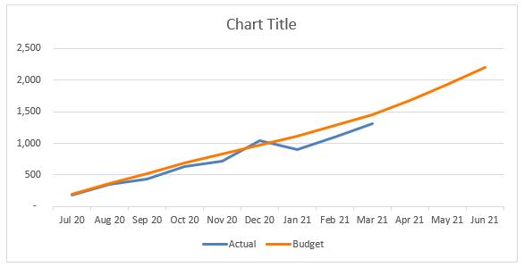
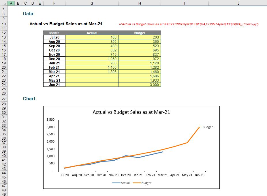
First, to create a chart, select the range F12:H24 and navigate to the Insert tab on the Ribbon, and then select a line chart. The initial line chart will look like the one below:
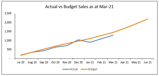
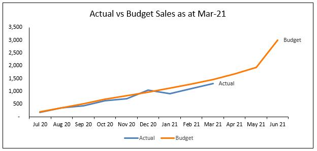
We will undertake some formatting at this point. First, we will extract the dynamic chart title by pointing it to cell D10. Then, we will remove the gridlines from the chart area and emphasise the border line for the two axes. You can read more about formatting the line chart here. The chart now appears like below:
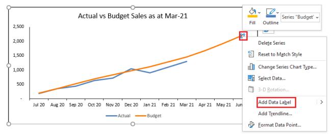
To get the series chart label for only the end point of a series, click on the series, then click once again on the data point we want to add the label on, right-click and choose ‘Add Data Label’.
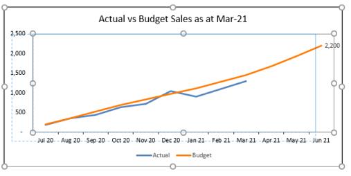
As the label stays too close to the chart border, we will resize the plot area.
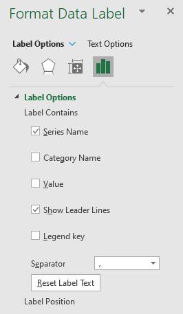
To change the chart label to the series name instead of the data value, right-click on the data point (not the label) and select ‘Format Data Label’. In the ‘Format Data Label’ pane, under ‘Label Options’, tick ‘Series Name’.
The chart will now look like the one below:
If we change the budget data, the label is moving with the chart series.
We will repeat the same process to get the label for the Actual series.
However, when we add more data to the chart, the label is not moving and is overwritten by the series line.
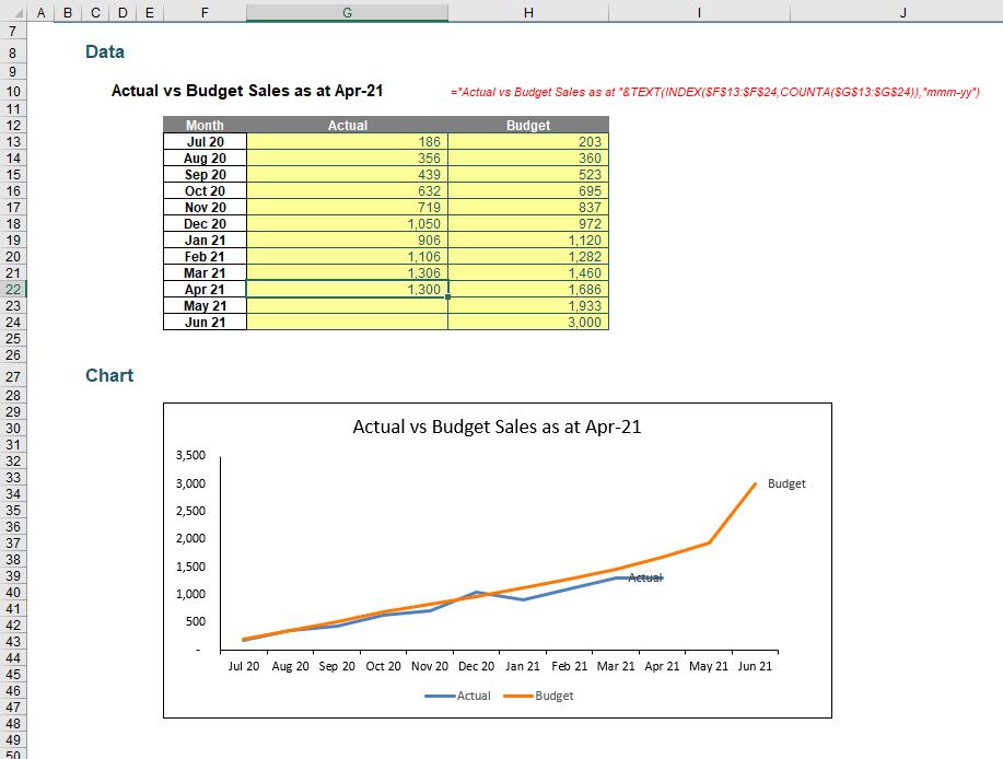
This is because we are adding data label for a single point in the series, so the data label is not dynamic yet. Of course, we can find a way to fix this, but that’s for next time…
That’s it for this week. Come back in a fortnight for more Charts and Dashboards tips.