
Charts and Dashboards: Marking Milestones - Part 2
9 July 2021
Welcome back to our Charts and Dashboards blog series. This week, I continue to plot milestones on a timeline.
Last time, John, my favourite imaginary salesperson, had a list of tasks to complete to secure a new contract.

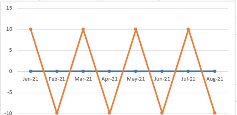
I created a chart with all the data I want to show, but the chart I created doesn’t look like milestones on a timeline yet:
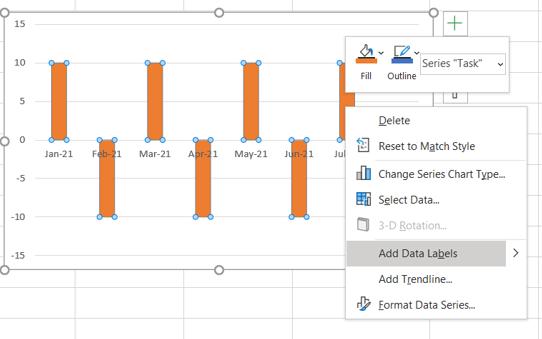
I need to format my chart. I can click on any Task point and right-click to ‘Change Series Chart Type’:

I change the zigzag to a column chart.

The next step is to right-click on one of the columns and access the ‘Format Data Series’ pane. I choose to plot the series on a secondary axis. Also, note that choosing this chart can affect the horizontal axis, but I can adjust the line later.

I don’t want to see the axis on the right, so I delete it.

This is starting to take shape, now I go back to ‘Select Data’ on the ‘Chart Design’ tab, where I can Edit the horizontal axis again. This time I want to change the axis labels.

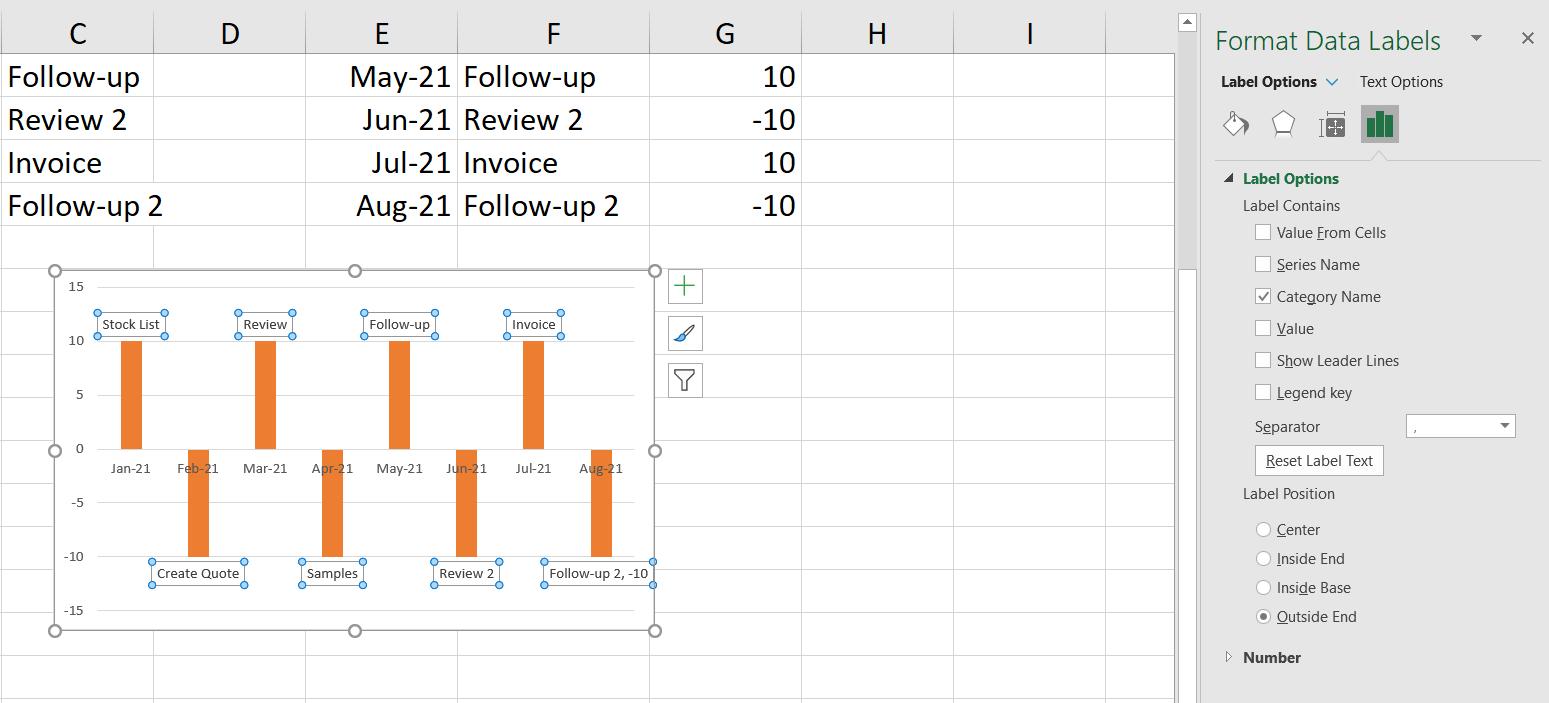
Now I can select one of the bars, and right-click it to ‘Add Data Labels’:
I can then right-click on a data label to access the ‘Format Data Label’ pane. I only want the ‘Category Name’ to appear.
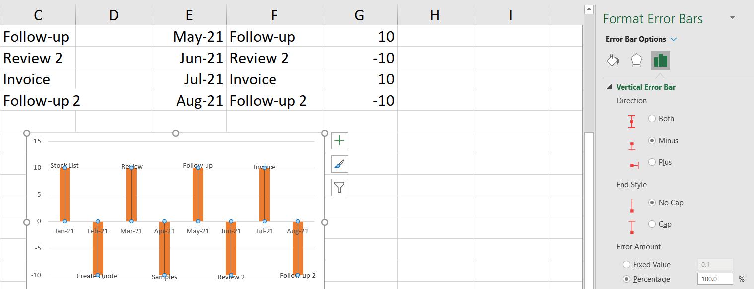
I can move the labels slightly by dragging them to the tip of the bar. Next on the ‘Chart Design’ tab, I am going to use ‘Add Chart Element’ to access the ‘Error Bars’ functionality:
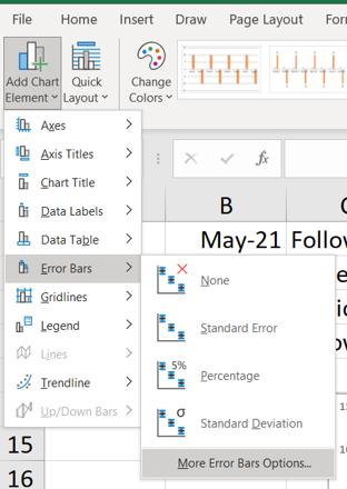
In ‘More Error Bars Options’ I can format the error bar for the Task series in a specific way: I want to set ‘Vertical Error Bar’ to ‘Minus’, ‘End Style’ to ‘No Cap’ and ‘Error Amount’ to 100 percent.
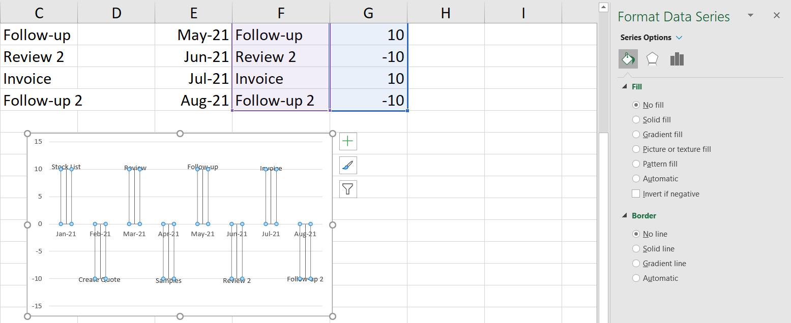
I can now change the bars in Format Data Series. I want ‘No Fill’ and no border (‘No Line’ in Border)
I edit the horizontal axis to show a black line, and edit the gridlines so they do not appear. I can also remove the other vertical axis if I wish. My timeline is complete:

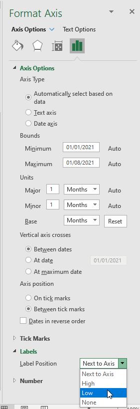
If I don’t want the dates to appear directly under the timeline, I can move the labels to make the chart easier to read. To do this, I right-click on the horizontal axis and go to ‘Format Axis…’:

In the resulting ‘Format Axis’ pane, on the fourth Axis option, change the ‘Label Position’ to ‘Low’ (pictured):
Voila!

That’s it for this week. Come back next week for more Charts and Dashboards tips.