
Charts and Dashboards: Introduction to Data Ranges and Data Tables
8 May 2020
Welcome back to this week’s Charts and Dashboards blog series. This week, let’s briefly go through data ranges and data tables for charts.
Data Ranges
A data range is simply a set of data that has been organised in a certain way for it to be converted into a chart, viz.
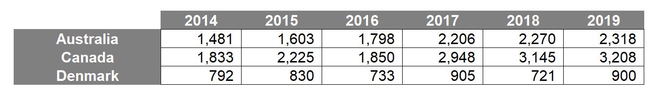
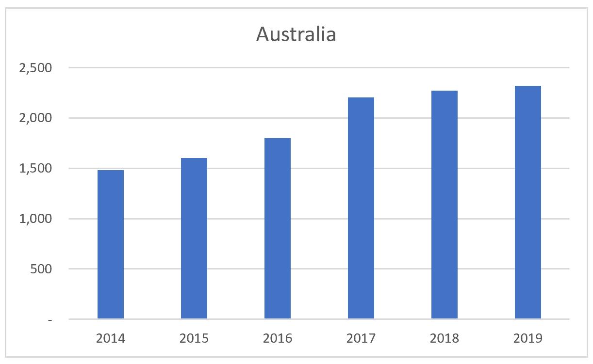
In general, good chart data is data that is structured in such a way that is easy to construct the consequential chart. For instance, to create a bar chart, data would be best organised in a continuous range of cells:

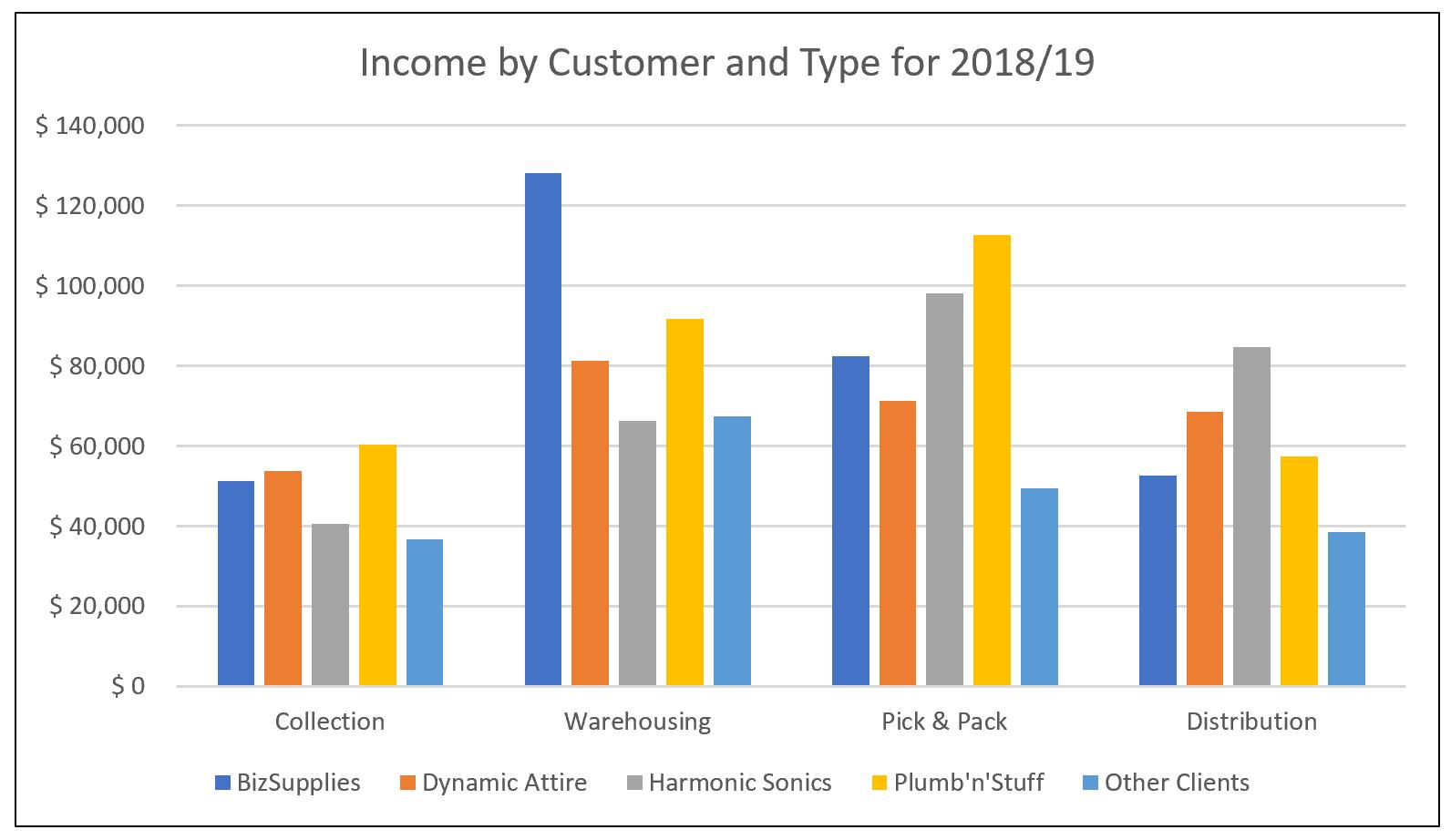
The table above will produce the following graph:
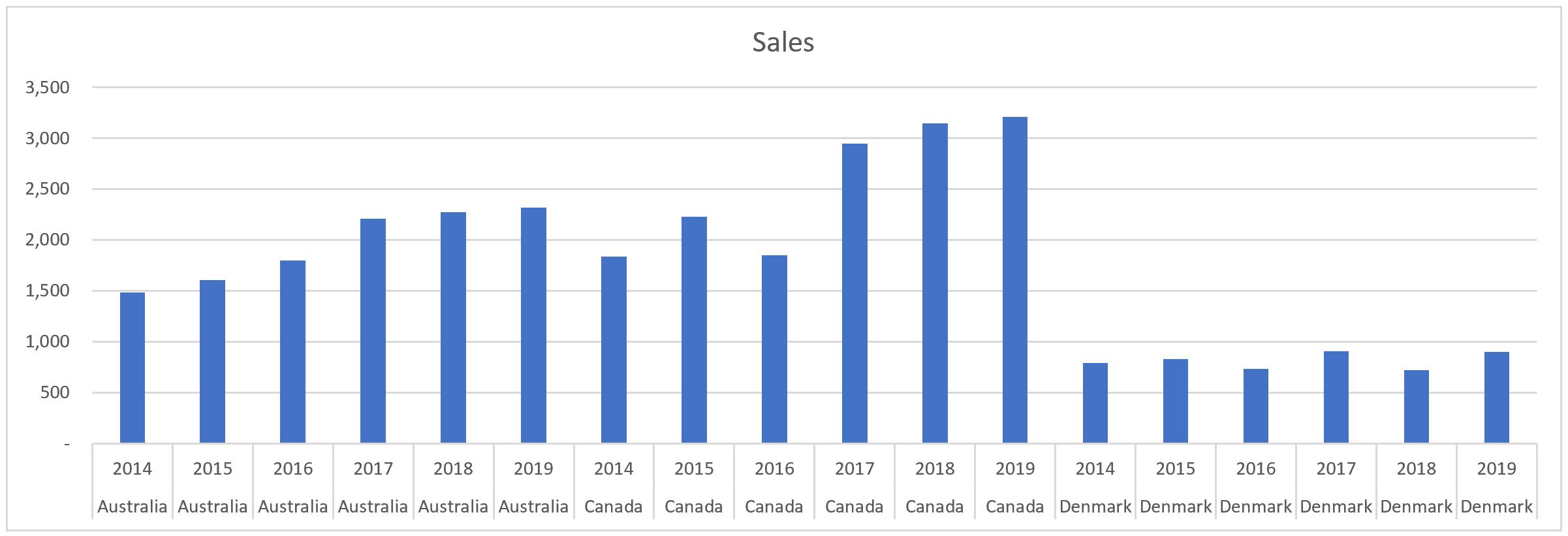
The following image is still considered a data range; it is just not formatted:
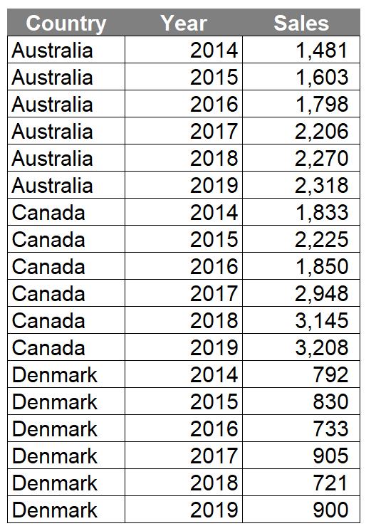
Now to be clear the data is neither dirty nor bad. The data is just in a format that is not in a favourable format when creating a chart, e.g.
Data Tables
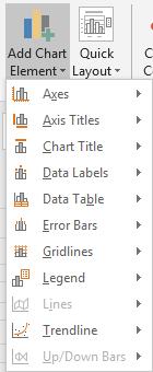
Charts may be built with a data table displayed within the chart. The ‘Data Table’ option may be enabled through selecting the chart:
Navigate to the Design tab on the Ribbon and then select the ‘Add Chart Element’ option in the ‘Chart Layouts’ group:
This will bring down a dropdown menu where I can select the ‘Data Table’ option.
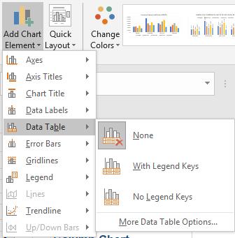
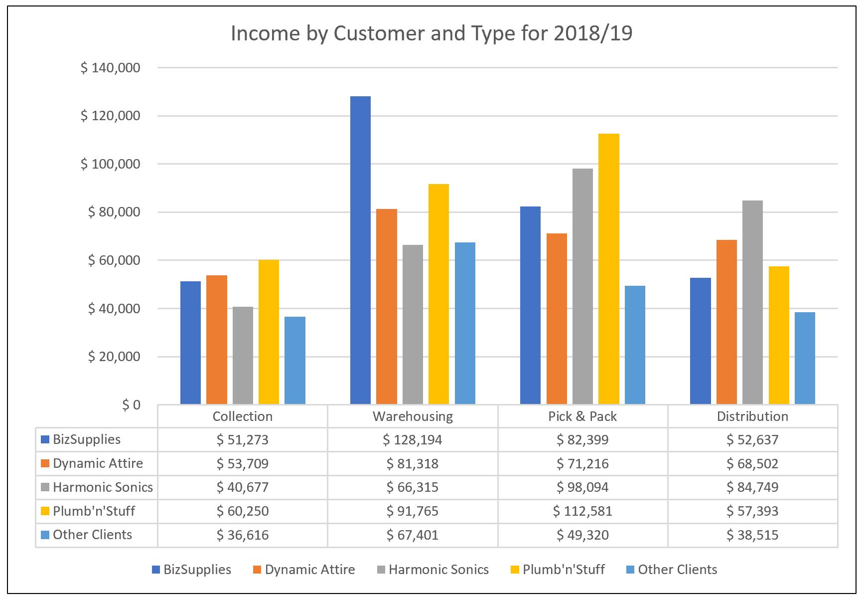
I can then opt to have a data table with or without legend keys. In the example below, I have opted to include legend keys so that it is easier for the end user to understand:
Data tables are an important tool to have in your toolkit while producing dashboards. Data tables represent another useful way to show how different scenarios will play out when flexing certain key inputs. When you have one input to flex you can simply use a one-dimensional table.
That’s it for this week, check back next week for more Charts and Dashboards tips.