
Charts and Dashboards: Highlighting Data
5 June 2020
Welcome back to this week’s Charts and Dashboards blog series. This week, let’s talk about how we can highlight one or more data points in a chart.
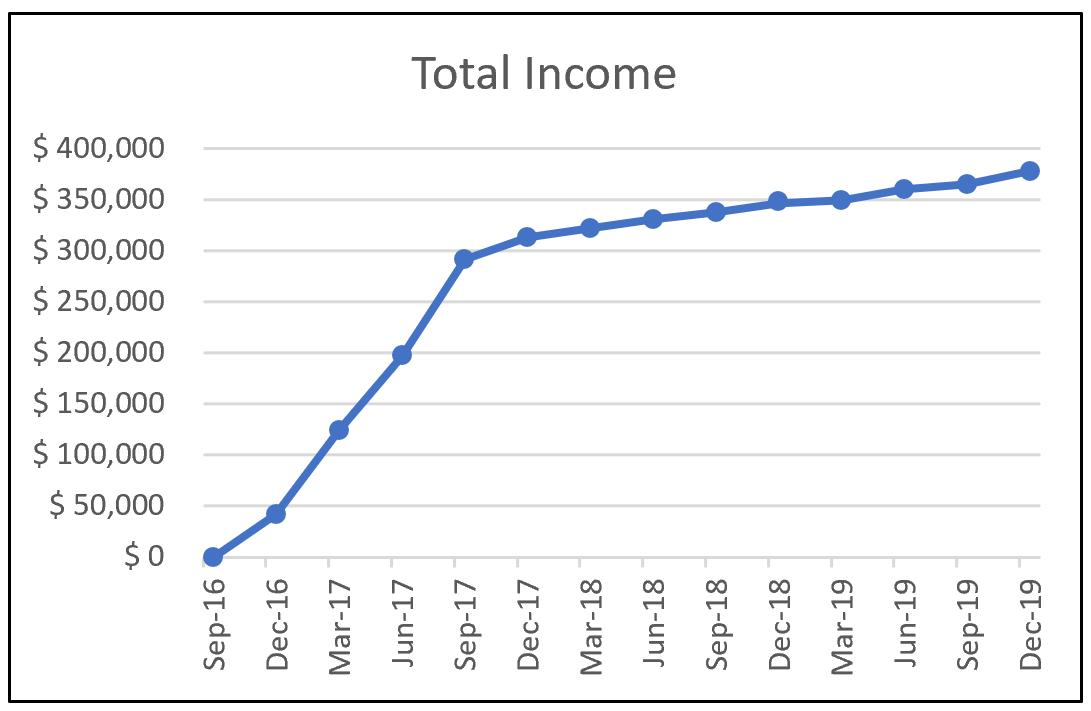
Charts are an effective way to presenting data, and one of the more informative methods is to highlight specific data points we wish to emphasise and make them stand out. For example, I have the following data of quarterly income for a company:

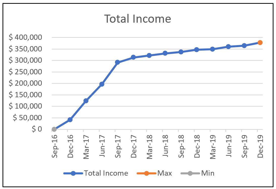
From the provided data, I plot a Line Chart as the one below, which has a clear minimum and maximum on Sep-16 and Dec-19, respectively:
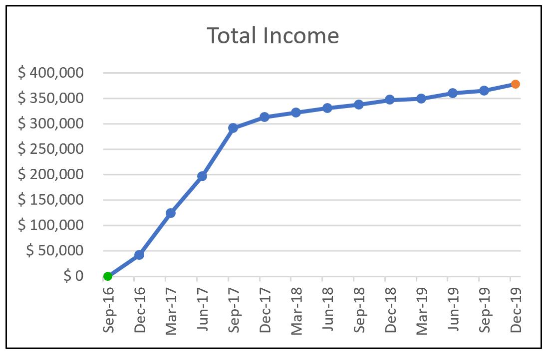
If I wish to highlight these points on the graph, it would be easy enough simply to highlight them and change the format of the points, e.g.
But what if the data changes? I would have to go back and edit the chart points each time there is a new maximum and minimum point.
In this situation, let’s create dynamic highlights for the chart. To do that, I am going to use two “helper” data series: one series is to calculate the maximum and the other, the minimum (surprise, surprise):

The ‘Total Income’ series represents the original series data that I used to construct the chart. Formulae are used to construct the Max and Min series; the Max series is calculated with the following formula:
=IF(G15>=MAX($G15:$T15),G15,NA())
The Min series is calculated with this formula:
=IF(G15<=MIN($G$15:$T$15),G15,NA())
This results in the series only displaying the Maximum and Minimum value in the original chart data, and #N/A for everything else. Using formulae allows the two series to be dynamic, so when there is new data the Max and Min series will update accordingly.
Now that I have the data series, I can include them in the chart. I can do that by clicking on the original chart, and Excel will highlight the relevant data series:

I can then drag the values down:

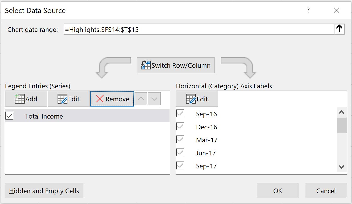
Alternatively, I can right-click on the original chart and select the ‘Select Data’ option. Then, the ‘Select Data Source’ dialog will appear. I can then add new series by clicking on the ‘Add’ button on the left side of the dialog box:
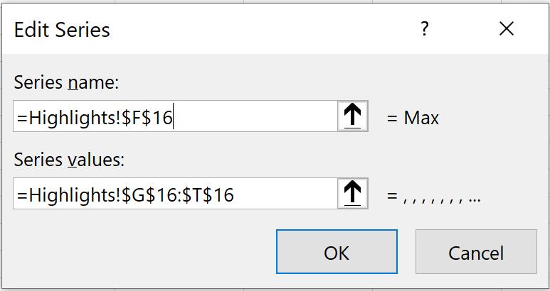
The next step is to fill out the ‘Edit Series’ dialog box accordingly for Max and Min series:
The two additional series are now added and shown in the ‘Legend Entries (Series)’ box:
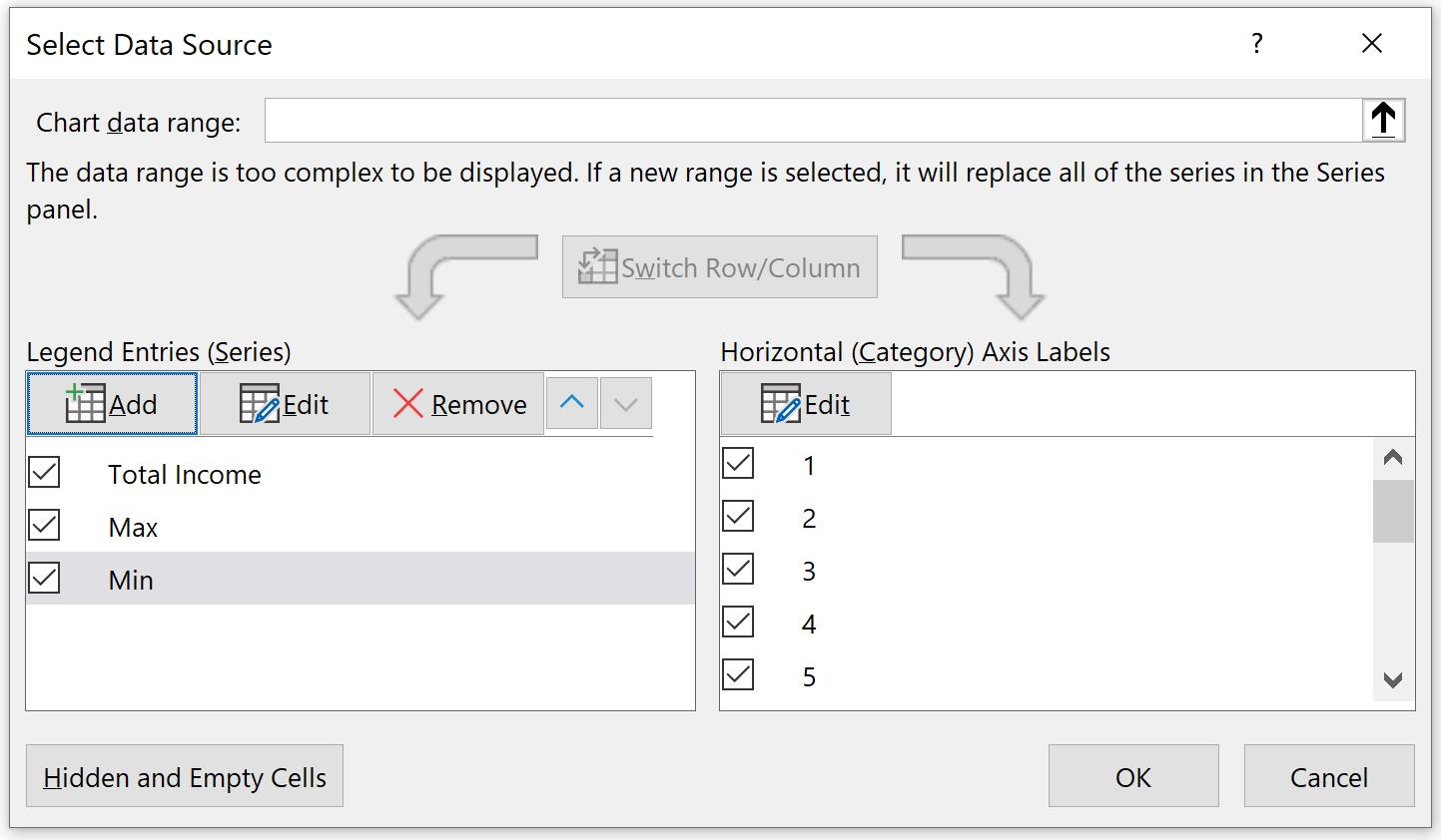
Do remember to reference the ‘Horizontal (Category) Axis Labels’ if the dates are replaced with sequential integers as illustrated above – otherwise this can cause charts to display incorrectly in alternative scenarios.
The chart is now shown as the one below, with Max and Min are now chart series and will be changed dynamically depending on the data:
That’s it for this week, check back next week for more Charts and Dashboards tips.