
Charts and Dashboards: Customised Chart Shapes – Part 2
22 January 2021
Welcome back to this week’s Charts and Dashboards blog series. This week, we continue to talk about customising chart shapes.
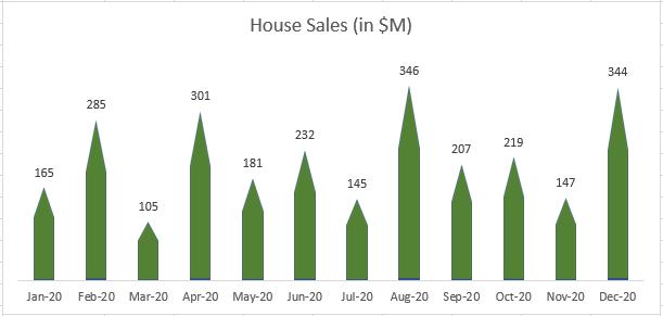
Last week, we created a column chart with a customised chart shape like the one below. Currently, the shapes do not look nice. The higher the sales, the more the shape stretches and the pointier the roof is. This week, we will continue editing this chart to give it a better look.
To do this, we need to separate the column into two parts, say Roof and Floor, in which the Roof parts are all equal to prevent the above stretch.

The Roof part should be formula-driven rather than a fix number. In this case, we will get the minimum sales of twelve months and divided it by two (2) since we have two parts (otherwise, the house will only have a roof without a floor!). The formula in cell C2 is
=MIN($B$2:$B$13)/2
and the Floor part, cell D2, equals B2-C2.
Now that we have the data, we will create a stacked column chart based on the two separated parts, we will have an initial chart like the one below.

We will copy the roof shape to the Roof series similarly to how we did last week.

Next, we will paint the Floor series the same colour as the Roof, reduce the Gap width between the columns and get the dynamic chart title pointing to cell B1. The chart looks better now.

That’s it for this week. Check back next week for more Charts and Dashboards tips.