
Charts and Dashboards: Creating Comparable Charts - Part 2
15 April 2022
Welcome back to our Charts and Dashboards blog series. This week, we finalise our charts from last week by creating similarly-scaled axes.
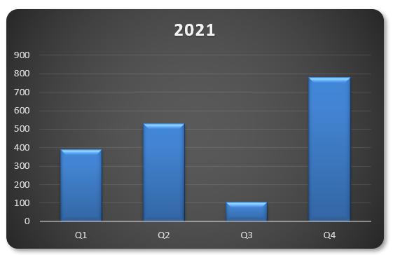
Last week, I left you with two similarly formatted graphs with differently scaled axes:

I mentioned that comparing these could be misleading, as we’re not comparing like with like – it is important that we rectify this issue by ensuring both graphs use the same scale on the y-axis.
An approach used by many modellers – assuming they notice the issue – is to right-click on one of the two y-axes and then click ‘Format Axis…’. This will open the ‘Format Axis’ pane where they would manually modify the maximum value.
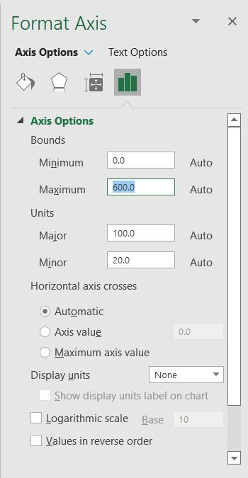
This solution isn’t ideal. What happens when the data changes? The process would need to be repeated ad nauseum. The problem is that we cannot link this ‘Maximum’ value to a cell, and there is no need to use VBA when you can simply cheat!
The trick is to go right back to the start, and add another column to our data chart, viz.
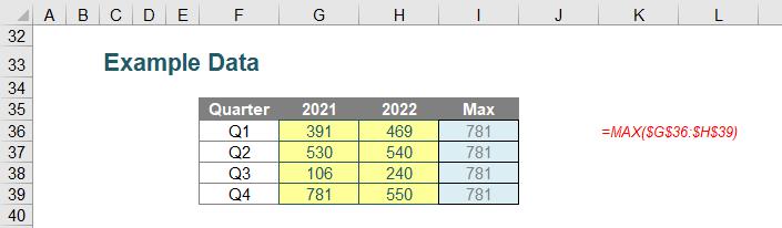
In column I, I have added a ‘Max’ column to determine the largest value in all of the data using the formula:
=MAX($G$35:$H$38)
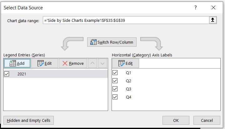
Now, I will include this column in our original chart. Returning to the first chart (we can bin the second one), I reopen the ‘Select Data Source’ dialog box and this time, I’ll ‘Add’ data:
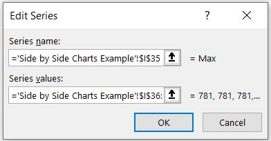
The ‘Max’ data will be included, as follows:
Clicking ‘OK’ twice in succession generates the following chart:
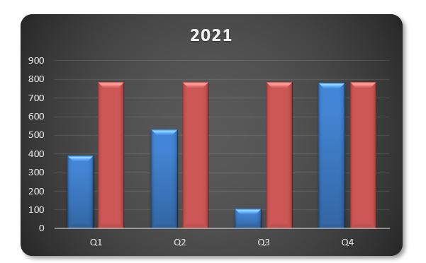
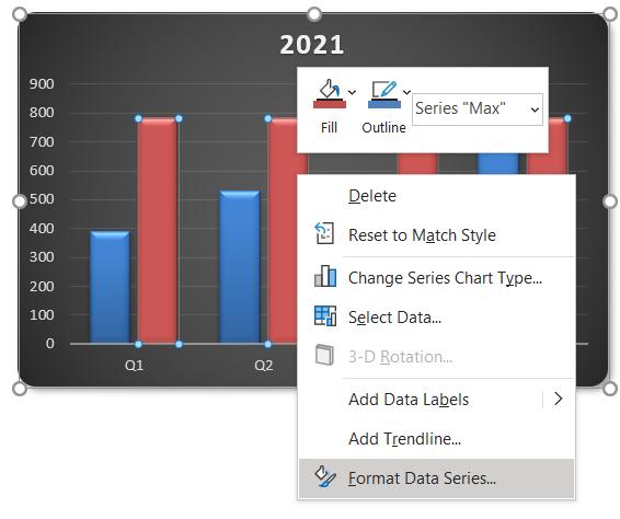
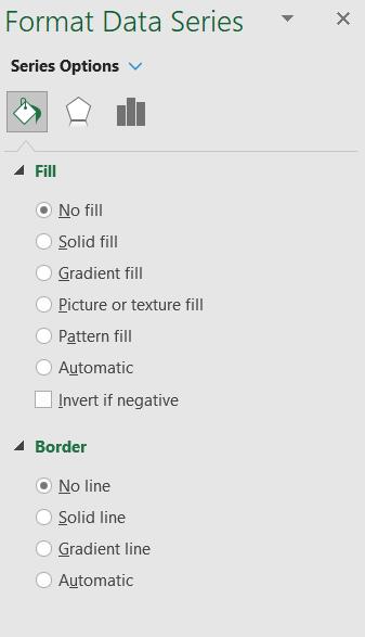
Now, I will right-click on the second data series and select ‘Format Data Series…’:
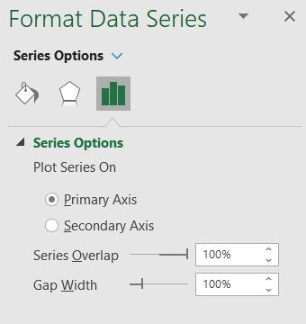
This will open the ‘Format Data Series’ pane, where I change the ‘Series Overlap’ to 100%:
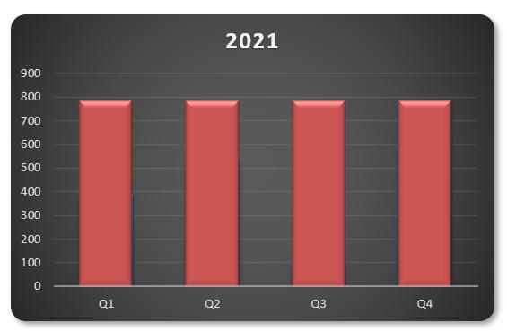
Initially, this may seem counterproductive as the new series has “obliterated” our original data, viz.
This is fine, as I am going to, again, right-click on this data series and select ‘Format Data Series…’, but this time I will navigate to the ‘Fill and Line’ settings and select both ‘No fill’ and ‘No line’ for the ‘Fill’ and ‘Border’ settings, respectively:
Lo and behold, we have our original chart back again:
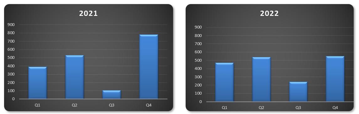
The difference now is that when we repeat the process of replicating the chart and changing the dataset (ensuring to keep ‘Max’ as is), we get comparative charts side by side (i.e. the y-axis scale is the same for both):
Easy!
That’s it for this week. Come back next week for more Charts and Dashboards tips.