
Charts and Dashboards: Chart Tools – Contextual Tabs (Part 1)
13 December 2019
Welcome back to Charts and Dashboards blog series. Over the next two weeks, we’ll look at contextual tabs in Chart Tools.
After a chart is created, if I click on a chart, Chart Tools contextual tabs will appear on the Ribbon. Here is where I can customise my chart. The tab has two sub-tabs, Design and Format. Let’s break them down.
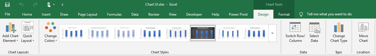
On the far-most, left-hand side is the ‘Chart Layouts’ category, where I can quickly fix the element and layout of my chart.
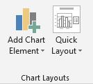
I can add a variety of element such as Axes, Axis Titles, Chart Titles, etc. in the ‘Add Chart Element’ section:
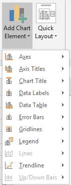
Also, I may choose how my chart and its element(s) will look like using the ‘Quick Layout’ option:
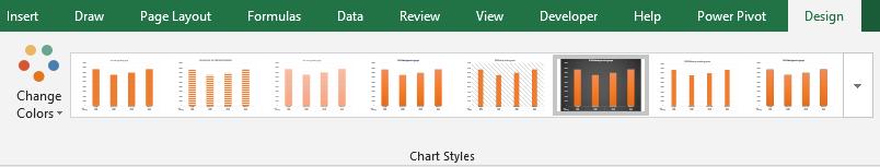
The ‘Chart Styles’ category is where I can change my chart color palette to my liking or report format requirements, and also there are different chart designs I can choose from, rather than design my chart manually:
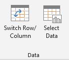
Then in the ‘Data’ section, I can choose to ‘Switch Row/Column’ in my data (just like how you do with transpose), then the chart layout will also be changed.
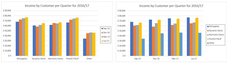
For example, note what have been changed in the chart when I click ‘Switch Row/Column’:
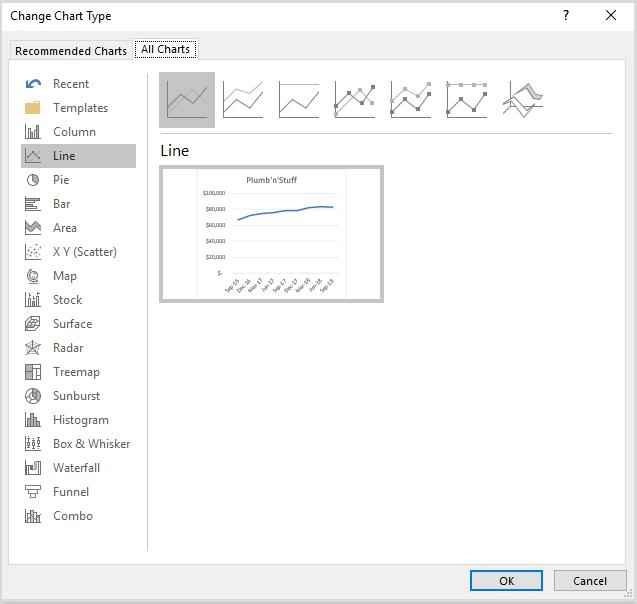
In case I think a Column chart is not ideal. However, rather than starting from scratch, choosing the entire data to insert the chart, I just need to click on ‘Change Chart Type’ section:
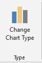
A dialog will pop out, where I can choose to change my initial chart to another chart type, or also make it a ‘Combo’ chart (as the last item on the left-hand list), to choose which series to be displayed as which type (Column, Line, etc.).
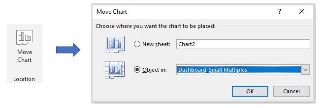
The last section on the ‘Design’ sub-tab is the ‘Move Chart’ category, where I can move the chart to another sheet or to my created dashboard:
That’s it for this week; check back next week for more Charts and Dashboards tips.