
Charts and Dashboards: Column Charts
10 January 2020
Welcome back to this week’s Charts and Dashboards blog series. This week, we are going to look at Column Charts.
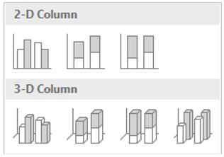
A Column Chart shows the magnitude of values in one or more data series using (typically) rectangular bars, with the height of each corresponding to the associated value. The categories appear on the horizontal axis and the values are mapped on the vertical axis.
Excel provides a range of Column Chart variations, including Clustered and Stacked formats in 2-D and 3-D.
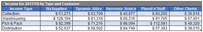
Let’s have a look at the sales data by customer group:
By selecting this data and inserting a 2-D Clustered Column Chart, I have an initial chart like the one below:
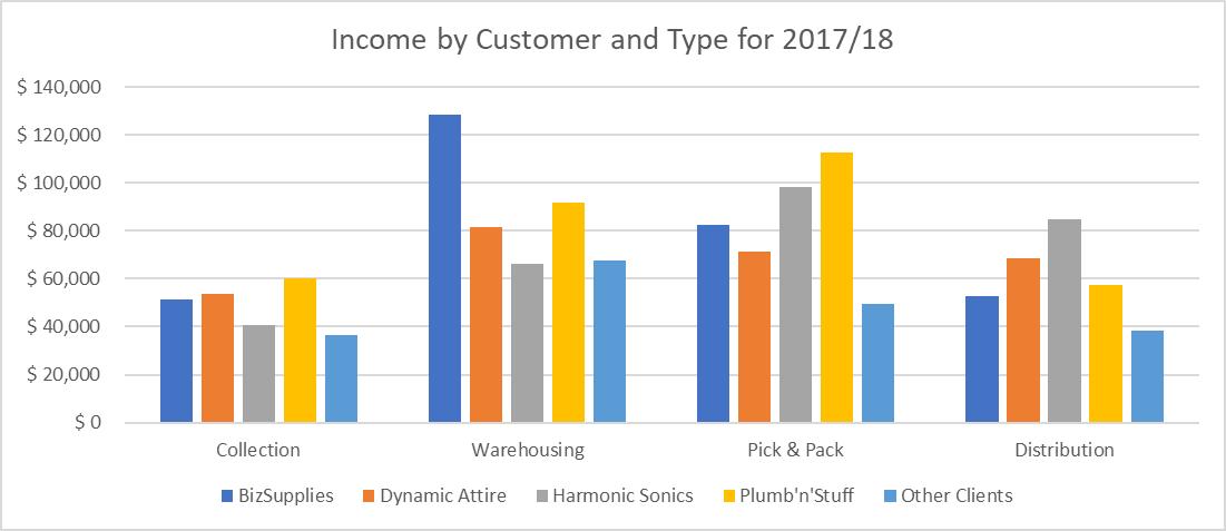
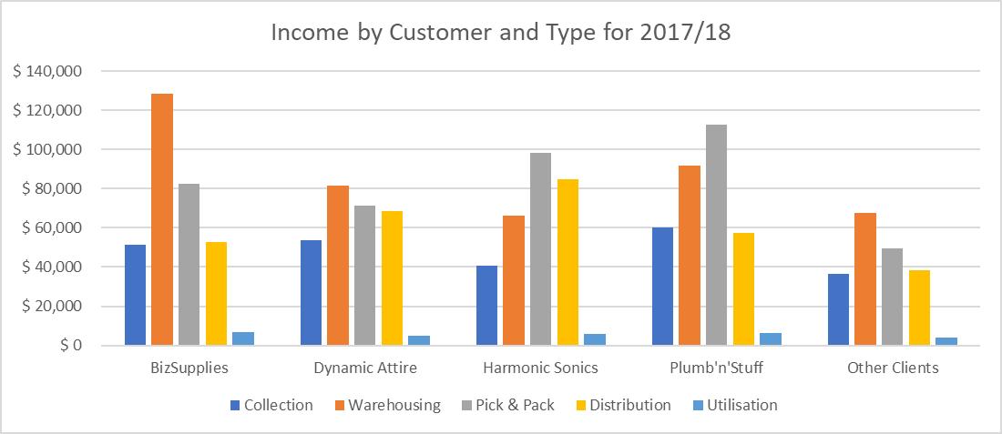
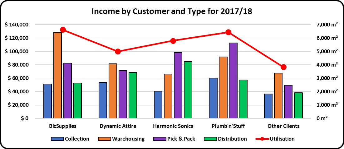
The current chart is great in communicating that the sales from each of the main four customer groups is more than the revenue from the Other Clients group. It also shows BizSupplies clearly provides the most Warehousing income.
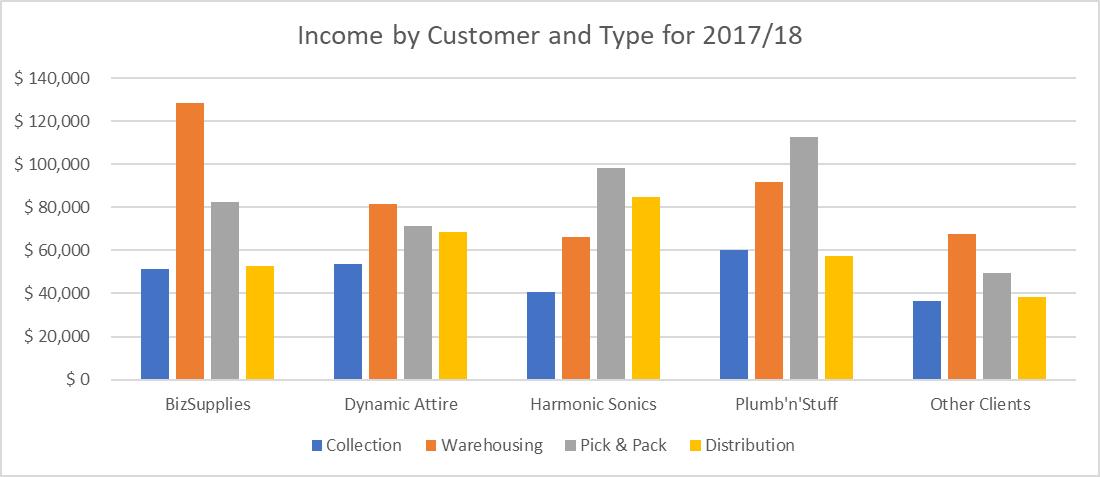
However, I am more concerned about income from each activity by customer, so I need to flip this chart around to report columns by customer groups, not sales type. In Excel, this is easily done. I simply click on the chart and under the Design tab, and then select ‘Switch Row/Column’. The chart now looks as follows:
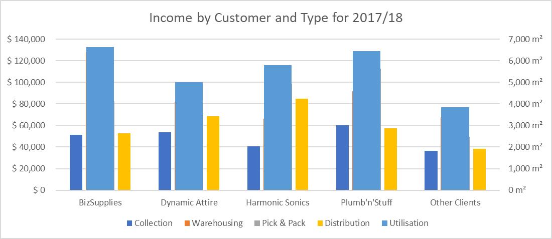
Then, I add one more row of data into my previous data table, which should also be updated in the chart:

Note that the newly added data is not financial data, with a different unit associated (which is m2), which means I can’t just simply add this series into the column chart. Hence, I need to undertake further steps:
- Highlight the data and copy it
- Click on the ‘Chart Area’, right-click and choose Paste. The data series is added to the chart as a fifth series (the light blue Utilisation data points):
- Next, select this fifth data series (circular markers will appear on each corner of each column of the series), right-click and choose ‘Format Data Series’
- Under ‘Series Options’, there is an option titled ‘Plot Series On’. Select the ‘Secondary Axis’ and the chart will update. A vertical axis will appear on the right side of the chart and the data series will now overlay the other four series
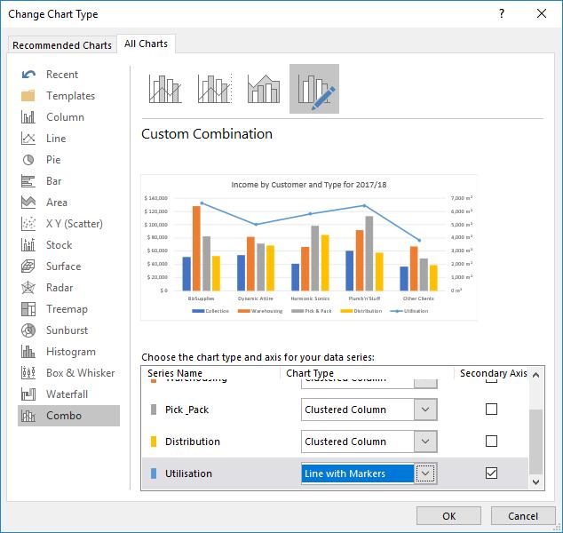
- Finally, in order to see the original sets of columns clearly once again, I need to change this new series from being columns to a line. Select this newest series, right-click, this time choose ‘Change Series Chart Type’ and a ‘Change Chart Type’ screen will appear. Scroll down in the bottom window within this screen and change the ‘Chart Type’ for Utilisation to ‘Line with Markers’. There will be a chart within this window reflecting our requested change, then click OK to confirm the settings.
I still want to make some further modifications:
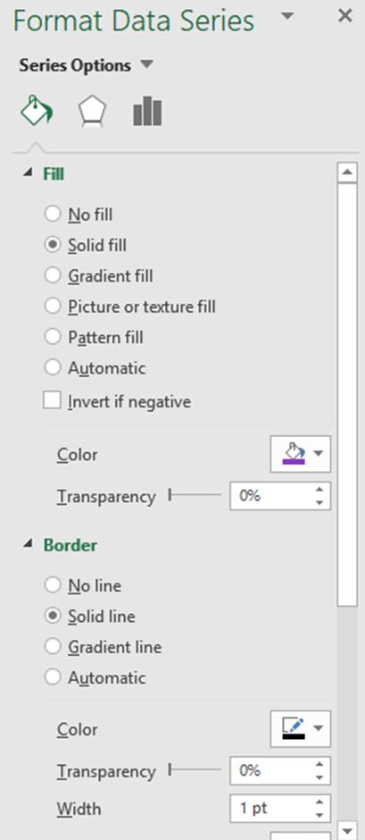
- I wish to change the colour code of each group to match my organisation colour scheme (say). I right-click on the series; in this case, one of the columns that I want its colour to be changed, and then select ‘Format Data Series’. Under the menu, I click on the bucket icon, Fill. Here, I set this to ‘Solid fill’ and change the colour as desired. I repeat these steps with other columns and the line indicating Utilisation
- I also want to enhance the border around each column so for all four data series relating to the columns, under Border, I set it to ‘Solid line’ and change the colour to black, and then set the ‘Width’ to 1 point.
With all the modifications made, the chart is now complete:
That’s it for this week; check back next week for more Charts and Dashboards tips.