
Charts and Dashboards: Chart Titles as a Text Box
14 May 2021
Welcome back to this week’s Charts and Dashboards blog series. This week, we will talk about creating a chart title using a text box.
One way to make the chart more presentable is to emphasise its title with a text box, which is straightforward to create in Excel. In this blog, we will go through a few tips to make the job even easier.
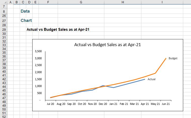
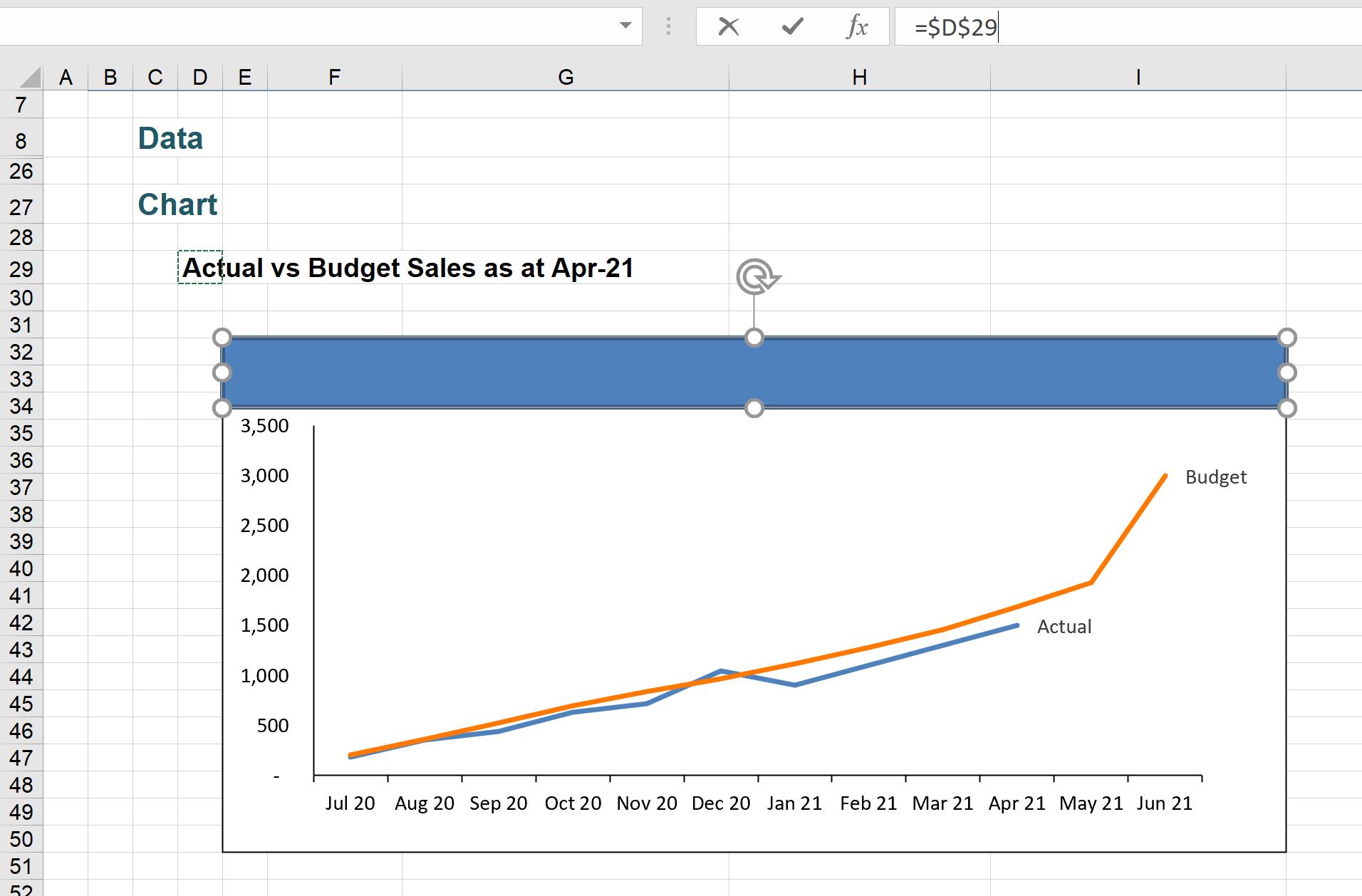
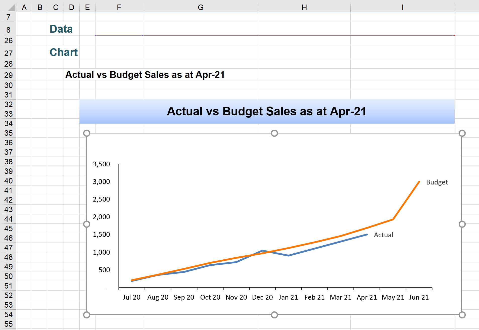
In my example, there is a line chart with a chart title in cell D29 as shown below, which we will use to illustrate our example:
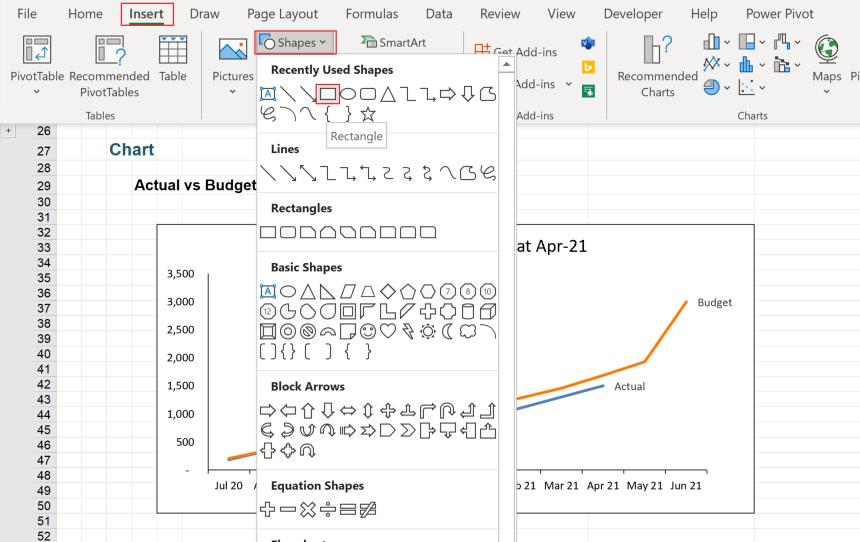
To get a text box, navigate to the Insert tab on the Ribbon, and under Shapes, choose a Rectangle (or any other shape that you would like to use).
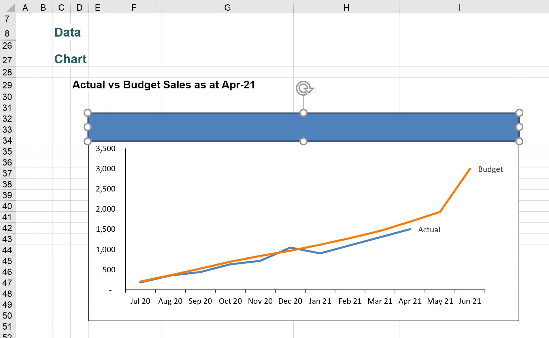
Draw a box to overlap the chart title as shown below:
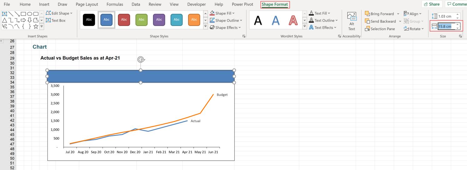
To make sure that the text box has the same width as the chart so that it fits beautifully, click on the chart, go to the Format contextual tab on the Ribbon, check the width of the chart:
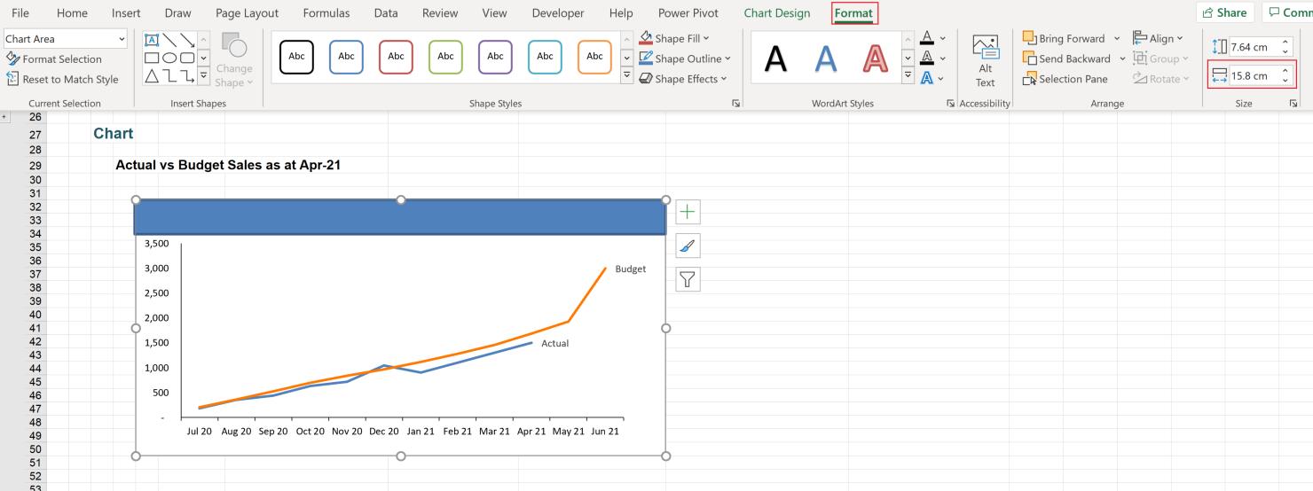
Then, click on the text box, and under the ‘Shape Format’ contextual tab on the Ribbon, apply the width under the Size group. Hold the ALT key to get the text box to snap to the same grid as the chart.
Similar to the way we get the dynamic chart title, click on the text box, in the Formula bar, and point it to cell D29:
Next, apply a few steps to further format to the text box:
- click on the text box, under the ‘Shape Format’ contextual tab, change the ‘Shape Fill’ to the colour of your liking, and remove the ‘Shape Outline’ and ‘Shape Effects (to ‘No Shadow’)
- under the Home tab, change the size of the text and let the text be in the centre of the text box.
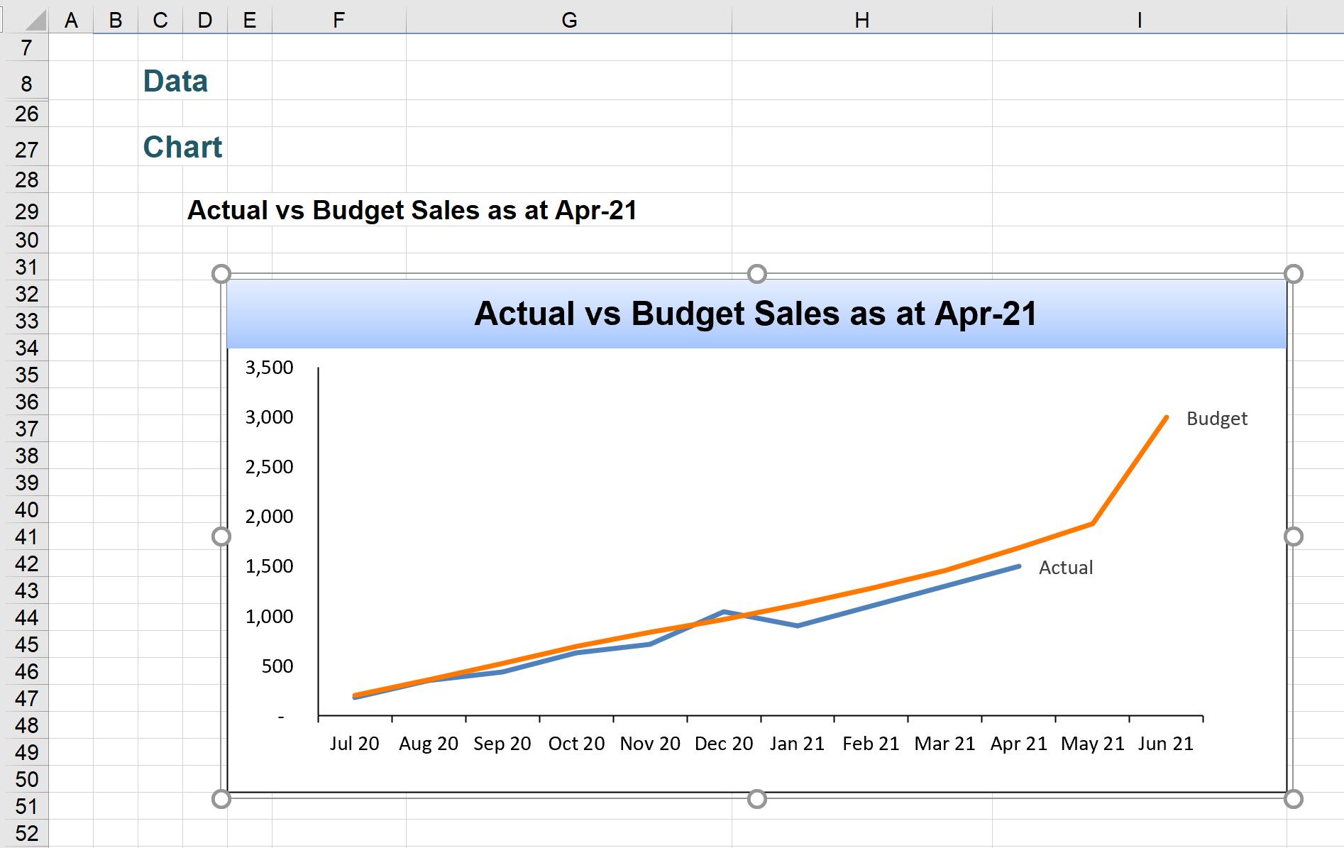
The text box now fits in the chart as shown below:
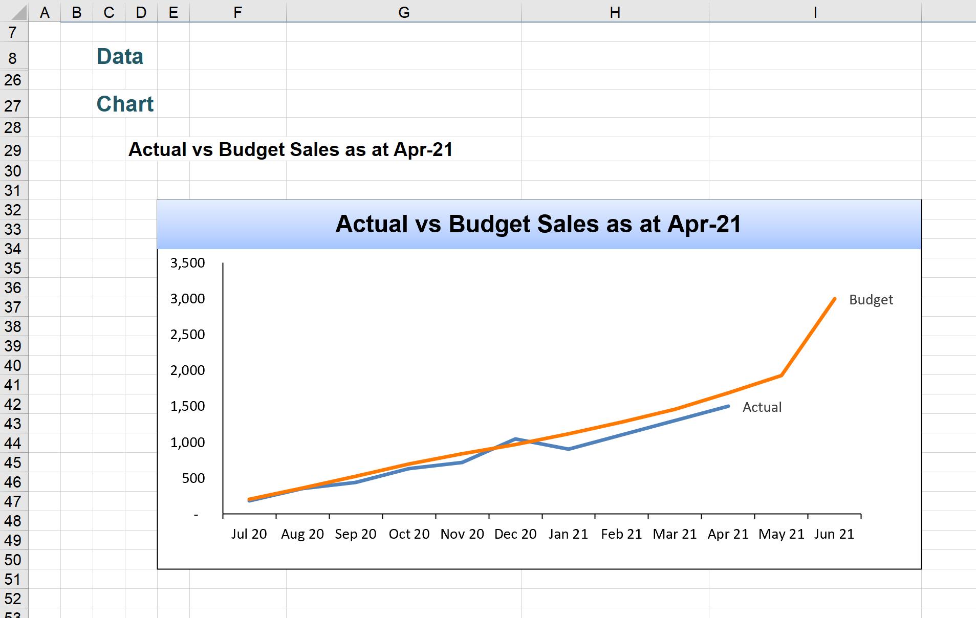
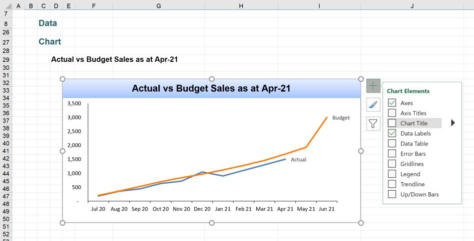
Click on the chart, under the Chart Elements menu, and uncheck ‘Chart Title’ to remove the underlying chart title.
We are almost done. However, if we need to move the chart, it no longer has the text box title on it, since they are not attached together yet.
To attach the chart title text box to the chart, click on the text box, hold the CTRL key and click on the chart, then right-click, choose Group -> Group.
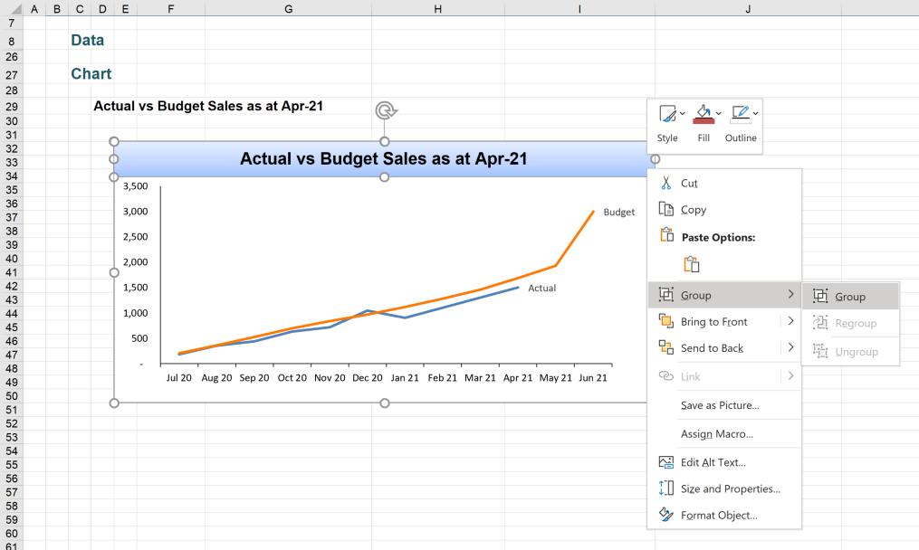
Now, the chart and the text box are grouped and will move together.
That’s it for this week. Come back next week for more Charts and Dashboards tips.