
Charts and Dashboards: Bullet Charts – Part 2
19 February 2021
Welcome back to this week’s Charts and Dashboards blog series. This week, we continue our review of Bullet Charts.
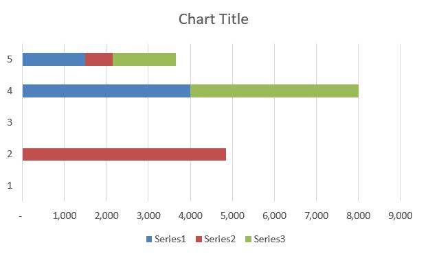
Last week, we performed the first few steps to create the initial chart, similar to the one below:
Now, we will start to format the chart.
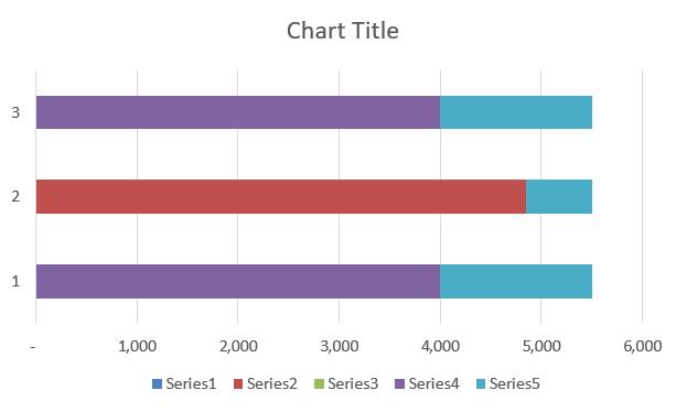
First, go to ‘Chart Design’ on the Ribbon, and select to ‘Switch Row / Column’.
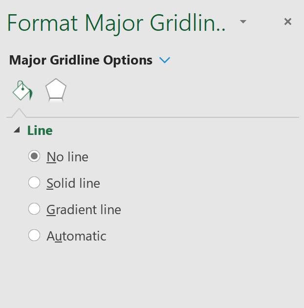
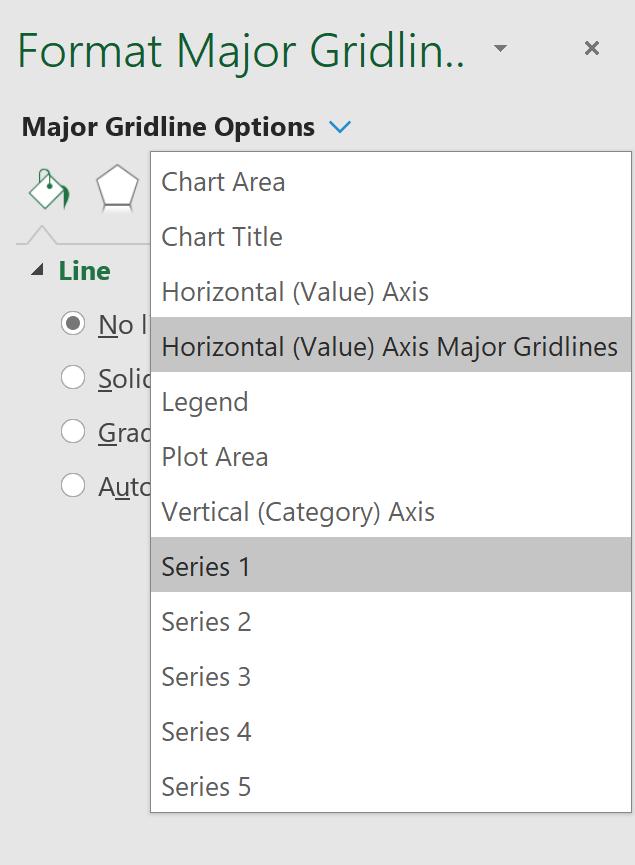
Click on the grid lines and press CTRL + 1 to bring up the ToolTip. Then, select ‘No Line’.
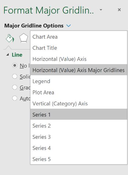
In the right-side pane, click on the ‘Major Gridline Options’ drop-down menu, then select ‘Series 1’:
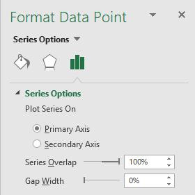
Go to the ‘Series Options’ button then change the ‘Gap Width’ to 0%.
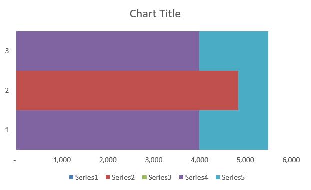
Your chart should now look like this (note that it is normal not to have the exact colours as the screenshot below potentially due to having a different colour scheme active):
Now, while the series are visible, this is the time to assign the conditional colours to the Actuals bar (currently coloured red, this colour may be different on your sheet depending on the default colour scheme). We decided to use a blue colour scheme. To emulate conditional colours, we set the three series to different colours.
- Series 1: dark blue
- Series 2: medium blue
- Series 3: light blue.
Click on the drop-down menu from the right-side panel to toggle between the different series to format.
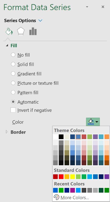
Go to the Fill option in the side panel, then navigate to the Color option. Here, we can click on a drop-down menu that will allow us to change the colour for the Series:
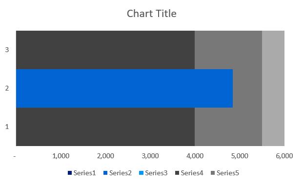
The next step is to change the background colours of the graph to highlight the poor, satisfactory and good thresholds. Again, to change the colours of Series 4, 5 and the Plot area, use the drop-down menu located at the top of the right-hand side panel:
We used a grey colour scheme.
- Series 4: dark grey
- Series 5: medium grey
- Plot Area: lightest grey.
Our chart should look like this (if your chart looks different due to the colour tone being different, it is because you have selected a different colour tone to our example):
That’s it for this week.
Check back next week for more Charts and Dashboards tips.