
Charts and Dashboards: Box and Whisker Charts
3 April 2020
Welcome back to this week’s Charts and Dashboards blog series. This week, let’s look at Box and Whisker Chart.
The Box and Whisker Chart shows the distribution of data by plotting five statistical values, being the maximum, minimum, median, the upper quartile and the lower quartile. The average or mean can also be added to the chart.
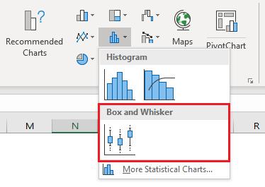
There is just one type of Box and Whisker chart available in Excel which is accessible from the Statistic Chart section under Charts in the Insert ribbon.
On Radar Chart, I graphed the average of the evaluation results that came in from eleven key people within the company. An average though does not indicate anything about the level of consensus of the eleven individuals who participated in the survey, only the statistical middle point of their opinions.
To explain, if 100 people completed a single survey question about customer service and the average was 50%, I might conclude that the group were neutral overall in their opinion, and I might consider implementing processes simply to improve customer service generally to try and improve the average over time. However, if I then found out that 50 responded with 100% and the other 50 responded with 0%, then the 50% average becomes meaningless. In reality, half the group were completely satisfied and the other were completely dissatisfied, so my reaction now might be to try and access why half the group were unhappy and address that specific issue rather than improve the service generally.
Given I have the individual submissions from the eleven participants from the survey, I can map their responses and evaluate their feedback in more detail.
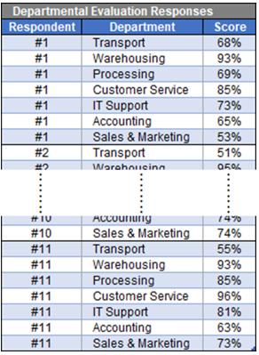
The layout of the data table is quite simple. Two columns are required – the first contains the category, in this case the departments being evaluated, and the second column contains the values, being the individual scores from each respondent. An extra column has been added on the left just to ensure I included all participants’ responses.
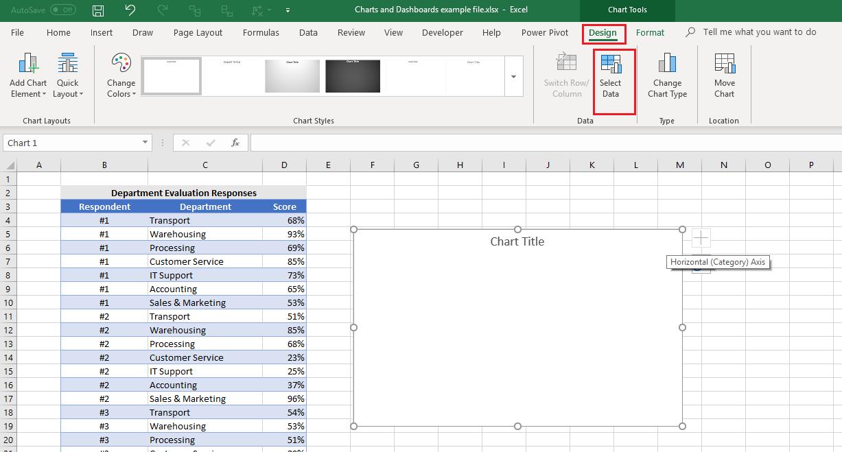
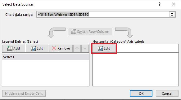
Without selecting any data, I insert a Box and Whisker Chart which will create an empty chart box. Next, with the chart box selected, I go to the Design ribbon and click on ‘Select Data’.
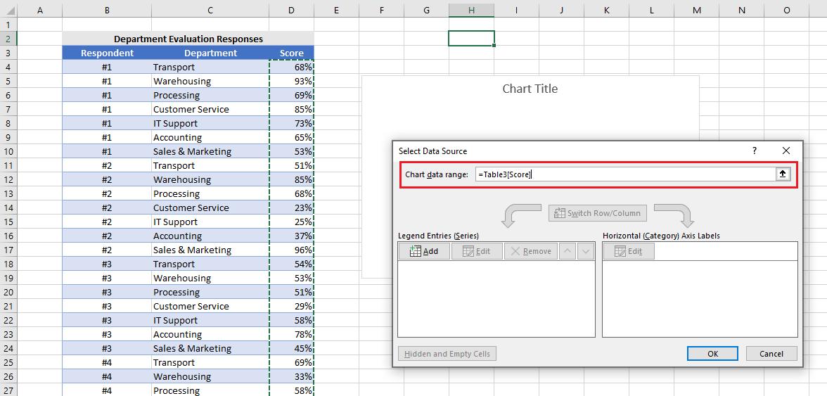
I now provide Excel with the information needed to create the chart. The first range it needs is the data series which is the column of scores from my table:
I select the data then click on the Edit button under Horizontal (Category) Axis Labels and highlight the range under the Department column:
When selecting data, I do not include the headings:
Once I click OK, Excel will collate the data automatically and prepare the chart like the one below:
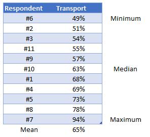
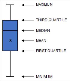
It is called a Box and Whisker chart as the key elements of the chart are the coloured block called the Box, and a line that protrudes out of the top and bottom of the Box called the Whisker. The start and end points of the Whisker are the minimum and maximum values in the data. The line that goes across the Box and the cross inside the Box are the median and mean respectively. The position and height of the Box is determined by the first quartile and third quartile. To clarify the terminology and better appreciate the information in the chart, let’s focus on the results for the Transport department. The table below shows the responses from the eleven participants in the performance survey:
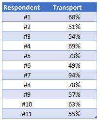
The first thing I need to do is sort the data numerically, so the scores are ranked from lowest to highest. The lowest score is the minimum, and, equally as obvious, the highest score is the maximum. The value in the centre of the series is called the median. The mean is simply the average of the series, which is rounded to 65%.
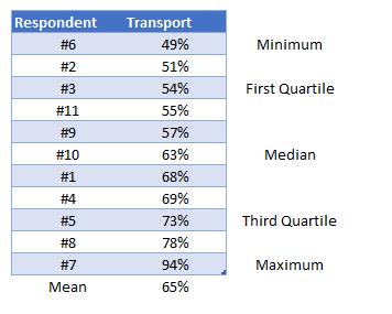
When it comes to quartiles, just think that I am splitting the data into quarters. If I wrote the above sorted series of number across a pierce of paper all in a row equally spaced and tore the page in half precisely, I would be tearing the list where the number 63% lies. If I then took the piece then the numbers from the minimum upwards on it and tore this in half, I would be tearing where the 54% is written. Tearing in half the piece with the maximum downwards on it would result in ripping where the 73% lies. I now have the quartile values. The first quartile is at 54%, the second quarter or the median is 63% and the third quartile is 73%.
The mathematics behind the calculation of quartiles is actually much more complex than this and my example is simplified by only having eleven participants in my base. Needless to say, Excel has the mathematics built in to determine quartiles precisely.
Note that the median will always reside within or on the boundary of the Box, but the mean can reside above or below the Box but always within the range of the Whisker.
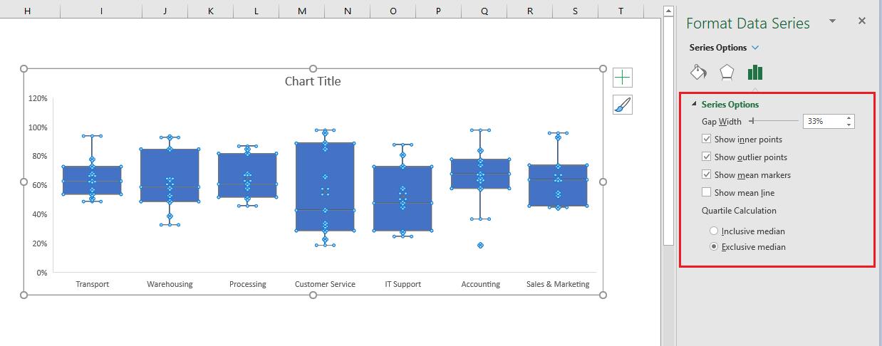
I want to remove the point elements in the initial chart, by clicking on one of the points, the ‘Format Data Series’ dialog will appear, in ‘Series Options’, untick the ‘Show inner points’ and ‘Show outlier points’:
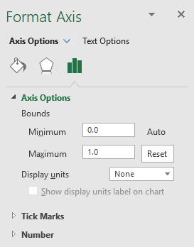
Before analysing this chart, it would be beneficial to change the vertical axis settings. The chart presently goes to 120% but obviously the maximum value is 100%, and it would be easier to read if the gridlines were every 10% instead of every 20%. I select the vertical axis by clicking on the area where the percentages are, right click and choose ‘Format Axis’, then under ‘Axis Options’, change Maximum setting under Bounds to be 1.0 (which equates to 100% in my data). Unfortunately, I cannot specify that I want the scale to be every 10%, so if the chart is still showing every 20%, I just need to click on the border of the Chart Area and extend the height of the chart.
I add gridline to the chart and now it looks like this:
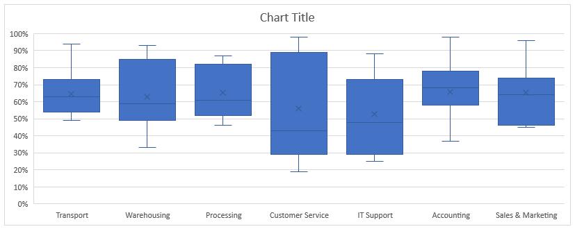
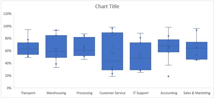
So how do I read this chart? What conclusions can I draw from the additional statistics about the data that I couldn’t draw from the Radar Chart?
If I look at the results, Customer Service has a very broad range of score, with a minimum of 19% and a maximum of 98%, the first quartile of 29% and third quartile of 89%, while the median of 43% tells that half of the responses lies below 43% and half lies above 43%, which mean the evaluation is quite evenly distributed. Meanwhile, Transport has a minimum score of 49% and maximum of 94%, the mean and median are almost identical, 63% and 65% respectively. It is obvious that the distance between the third quartile (73%) to the maximum score outweighs that of the first quartile (54%) to the minimum score, meaning 75% of the data is between 49% and 73%. This may require further analysis of the individual responses, but it could be interpreted that there is mixed feedback from the respondents as to their experiences working with Transport department.
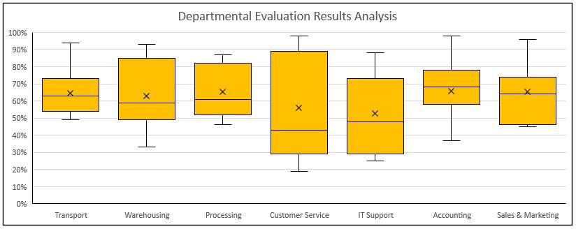
Final touches applied, the chart is ready for presentation:
That’s it for this week, check back next week for more Charts and Dashboards tips.