
Charts and Dashboards: Braving the Elements
15 July 2022
Welcome back to our Charts and Dashboards blog series. This week, I take a closer look at the elements of a chart.
When choosing and adapting charts to present information, it’s important to understand what elements make up a chart.
Not all charts include every type of element, but here is a description of the elements in a typical chart:
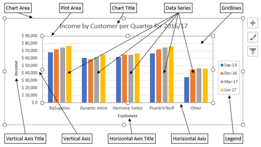
Chart Area
This is everything inside the outer box on the diagram above, including all the other chart elements. To change the chart area, select the chart and click and drag the circles on the chart area box.
Data Marker
The form a data marker takes depends on the type of chart, but it corresponds to a single value in the data the chart is representing. In the example above, it would be a bar.
Chart data series
A very simple chart might have just one data series, usually representing a row of data, though it can be a column. Most charts have several data series, for example in the chart above, each data series is represented by bars of the same colour.
Series formula
The series formula appears in the formula bar when a data series is selected:
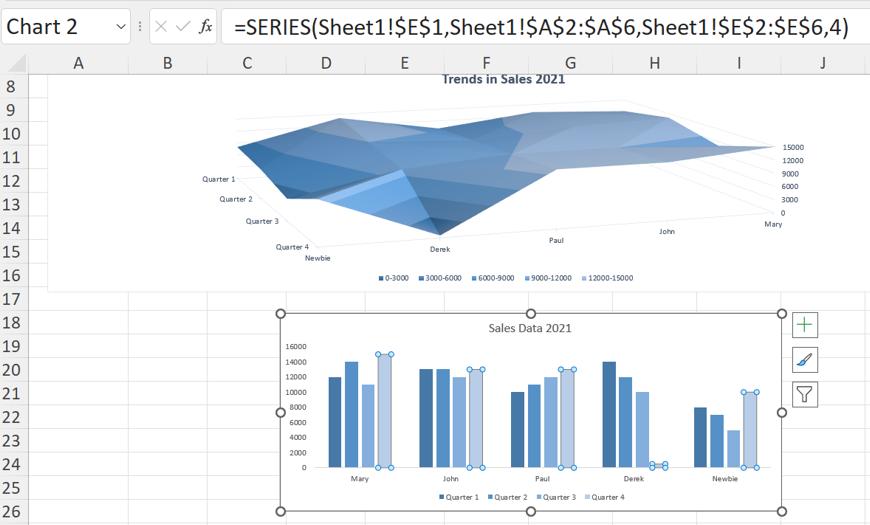
The diagram above shows the series formula for Quarter 4. The series formula can be edited to change the data selected and the plot order.
Axis
The number of axes depend on the type of chart and how many dimensions they show. A bar chart has no axes, whereas the bar charts in the examples above have two, a horizontal (x) axis and a vertical (y) axis.
Tick mark
This is a line or cross that intersects an axis, indicating a category, scale or chart data series. Gridlines extend from tick marks.
Plot area
This is the area where the data is plotted, including the axes, and data series, and is shown by the inner box on the following example:
This area can also be changed by clicking and dragging on the circles on the box.
Gridlines
These are extensions of the tick marks, which can make it easier to see the scales. Gridlines are often removed when a chart is ready to be viewed, to present a less cluttered image.
Chart text
Labels or titles associated with the chart. Attached text is linked to a chart element, for example Vertical Axis Title, and unattached text is text that is independent of the chart, e.g.text entered using a Text Box.
Legend
This is the key; in the example above, the key shows which colour represents each data series.
Also note on the diagram below:
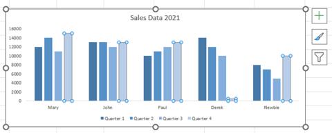
- the box marked with a plus (+) sign accesses a dialog containing a list of Chart Elements available for the chart selected, each with a checkbox which can be ticked or left empty
- the box with a paintbrush calls a dialog with two tabs, one to access styles (with previews), and one to access colour schemes
- the box with a funnel calls a filter dialog which allows the user to filter on Values and Names.
That’s it for this week. Come back next week for more Charts and Dashboards tips.