
Charts and Dashboards: A Quick Look at Analysis
12 August 2022
Welcome back to our Charts and Dashboards blog series. This week, I look at the Quick Analysis tool.
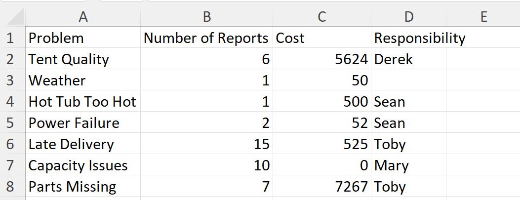
I have some data for my imaginary tent business:
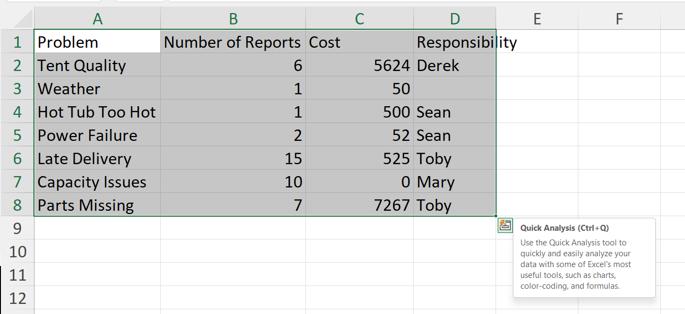
I’d like to create a dashboard from this data, but let’s assume I don’t know where to start. When I select my data, a box appears at the bottom right-hand corner:
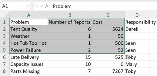
I can also access ‘Quick Analysis’ by using CTRL + Q. Note that I need to select a data range; if I select columns, this option is not available. I don’t need to select all my data:
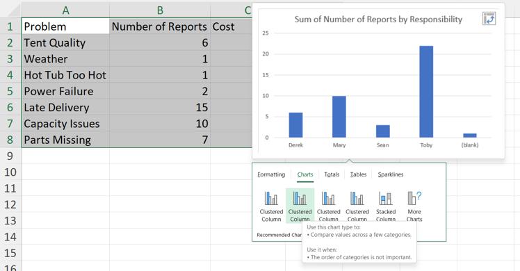
The ‘Quick Analysis’ dialog has several tabs to help me analyse the data:
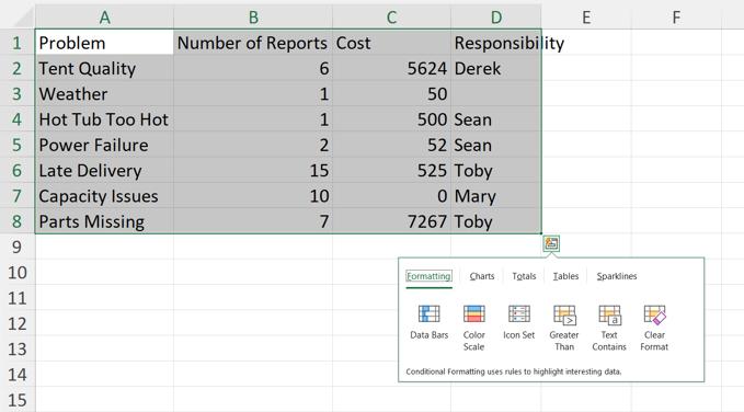
Depending upon the data chosen, a number of ways of formatting the data are offered. I can hover over each of them to see the effect on the data, and click on them to choose that formatting:
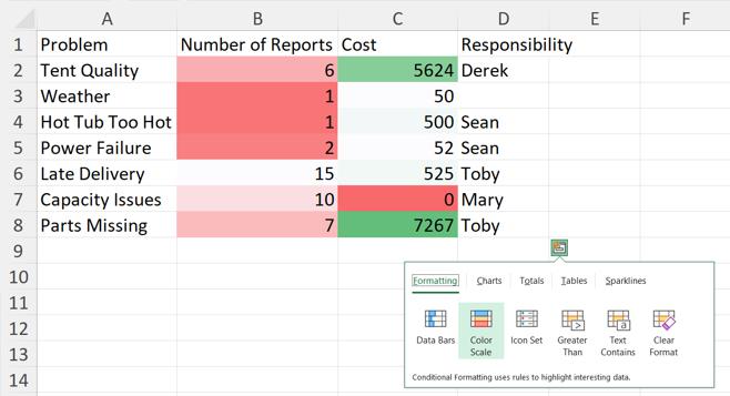
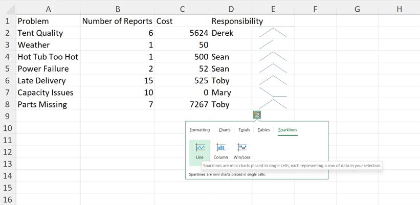
For this data, ‘Formatting’ is not helpful. Similarly, Sparklines do not help to explain my data:
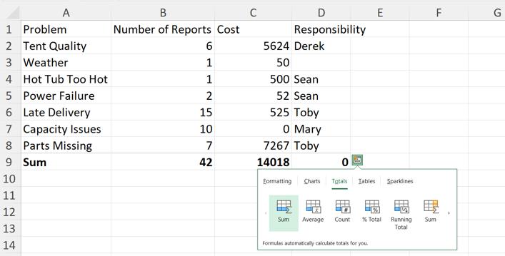
On the Totals tab, the numerical values can be manipulated automatically, for example by calculating the ‘Sum’:
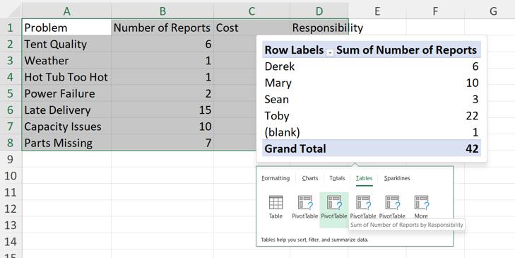
I also have the option of trying out Tables based upon the data I have selected. I could create an Excel Table, or choose a PivotTable option, such as the one shown here:
However, it is the Charts tab, which I want to look at for ideas. Some of the recommended charts appear here, and I can hover over them to see my data:
If I want to see more, clicking on ‘More’ takes me to the ‘Insert Chart’ dialog:
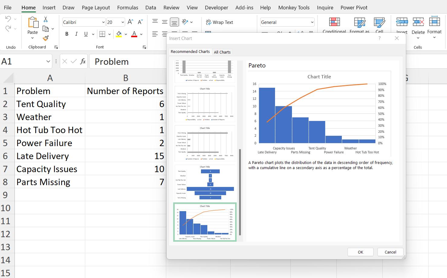
Here, I can see my data displayed in different forms, and choose the charts I want to add to my dashboard.
The Quick Analysis tool can help to find the best way to display my data. Next time, I’ll look at the insights that the ‘Analyze Data’ tool may provide.
That’s it for this week. Come back next week for more Charts and Dashboards tips.