
New Views for Power Query
25 September 2019
The Artist Formerly Known as Power Query – Get & Transform – is having a bit of a makeover, with some useful new features added to the View tab of the Power Query Editor, viz.
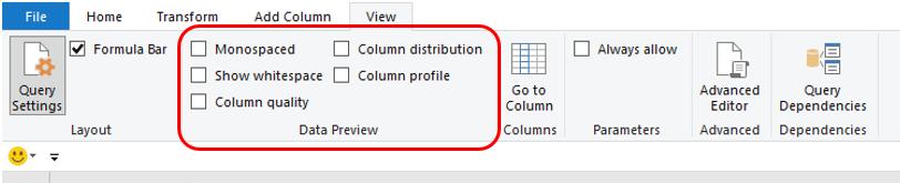
This has popped up “on the quiet” from Microsoft so we aren’t sure yet what versions of Excel this is in, or when it will be propagated to all versions (if at all). Situated on the View tab in the ‘Data Preview’ grouping, there’s three new features of note:
- Column distribution
- Column profile
- Column quality.
Let’s take a look at each in turn.
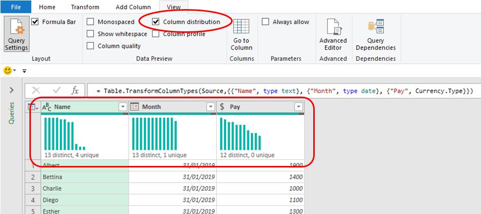
Column distribution
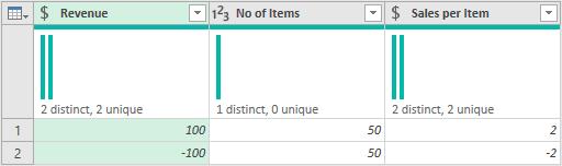
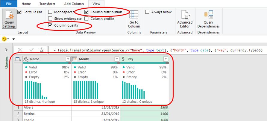
With the ‘Column distribution’ checkbox ticked, graphics are displayed at the top of each column (field), highlighting the number of distinct and unique items in that field:
To be clear:
- distinct means the number of different items in that field, so “A”, “B”, “B”, “A” and “C” would be five items (five records), but only three distinct items – “A”, “B” and “C”. Further, remembering that M is case sensitive, the items “Alpha”, “alpha”, “ALPHA” and “Alpha “ (with an extra space) would be four distinct items
- unique means the number of items that occur once and only once in that field. Using my example “A”, “B”, “B”, “A” and “C” again would still be five items, but only “A” and “C” occur once and only once, so there are two unique items.
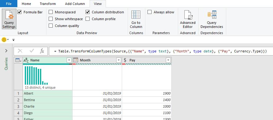
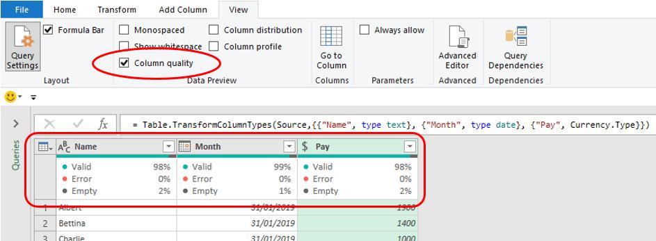
I am not sure if it’s by default or by design, but the graphics and the counts of unique items will not show if there are any errors in that field. For illustration, this example has errors in both the Month and Pay fields, hence the blank ‘Column distribution’ sections:
Given this can be particularly unhelpful, it’s probably a good idea to have a brief aside to discuss the different types of errors in Power Query…
ASIDE: Errors in the system
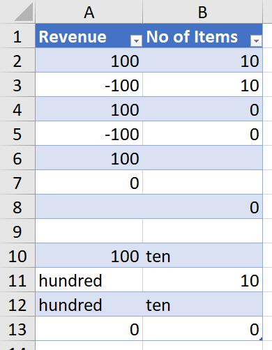
Consider the following Table is loaded from Excel into Power Query (Get & Transform) in the usual way:
Once loaded, I can add a calculated column by clicking on the ‘Custom Column’ icon in the General grouping of the ‘Add Column’ tab, viz.
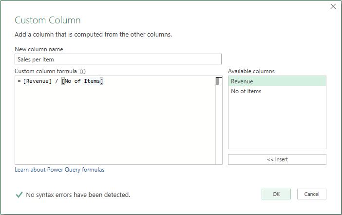
Essentially, I am calculating the ‘Sales per Item’ by taking the value in the Revenue field and dividing it by the corresponding number in the ‘No of Items’ field. It’s not rocket science, but it does generate the following results:
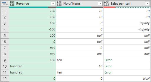
Only the first two records generate values we may use. The rest is a litany of errors and issues:
- Infinity: diving a positive number by zero gives rise to this error. Technically, such a calculation is mathematically indeterminate, but it is ascribed the error Infinity
- -Infinity: similar to the last error, this is the error returned when you divide a negative number by zero
- NaN: this does not mean your grandmother wrote the calculation, NaN means that it is not a number, i.e. it is either undefined or unrepresentable, especially in floating-point arithmetic, such as that prevalent in Power Query
- null: this means your formula attempts to perform a calculation with a null value. Good luck with that – it ain’t gonna happen
- Error: this is a general catch-all when the error cannot be described specifically. In the example above, we are trying to use text in a formula – that’s a type mismatch and Power Query will justifiably spit the proverbial dummy instead.
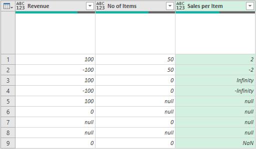
Bizarrely, only Error is counted as an error for reporting purposes, but it still will not present the chart currently:
There is worse – sometimes. If you filter out some of the errors, it is possible to break our new ‘Column distribution’ reporting tool on occasion:
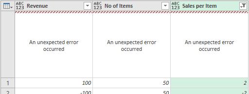
Some of the time, trying a second time, or clicking on another ‘Applied Steps’ item and then returning, fixes this – but not always. Sometimes, you’ll just have to close Excel and re-open it, perhaps two or three hundred times. I am sure this will be fixed by the Power that Be very soon – we have already reported this error!
Filtering out all of the error types will provide the charts once more:
If you don’t get these charts, do ensure that your data type isn’t set to ‘Any’ – that seems to upset the applecart.
Column profile
The ‘Column profile’ view adds statistics and a chart at the foot of the query in the Power Query Editor, viz.
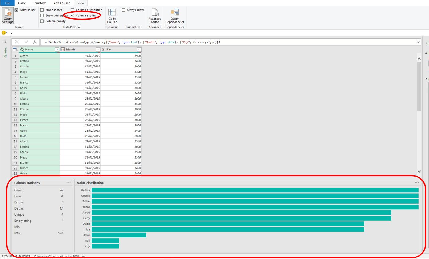
The statistics are useful, and now that I have explained what is meant by distinct, unique and errors, fairly self-explanatory. However, it should be noted that certain fields may have both Empty items and Empty strings:
- Empty: this means the cell either contains nothing or Power Query is treating the value as null
- Empty string: this is the equivalent of the Excel formula =””, i.e. there is something there – it just happens to be, er, nothing.
The Statistics window varies depending upon the data type of the column selected (e.g. text, number) and the field’s contents. For example, in a numeric field, you may see something like the following instead:
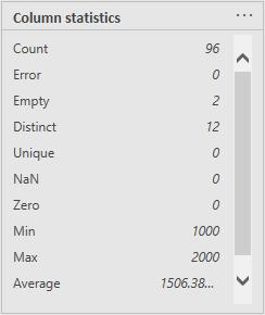
Here, unlike a text field, Min and Max mean something, but there is no longer an ‘Empty string’ item. You should note also the scroll bar, highlighting ‘Standard deviation’ is off screen. Unless you change the screen resolution, it does not appear you can presently change the size of this Statistics dialog.
Regarding the ‘Value distribution’ dialog, you can get bar charts…
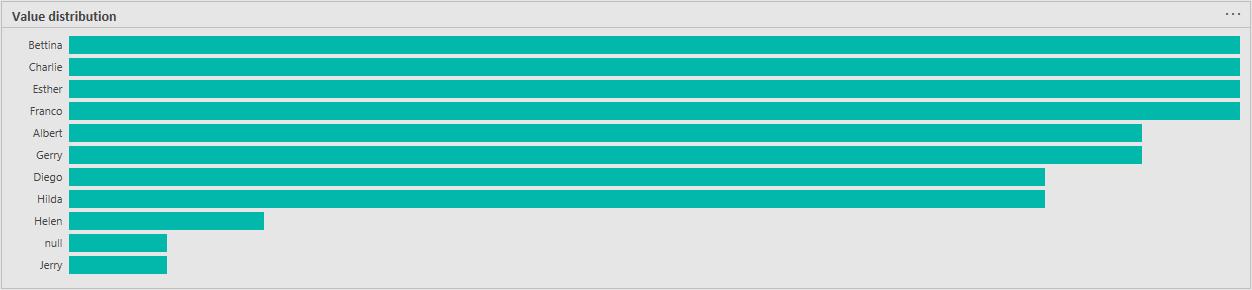
…and column charts:
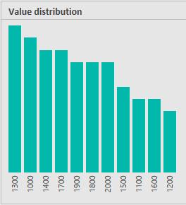
The logic eludes me presently, but it is worrying that for bar charts you may not see all records displayed (only 11 of the 13 are shown in the example above). With no options to revise images currently, do bear this is mind when viewing such graphics.
Column quality
This again reports above the field data:
If the ‘Column distribution’ is checked as well, the graphic will appear below the statistics, viz.
The Data is separated into three elements:
- Error: as explained above, this is any record that results in Error
- Empty: this is a blank or null record
- Valid: this is everything else (both figuratively and literally!). All specified error types (see above), i.e. those not classified as Error, will be included in Valid.
It is quite a basic analysis, but it is better than what we had previously (i.e. nothing).
Word to the Wise
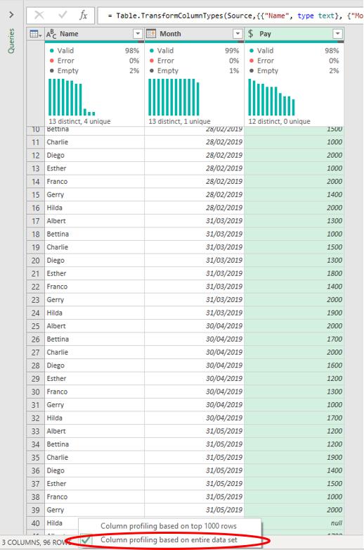
There is a classic “gotcha” in here too… The data profiling is only performed on the first 1,000 records by default. If you have more than this ensure you select the entire data set. To do this, you have to LEFT-click at the foot of the Power Query Editor and select ‘Column profiling based on entire data set’ instead (pictured):
Finally, as I have explained these new views, I may have come across as a little negative. This is not my intention. The features are brand new, and you should be aware of the issues we discovered. You may find plenty of your own too. This is often the case with new features and functions. Microsoft will fix them as they are reported, so don’t let this put you off trying out these new views – assuming you can access them.