
Creating Similar Charts Side by Side
Liam Bastick, director (and Excel MVP) with SumProduct Pty Ltd, highlights some of the common issues and scenarios in financial modelling / Excel spreadsheeting. This time he looks at how to create comparison charts with similarly-scaled axes.
Imagine you needed to create comparison charts for a report or dashboard. Let’s say you had the following data:
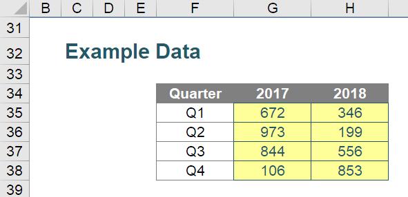
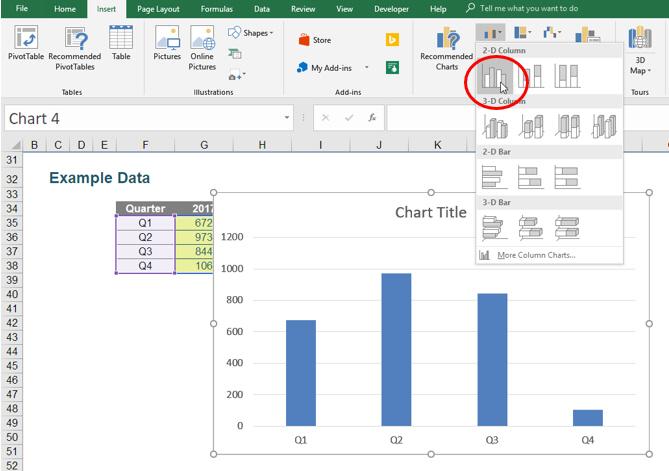
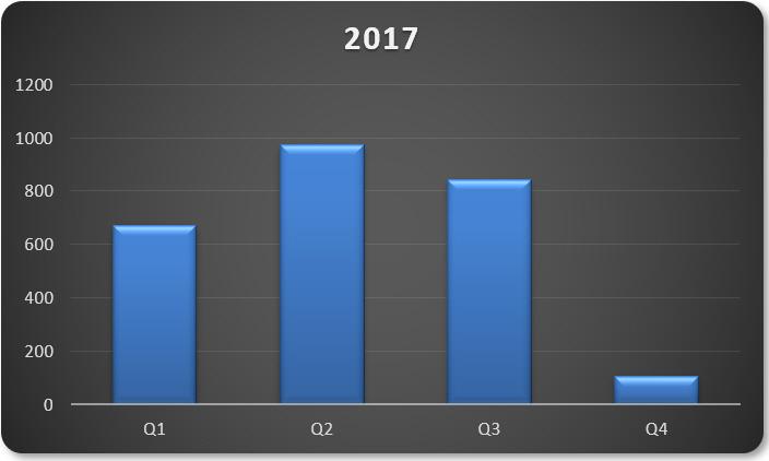
I don’t wish to plot this data on the same chart; I wish to have two charts side by side that depict the data above. To do this, I would create my chart as follows. I will select cells F35:G38 and then insert a 2-D Clustered Column chart (keyboard shortcut ALT + N + C), viz.
With a little tidying up of the chart, I could get something similar to the following:
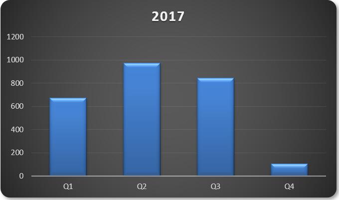
Note that the scale on the y-axis goes from zero (0) to 1,200. Exciting I know, but I do need to point this out for reasons that will become apparent shortly.
Rather than add the second dataset into this chart, for dashboard reporting reasons, I have decided I want to display a similar chart next to this one. The easiest way to do this is to right-click on the chart and select ‘Copy’ (CTRL + C). I can then paste a duplicate wherever I please.
If I right-click on the data,
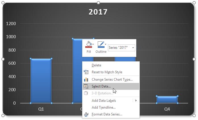
I can choose ‘Select Data…’ which results in the following dialog box:
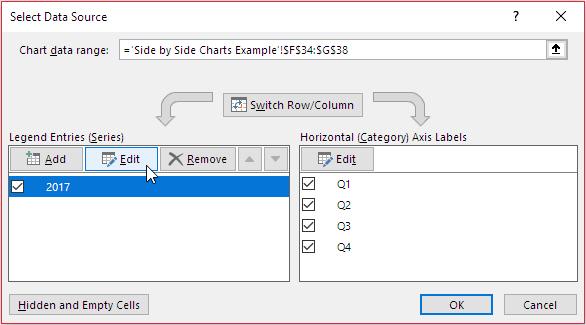
I can then edit the ‘Legend Entries (Series)’ section (pictured above):
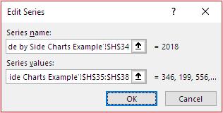
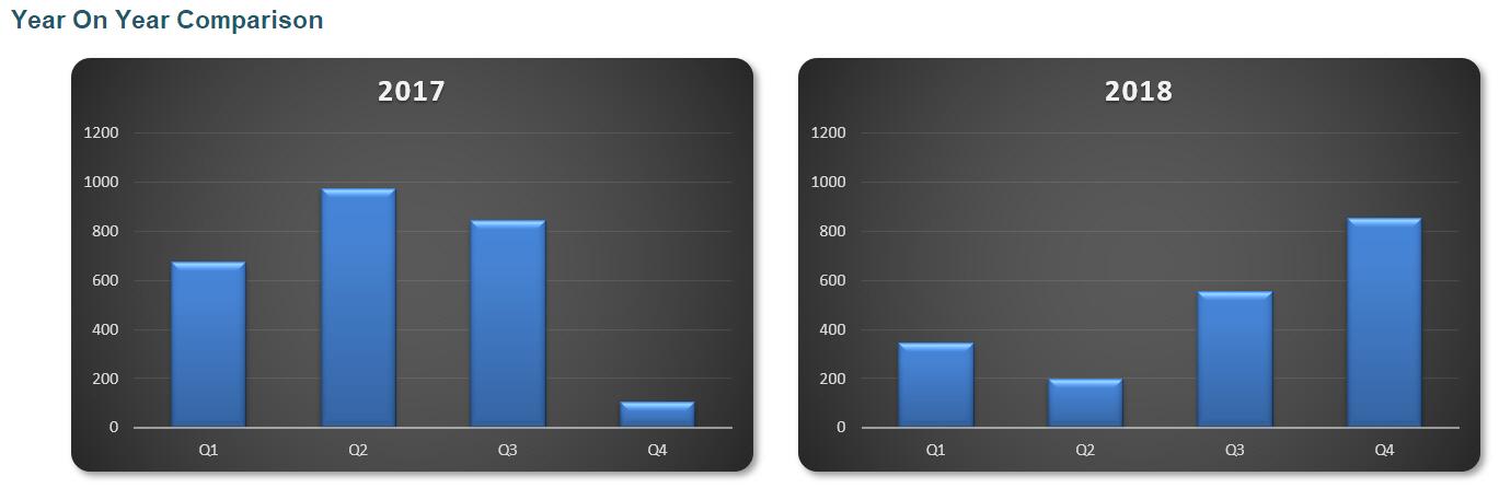
Here, I have changed the references to the second data set. Clicking ‘OK’ twice in succession, I get a replica chart but for the following year:
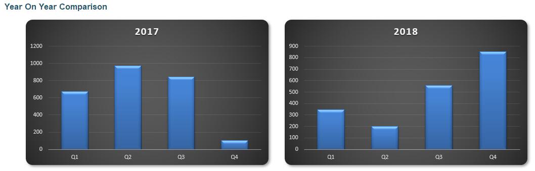
Do you see comparing these charts can be misleading? The right-hand chart has a y-axis scale that goes from zero (0) to 900 – not 1,200. We are not comparing like with like. This is a common mistake made in dashboard reporting and easily rectified.
Most modellers – assuming they notice – will right-click on one of the two y-axes and then click on “Format Axis…’ on the shortcut menu that appears. This gives rise to the ‘Format Axis’ pain where they will manually modify the maximum value.
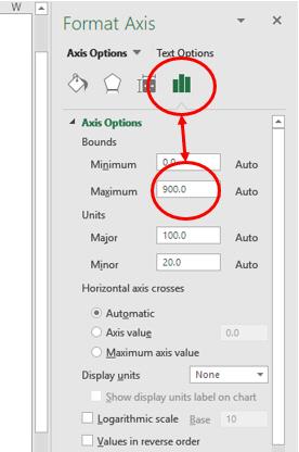
But what happens when the data changes? The process is doomed to be repeated ad nauseum. The problem is we cannot link this ‘Maximum’ value to a cell and I don’t want to use VBA when you can simply cheat!
The trick is to go right back to the start and add another column to our chart data, viz.
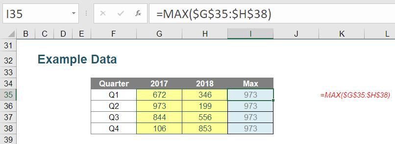
In column I, I have added a ‘Max’ column which determines the largest value in all of the data using the formula:
=MAX($G$35:$H$38)
Now, we include this column in our original chart. Returning to the first chart (you can bin the second one), we’ll re-open the ‘Select Data Source’ dialog box and this time, we’ll add data:
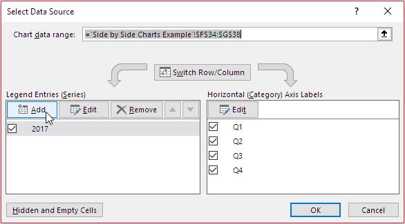
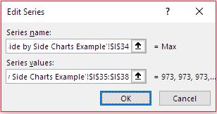
The ‘Max’ data will be included as follows:
Clicking ‘OK’ twice in succession generates the following chart:
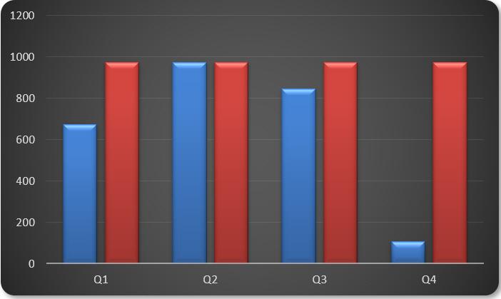
It’s not pretty, but we aren’t finished. Now, we will right-click on this second data series and select ‘Format Data Series…’:
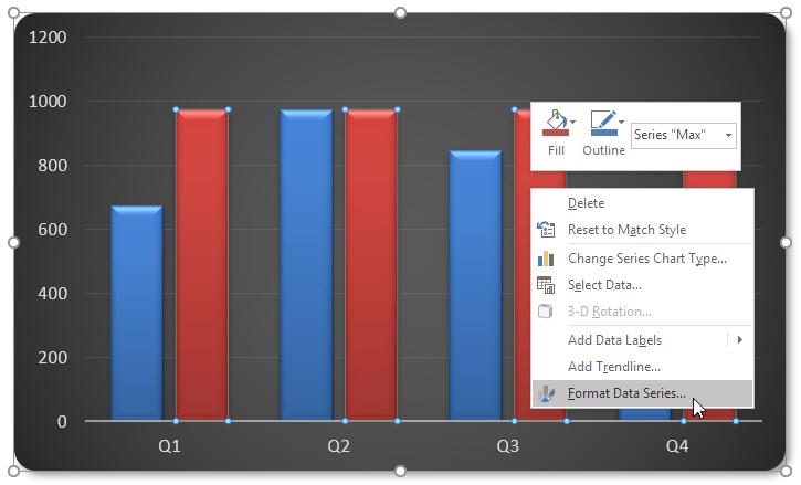
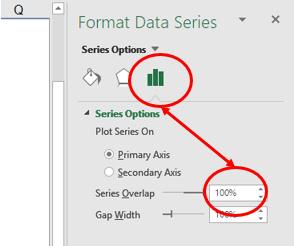
In the resulting ‘Format Data Series’ pane, change the ‘Series Overlap’ to 100%:
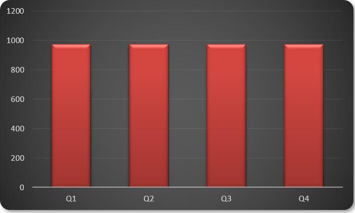
Given this data series was added second (it’s the bottom data series in the ‘Select Data Source’ dialog box), this “obliterates” our original data, viz.
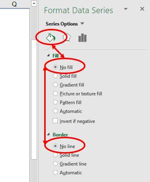
That’s fine, because we are again going to right-click on this data series and select ‘Format Data Series…’, but this time select ‘No Fill’ for both the ‘Fill’ and the ‘Border’ of the data series:
Lo and behold, we have our original chart back again after we add a chart title and remove the second data series’ shadow if necessary (it depends on what chart you choose):
The difference now is that when we repeat the process of replicating the chart and changing the dataset (keep ‘Max’ as is), we get comparative charts side by side (i.e. the y-axis scale is the same for both):
Easy!
The attached Excel file provides an example of how this might work in practice.
If you have a query for the Thought section, please feel free to drop Liam a line at liam.bastick@sumproduct.com or visit the SumProduct website.