
Geo with the Flow
22 April 2013
April saw Microsoft announce the availability of the project currently code named “GeoFlow” Preview for Excel 2013 (a catchy title I thought), an add-in for Excel that allows users to view information over the twin parameters of space and time.
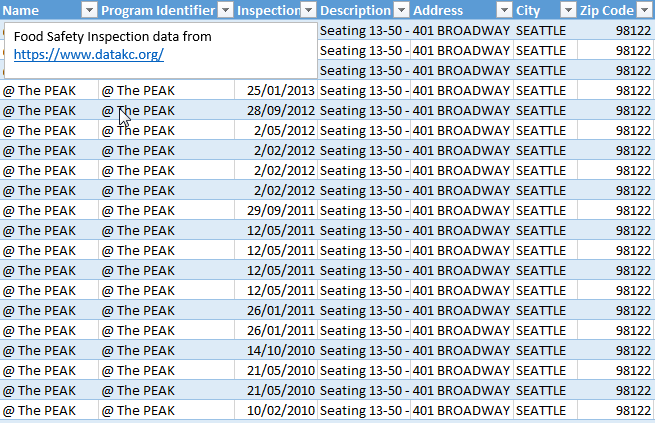
Essentially, chart data is constructed in the usual way in Excel (more than a million rows of data may be plotted from an Excel worksheet, the Excel Data Model or PowerPivot), including temporal and / or geographic data:
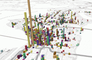
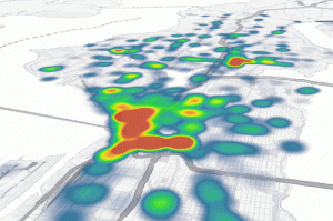
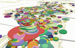
This data can then be presented in one of three ways:
Columns
Heat Maps
Bubble Visualisations
You can even go further and create interactive “tours” to share with others in a video format, annotating data points and comparing time periods in just a few moments.
I am a firm believer that a picture tells more than a thousand words, and GeoFlow can certainly make a visual impact. My company (SumProduct) has already added the video tour into a recent PowerPoint presentation drawing immediate attention to key issues for our engaged audience. Our presentation was for a client working in the transport / logistics sector. Very quickly, using their data we were able to display the most profitable destinations for transporting items from Australian cities, and how this had changed over time. They liked it.
This software is still in “preview” mode and of course, there are glitches: Lenovo users may need to deploy Microsoft’s troubleshooting instructions and presently, all data has to be in English. Further, GeoFlow can only work with Excel’s Data Model; it can neither connect to external servers nor support hierarchies in the Data Model.
But I think it’s a great start.
You can download the add-in for Excel 2013 with Office 365 ProPlus or Office Professional Plus 2013 from http://www.microsoft.com/en-us/download/details.aspx?id=38395.